OVERVIEW
For the user interface of the game I knew I wanted it to be space themed. This could be either designing the text box borders in designs of planets or creating the inventory / select menu to be the solar system. What I ended up leaning towards was basing my menu screen off astronomical rings after finding them in some of my inspirations and adding in a fantasy element of a storybook / cut-out animation theme for my dialogue screens. My goal was to try and blend these sci-fi and gothic fantasy elements together without making it seem too far apart in terms of the style.
Pinterest Board
https://pin.it/6EM5TFswp
RESEARCH
A site I found particularly handy when gathering references for myself was the Interface In Game site. It adds games frequently of screenshots for any section where the interface design can be found.
https://interfaceingame.com/
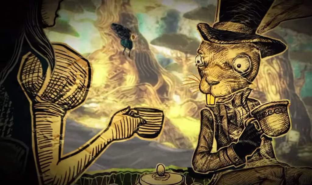
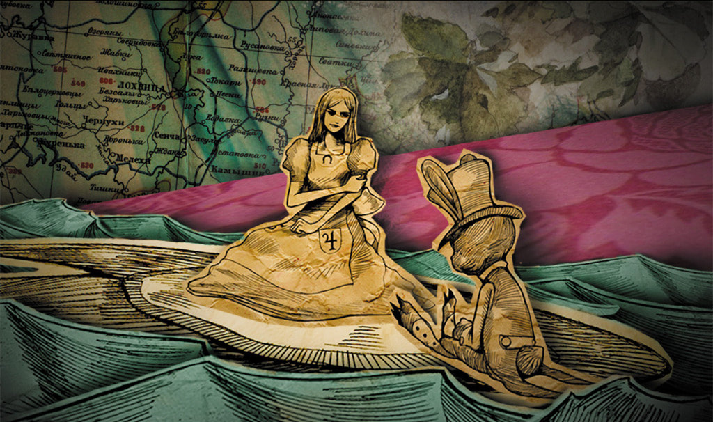
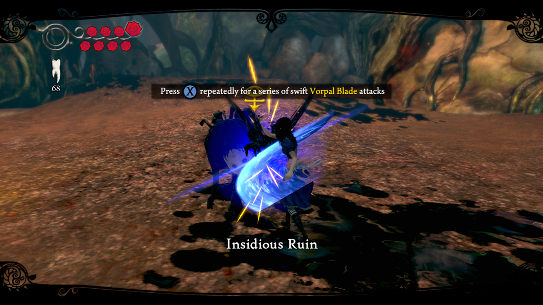
Alice Madness Returns
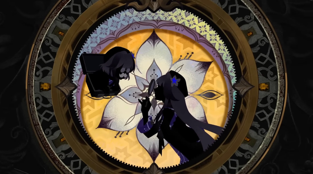
I wanted the interface during dialogue between characters to have an element of fantasy to it, so I looked into the book like illustrations used for the Alice Madness cutscenes. This plus the border design for when the player locks onto the enemy helped brainstorm how to attempt the 3D effect it has.
|
|
|
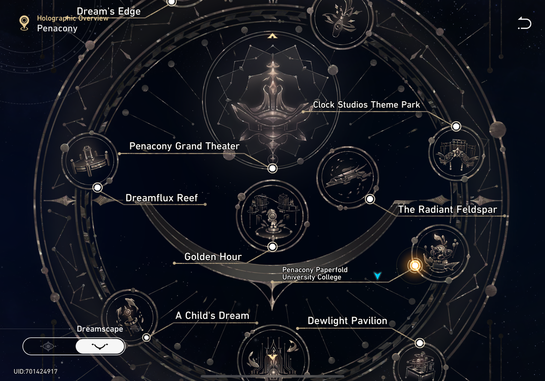
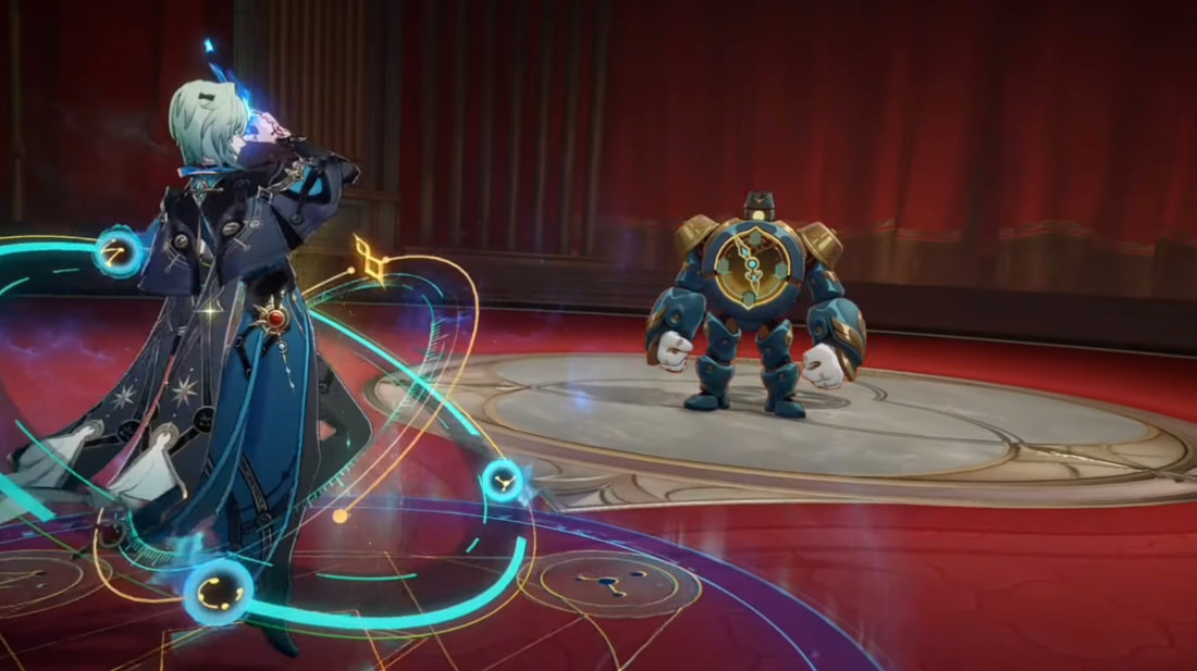
Honkai Star Rail
At the time I started this project, Honkai's new planet added to the game was all centred around gods and goddesses with a prominent day to night. This gave me plentiful of references from map designs, battle interfaces and more. Their world maps were one of the biggest inspirations when creating my own design.
|

|
|
|
|
|
|
|
Honkai Star Rail - The Herta
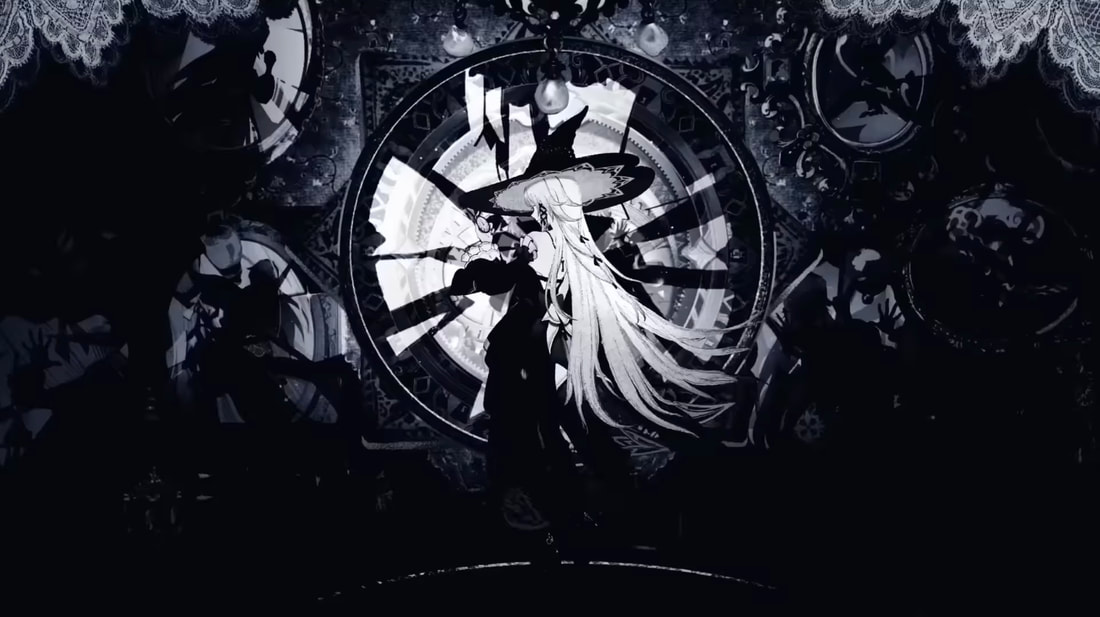
Alongside Honkai's battle interface for one of their planets, their character trailers also have a unique style depending on the character that I looked into. The video I took most reference from was for The Herta and the mixture of the gothic-Victorian space like illustrations caught my eye.
|
|
|
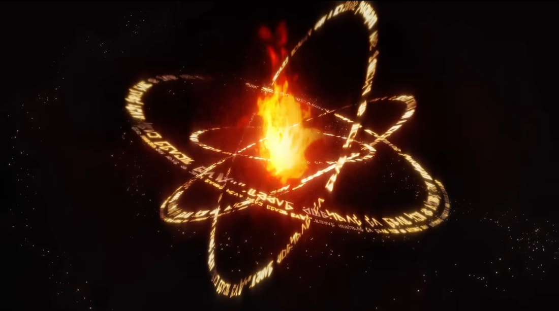
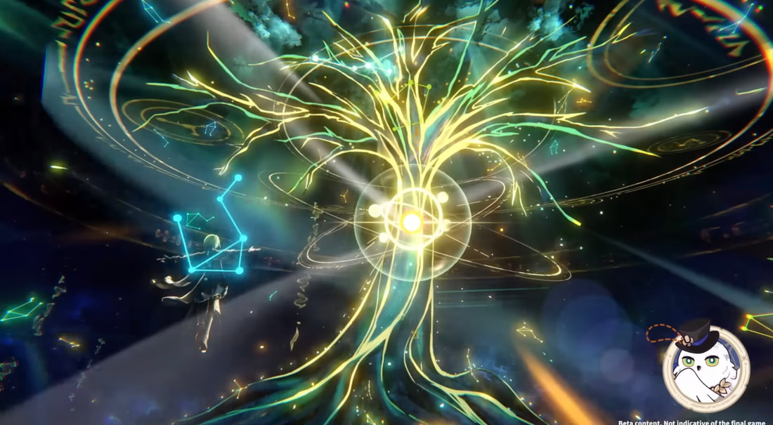
Honkai star rail - Anaxagoras
When I started to look more into the games I personally played, Honkai had even more of what I was after. Below is the skill design for a character based on a Greek Philosopher who studied cosmology. His abilities came with a lot of the astronomical rings I found myself wanting to take further into my research, which later became a big influence for my first few menu designs. The rings that surround him on the ground and above the tree in his abilities inspired my final design.
|
|
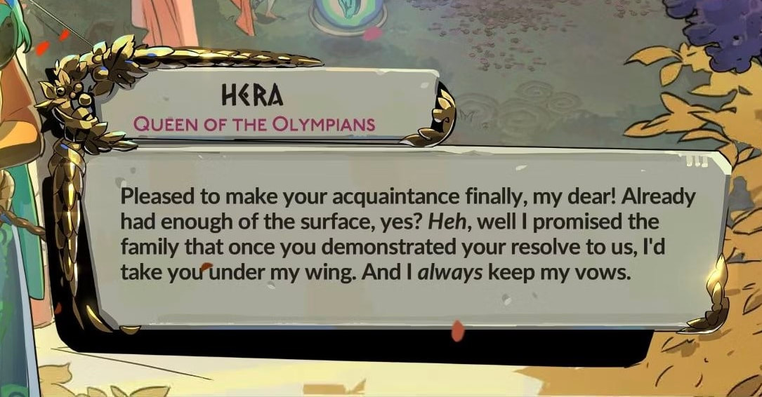
Hades 2
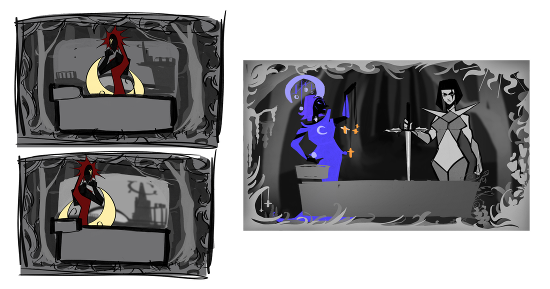
The dialogue boxes in Hades 2 are very unique and inspired the biggest part of my story, the split world. Seeing that there were two types of boxes depending on the alignment of sides the gods were on made me want to look into doing something similar. Though I think as development went on I decided to keep the text boxes the same for everyone, the moon style borders gave me lot of thought into designing my own unique ones.
|
|

|
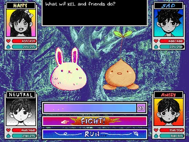
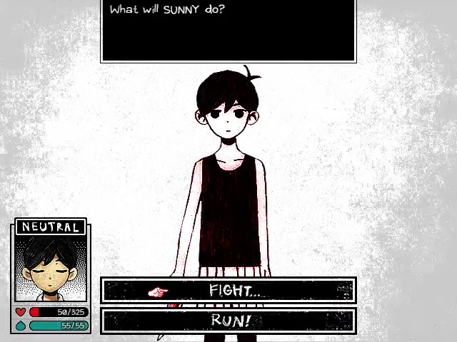
Omori
Another game I have recently played in my free time was Omori, a horror game that combines art styles from hand drawn pencil work, scanography and pixel art to fit the mood. Not only does the game feature many black and white moments to my head buzzing with ideas but it also has a feature that's made it iconic. During combat, it is based around an emotion chart. For example, if a you or a foe are happy, you can beat them if your party are sad. This meant the combat needed portraits of the characters to show the emotion they're feeling. While over time I had thought how I'd want the health / special bar to show, I thought it would be interesting to create the protagonist a portrait that changes on low health.
|
|
|
Game Design Videos
|
|
|
|
IDEAS / DEVELOPMENT
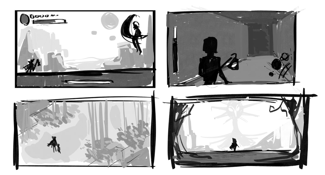
In the first couple weeks, I drew up thumbnails for different perspectives of my game. They each had their own pros and cons based on how exactly I wanted things to be seen. Isometric views like Hades are good for seeing the environment in full view, but don't do well showing the characters. Third person views like horror games such as Silent Hill or other action games give it better combat focus and make it feel more tense if I went full horror style. What I ended up choosing was a 2D-scrolling platform style, where a lot of focus can still be in the characters and use the backdrop for environments. It is also how I pictured most of my combat to appear.
Biome / Location Introductions
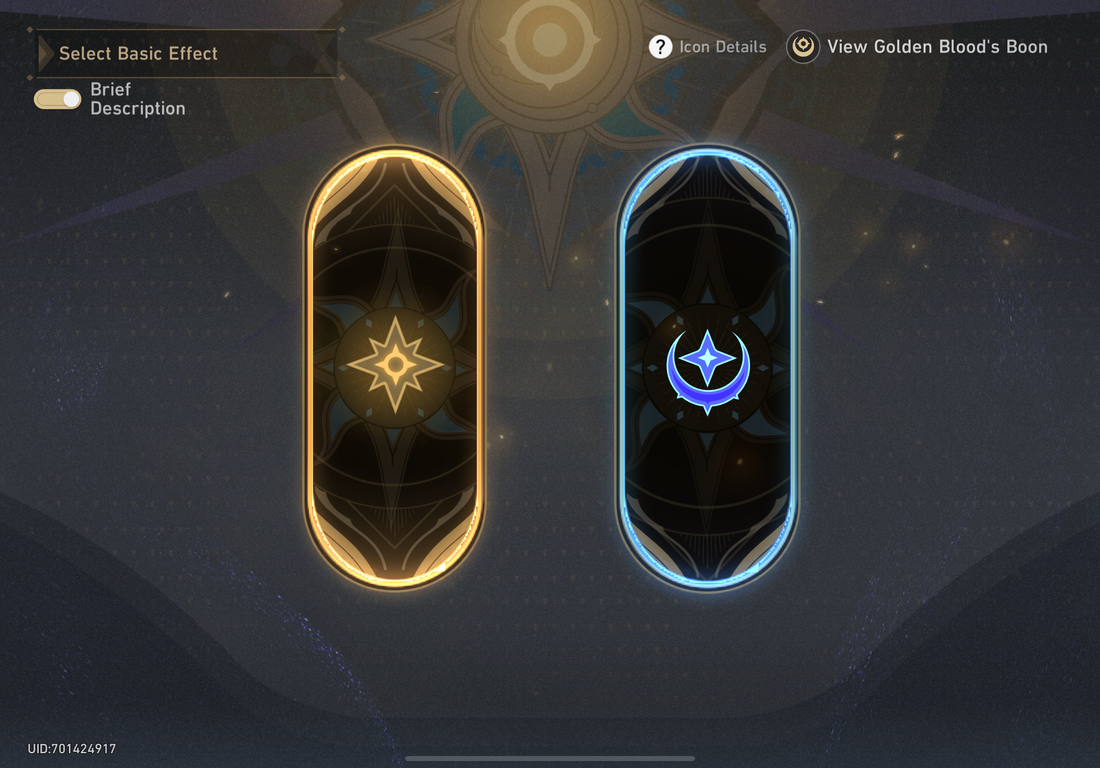
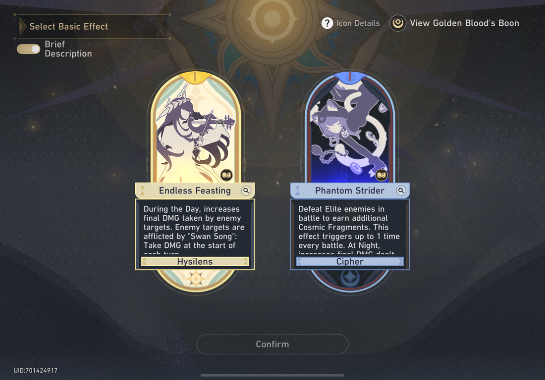
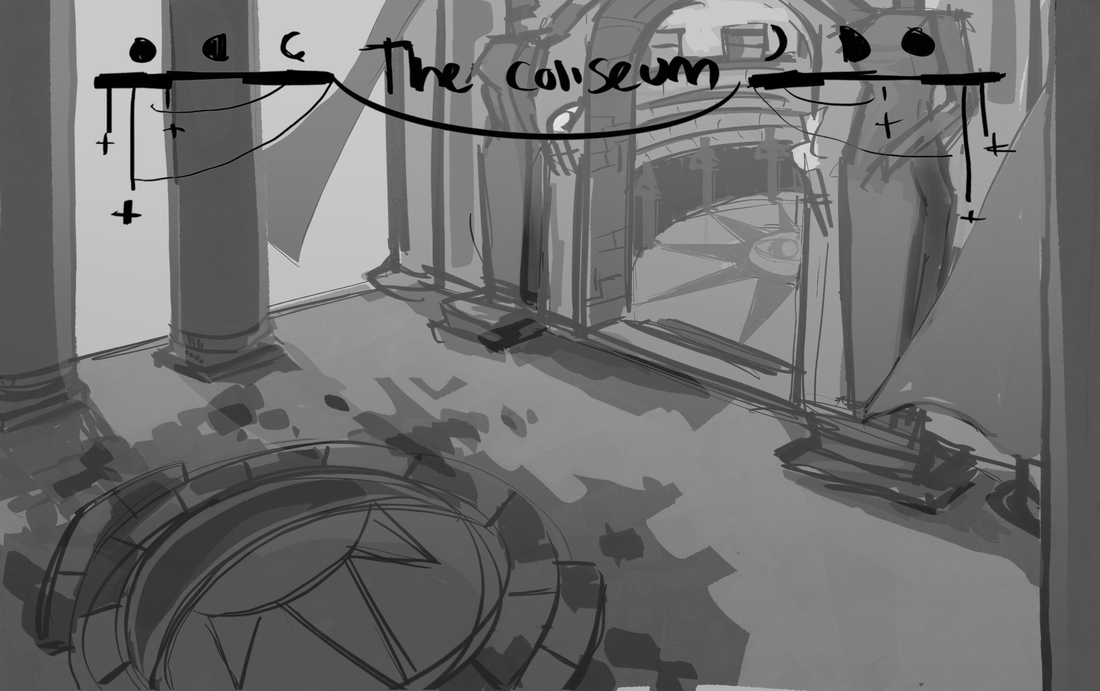
Certain games include a feature where when the player enters a new area there is a title that tells them the name. I liked the idea to design my own for the areas in my game. So to test out some designs I used a location that's included in the world I'm creating, a Coliseum where the player will have to fight a boss that represents one of the planets from either the sun of moon faction depending on where you are.
What I had in mind was to create two styles, one that would appear in areas for the Suns kingdom and another that would appear in the Moons. I went through different attempts to first design a single one that referenced both kingdoms. I liked the reference to the black hole in my world too from the straight to curved lines above and below.
What I had in mind was to create two styles, one that would appear in areas for the Suns kingdom and another that would appear in the Moons. I went through different attempts to first design a single one that referenced both kingdoms. I liked the reference to the black hole in my world too from the straight to curved lines above and below.

Combat
Turn-Based Boss Fights
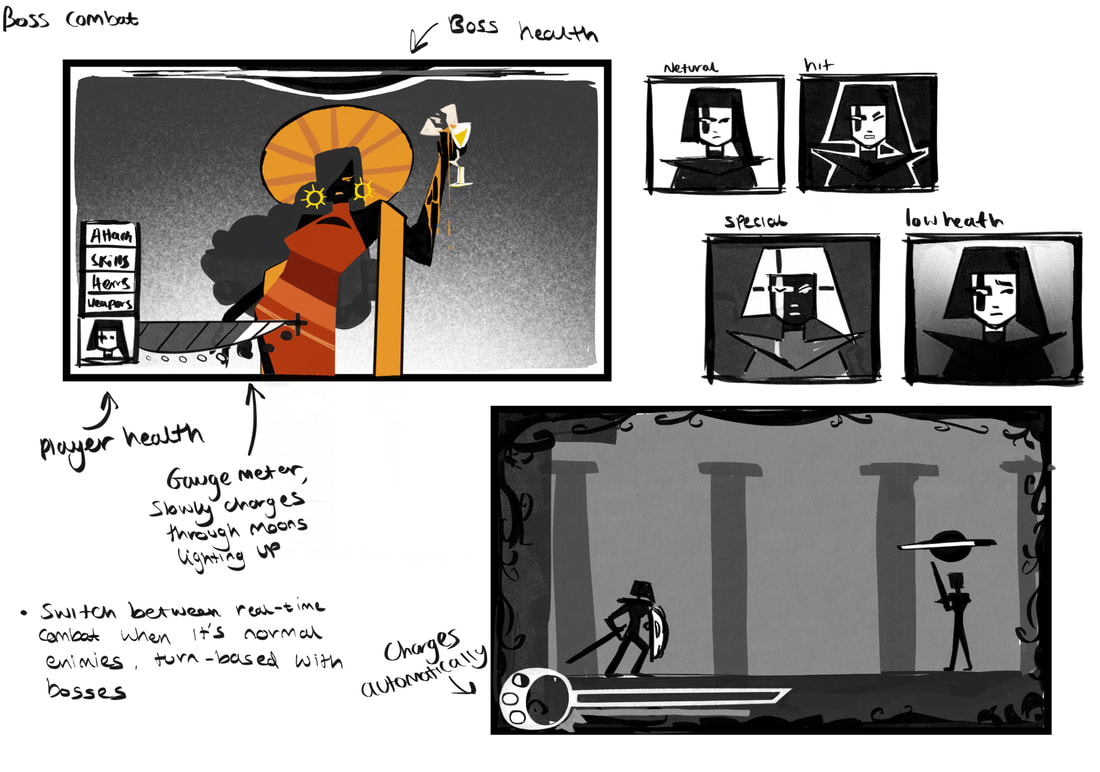
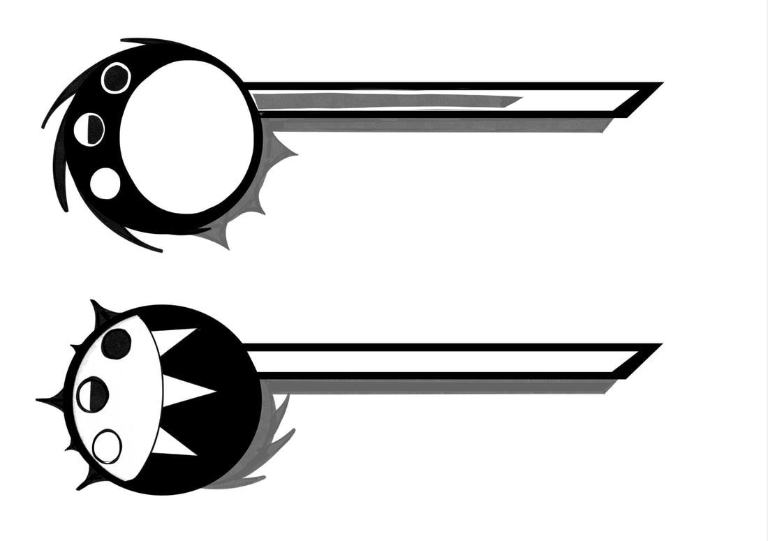
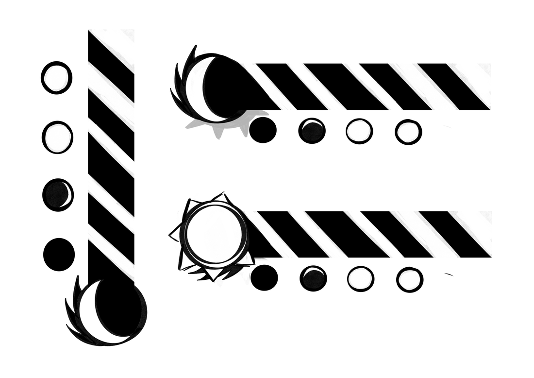
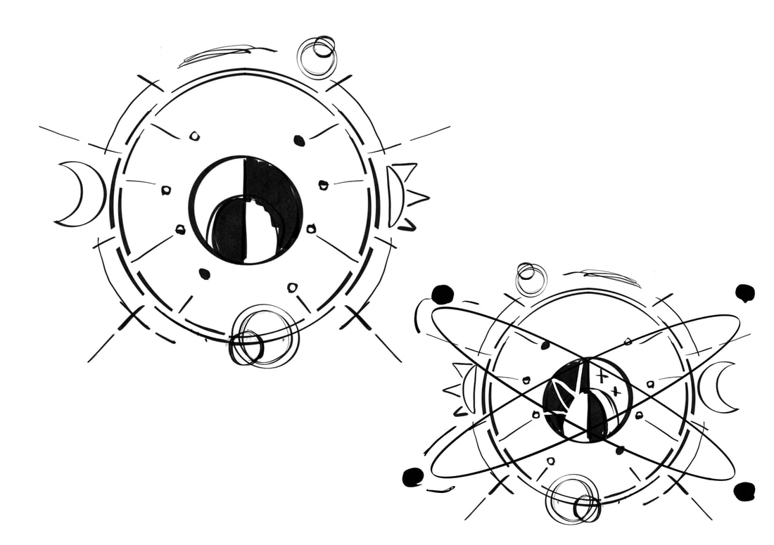
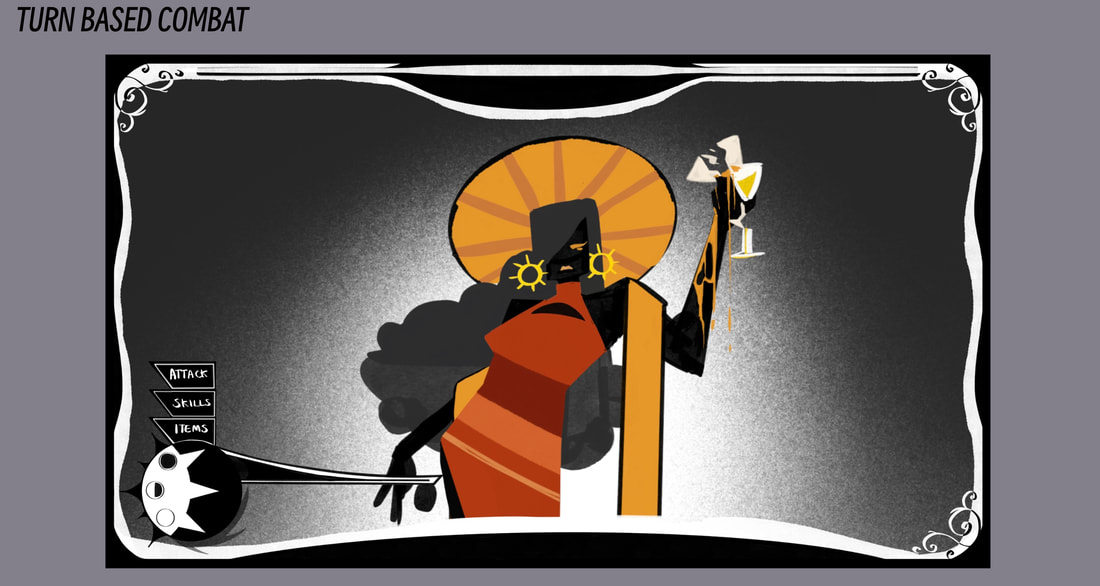
The combat in my game is split between two styles. For boss fights, the player is put into a turn based system. The bosses health appears at the top in a shape similar to the black hole in the world, the accretion disk now acting as the health bar This design is also included in the real time combat outside of boss fights, a miniature version would appear on top of the enemies head. I didn't want to overcrowd the interface design with an additional background behind the enemy sprite, so I added a static gradient, which I experimented in different ways to see how it fit best around the sprite so it wouldn't blend in with the black line art.
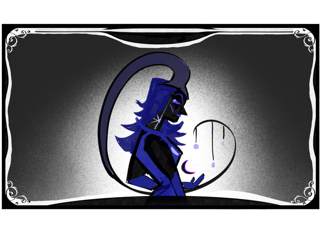
Alongside this I thought to add in a portrait of the protagonist in one of the corners of the screen that could change between her normal and special inverted form. At this moment in time I'm still on the fence about including it for either aesthetic reasons or perhaps to add another mechanic down the line. Next to the portrait and under the health bar, I had the idea for a slowly charged attack that would change her to the inverted form. This would charge up after each time in the form of the lunar phase.
Alongside this I thought to add in a portrait of the protagonist in one of the corners of the screen that could change between her normal and special inverted form. At this moment in time I'm still on the fence about including it for either aesthetic reasons or perhaps to add another mechanic down the line. Next to the portrait and under the health bar, I had the idea for a slowly charged attack that would change her to the inverted form. This would charge up after each time in the form of the lunar phase.
|
|
|
|
|
|

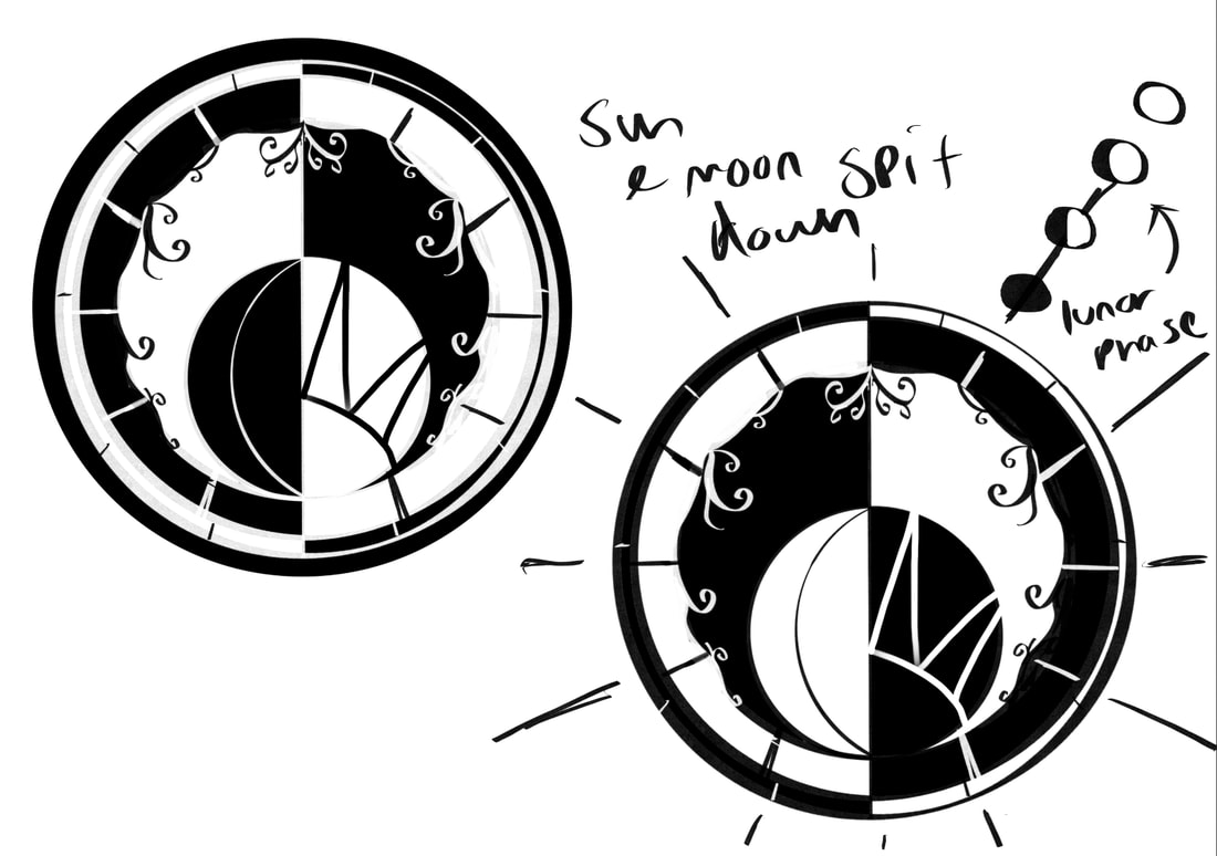
Health Bar & Special gauge
For the health bars, I imagined there to be two types that would switch depending on the environment the player was in. The health bar I've designed changes between a Sun and Moon style, the grey area behind the one in the front is the other health bar. Included on the side of the circle is three moons that start as new moons. As the player fights enemies around the area, those moons slowly charge one by one into full moons. When one moon is full, the player is able to use the Protagonists "corrupted" form, but only for a temporary time until it drains back to a new moon. Once all three moons are full and activated, the Protagonists form is longer lasting and would do more damage.
|
|

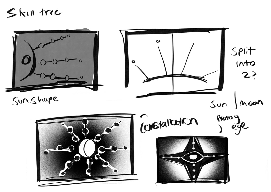
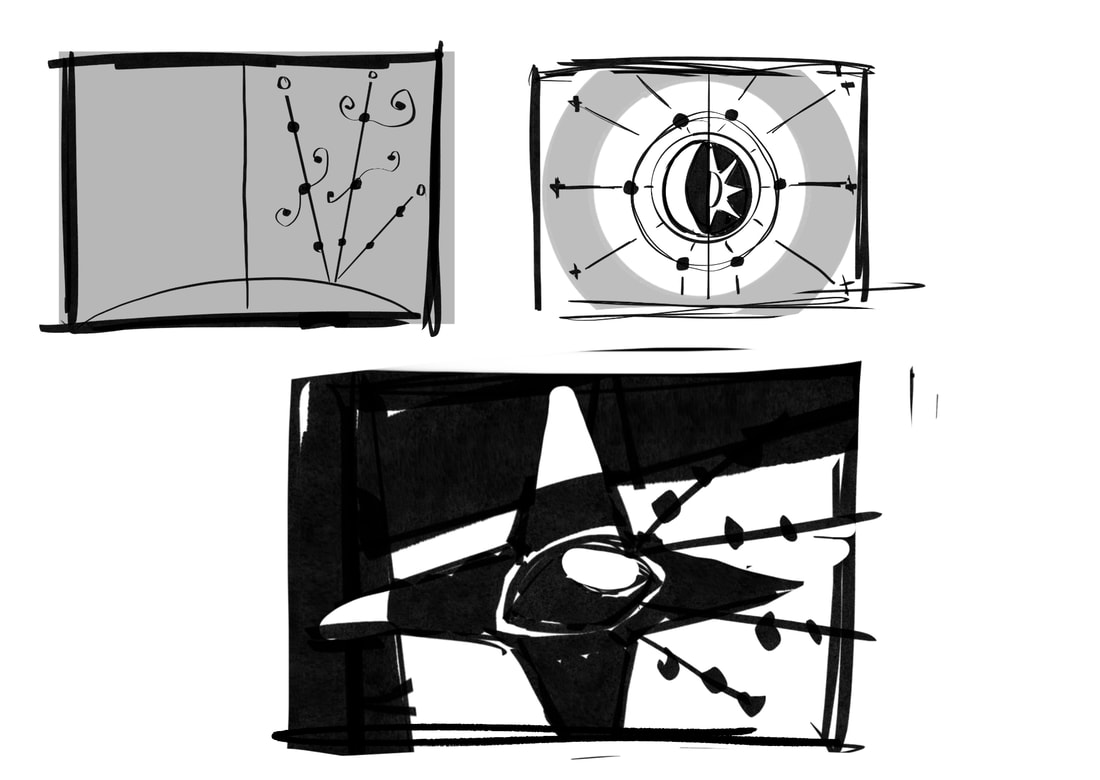
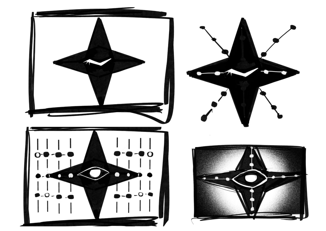
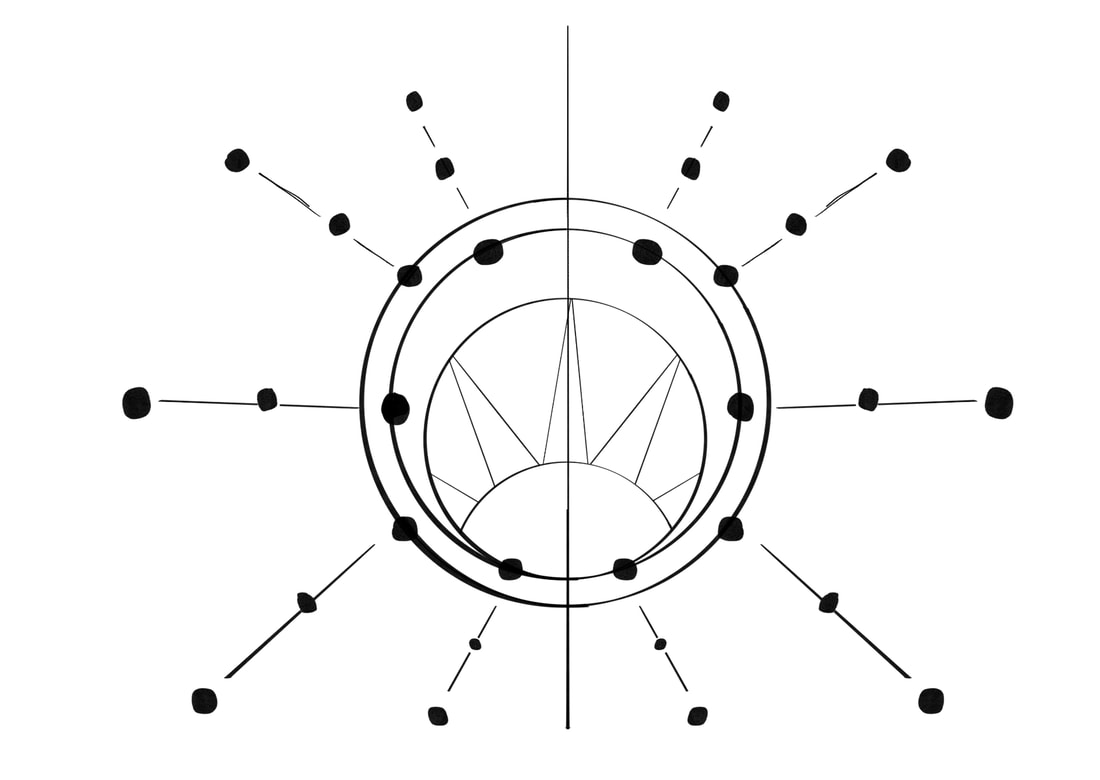
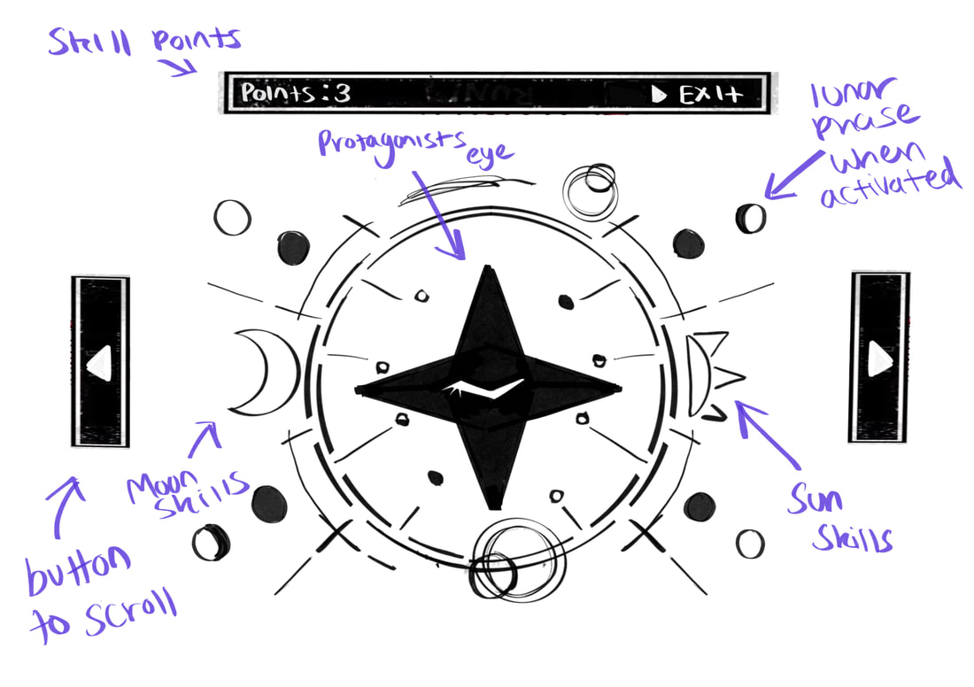
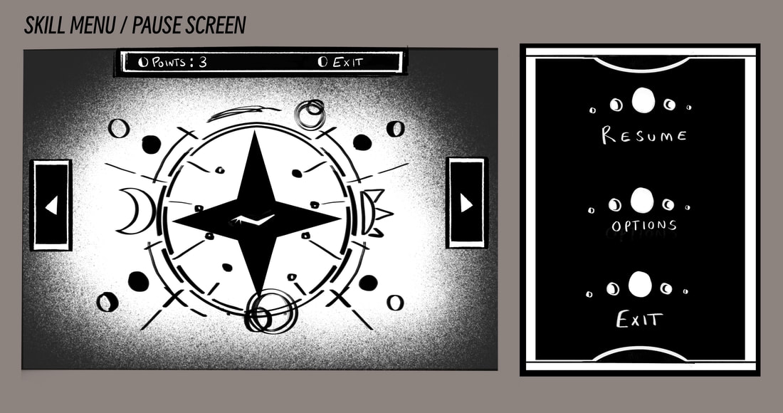
Skill Tree
|
|
|
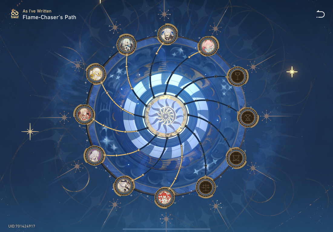
Designing a skill tree was the more difficult task for the UI in my list so I chose to work on that next. Initially, I wanted the skill tree to be split into two. One side for skills useful for the Suns signature weapon and possible exploration in the Sun kingdom, while the other side of the skill tree be for the Moons. The sketch that I took forward was a circle in the centre, split down into two and skill branches spread out.
|
|
After a couple attempts coming up with other alternative designs I took forward a sketch from my first thumbnails. It used the protagonists unique eye as the centre. Since she doesn't open her eye often I imagined that when opening the skill tree menu it would be a closed eye, but when you upgrade the entire skill tree, the design would permanently change to be an open eye. To branch off from the eye I thought about using the astronomical rings around to place the skills. While I liked the idea, I felt like it was needing something else to have that space feel.
|
|
|
|
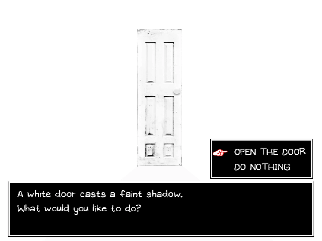
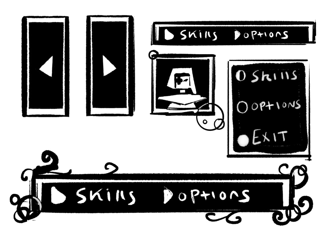
Before I went ahead and redesigned the centre piece, I first wanted to look at the buttons the player would click on to scroll across, select skills, exit and how many points that currently had. Taking inspiration from Omori's interface design I created some simple black and white boxes using a textured brush. I was originally going to look into any fonts to test, but I felt since this had a handful of clean, graphic style designs already, to try using my handwriting instead. My handwriting itself is pretty messy and changes a lot so I would probably need to think about designing my own alphabet or look for fonts with a similar chalky texture.

final concept choice for skill tree
Dialogue
|
|
|
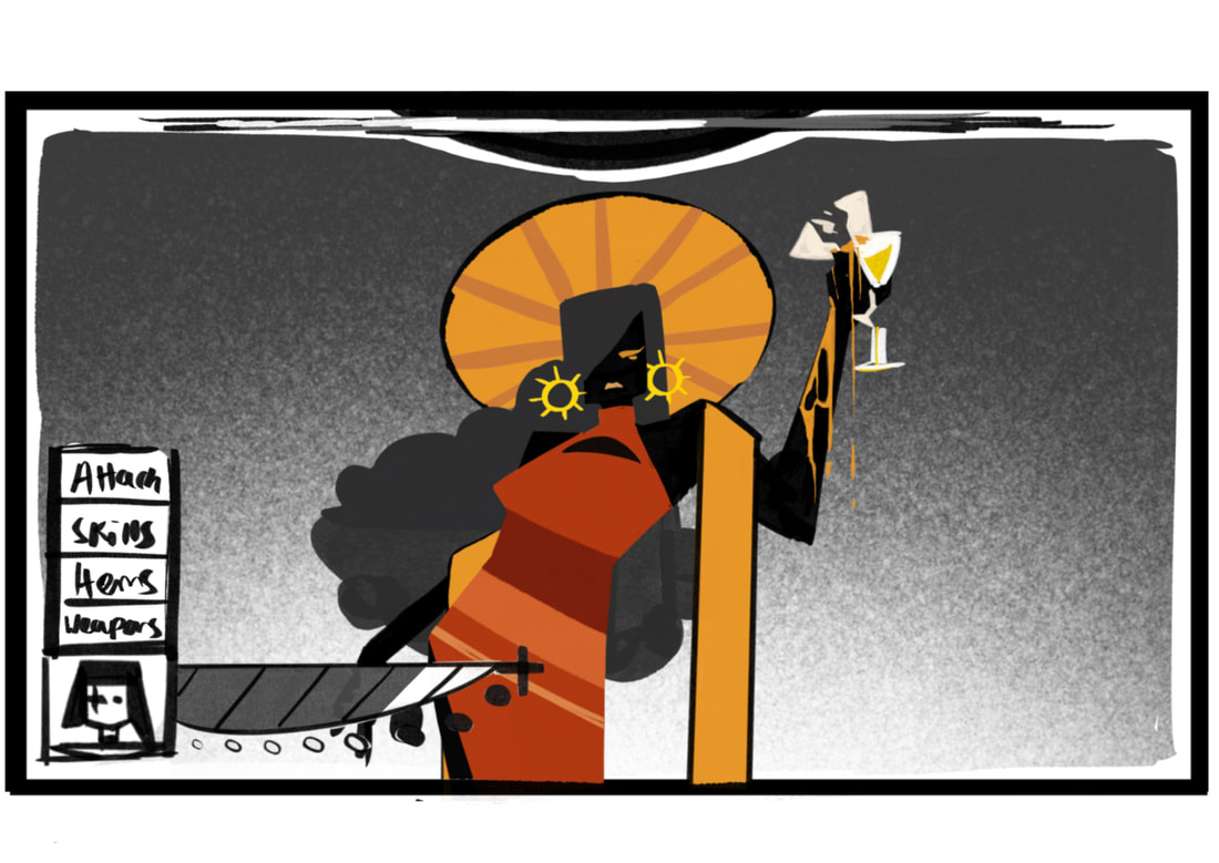
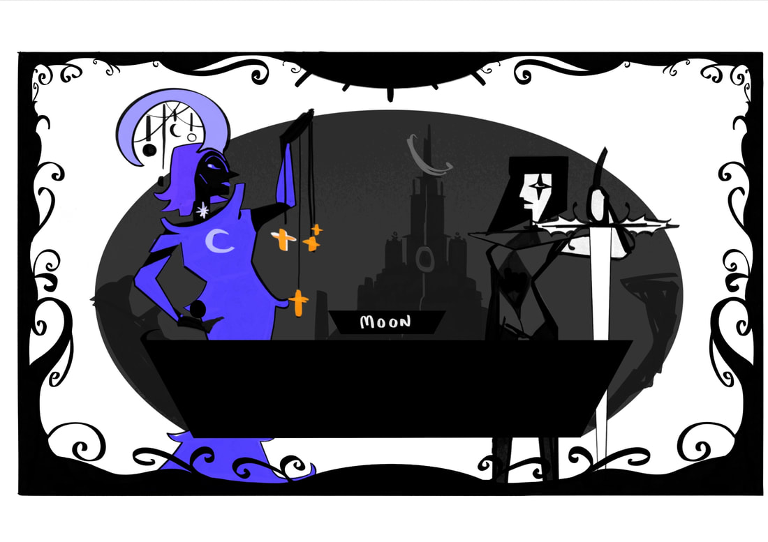
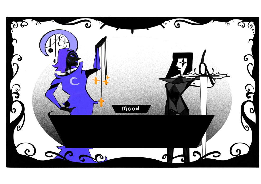
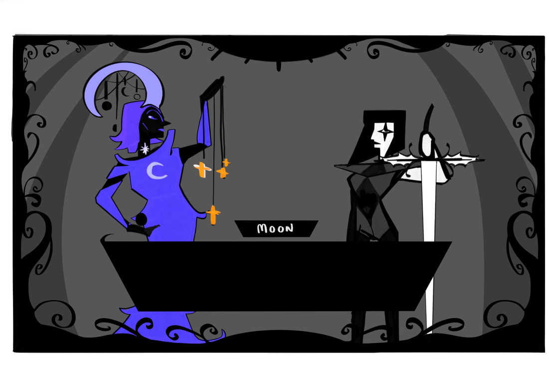
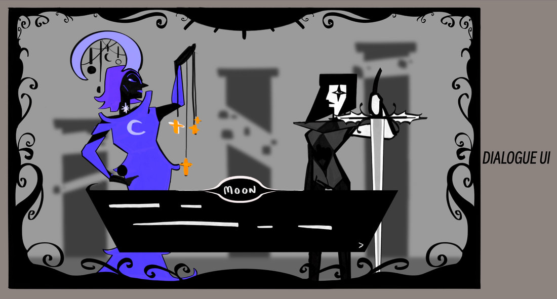
The interface for the dialogue had some changes since I last focussed on it. The Victorian style pattern for the border was kept, but changed to a black to fit the theme of the environment around. Instead of just being decorative patterns to fill the space I wanted to incorporate some sun and moon design to fit the world, both sides of the border have a rounded centre with the top one given some spikes to be sun rays and the bottom left alone to be a simple moon. The text box for dialogue was originally going to have some of the same curled patterns around the edges, but I thought it was too much, and instead made a section for the characters name to be presented in the middle of a black hole.
Behind the character sprites the background was a tough decision. First I wanted it to be a small illustration of the area they were in, then I tried a simple gradient approach and then tried the full background like my first sketches at the start of my UI development. Since my border was already busy my final choice that I went with was a blurred background of the area the player would be stood before interacting with NPCs. Personally, I prefer the simple background, it wouldn't throw off the player on where they actually were and it gives more focus to the character sprites and dialogue.
Behind the character sprites the background was a tough decision. First I wanted it to be a small illustration of the area they were in, then I tried a simple gradient approach and then tried the full background like my first sketches at the start of my UI development. Since my border was already busy my final choice that I went with was a blurred background of the area the player would be stood before interacting with NPCs. Personally, I prefer the simple background, it wouldn't throw off the player on where they actually were and it gives more focus to the character sprites and dialogue.

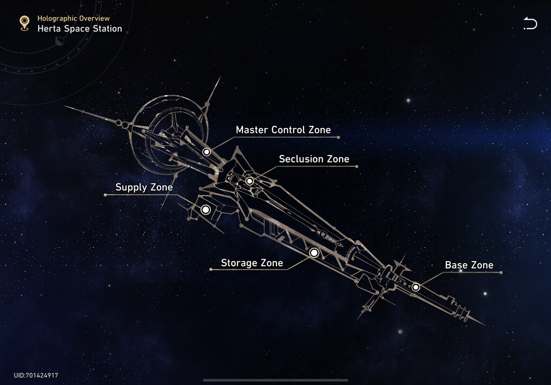
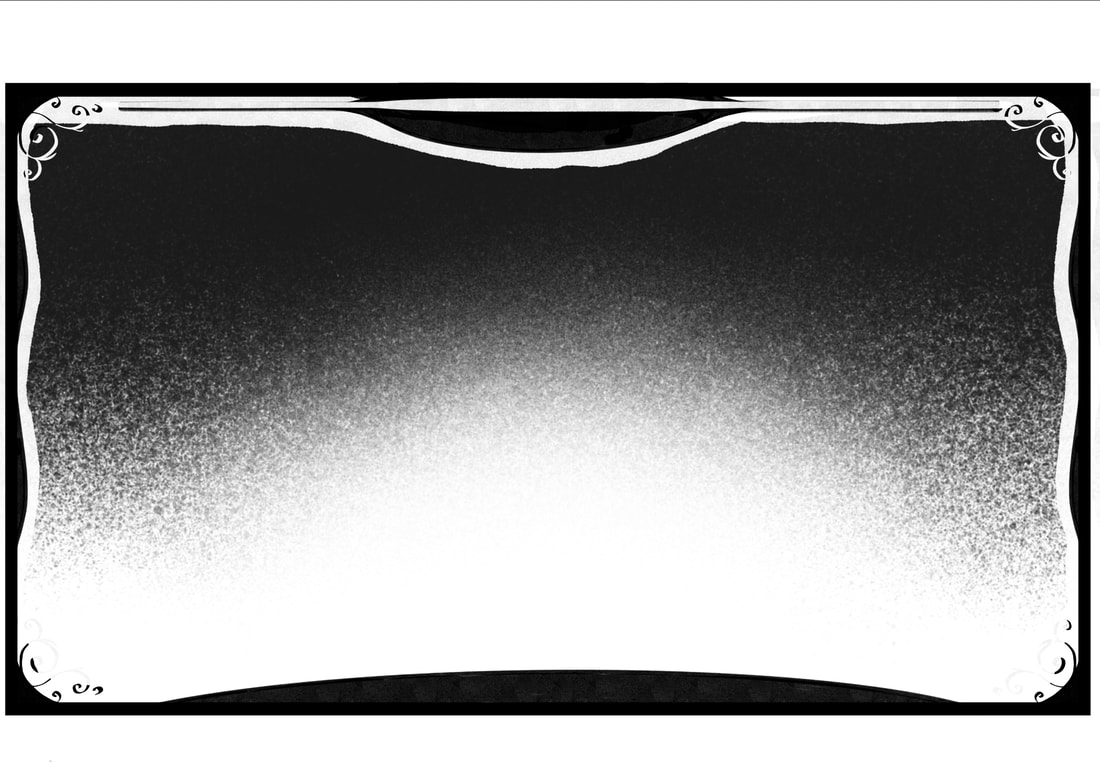
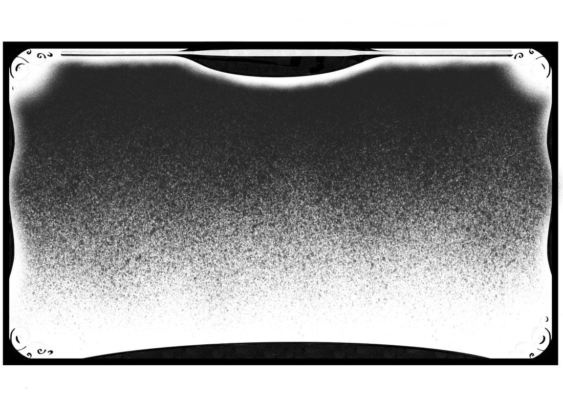
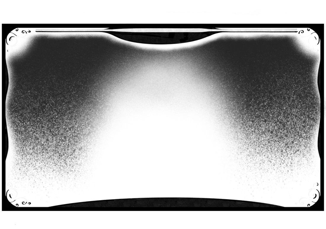
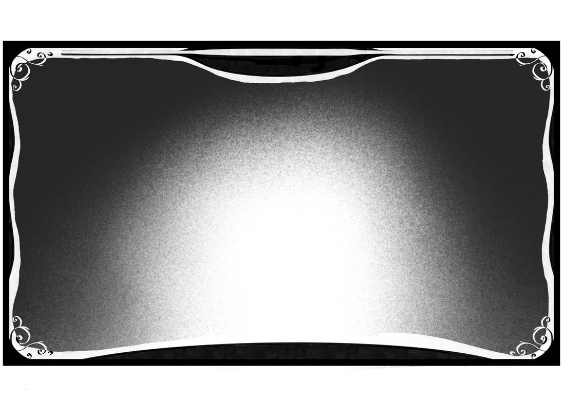
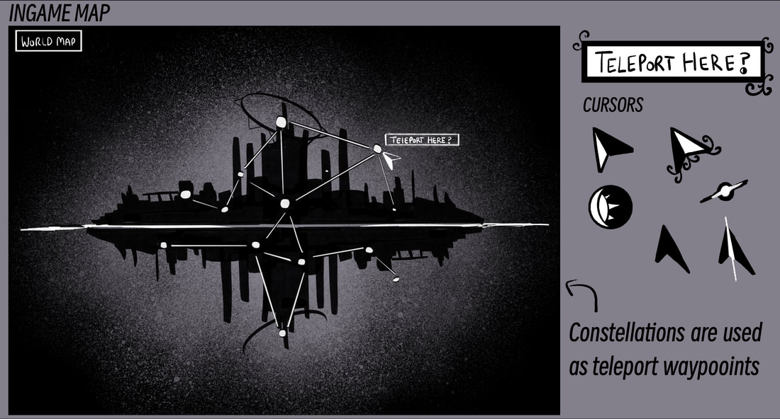
In-game Map

I had already had the idea for the in-game map to have some use with constellations. There was only a vague idea of what areas the player could explore, so I mostly just placed them randomly. I think I had most trouble deciding on a background for it. Feeling like I needed it to fit the rest of the theme for the menu, I was inclined to go for the grainy effect in the first option, but ended up choosing a mixture of that with a darker background and having it surround the world instead of just the sides, since my main goal was to make the waypoints the most noticeable feature.
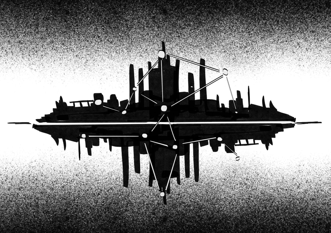
Grain effect
|
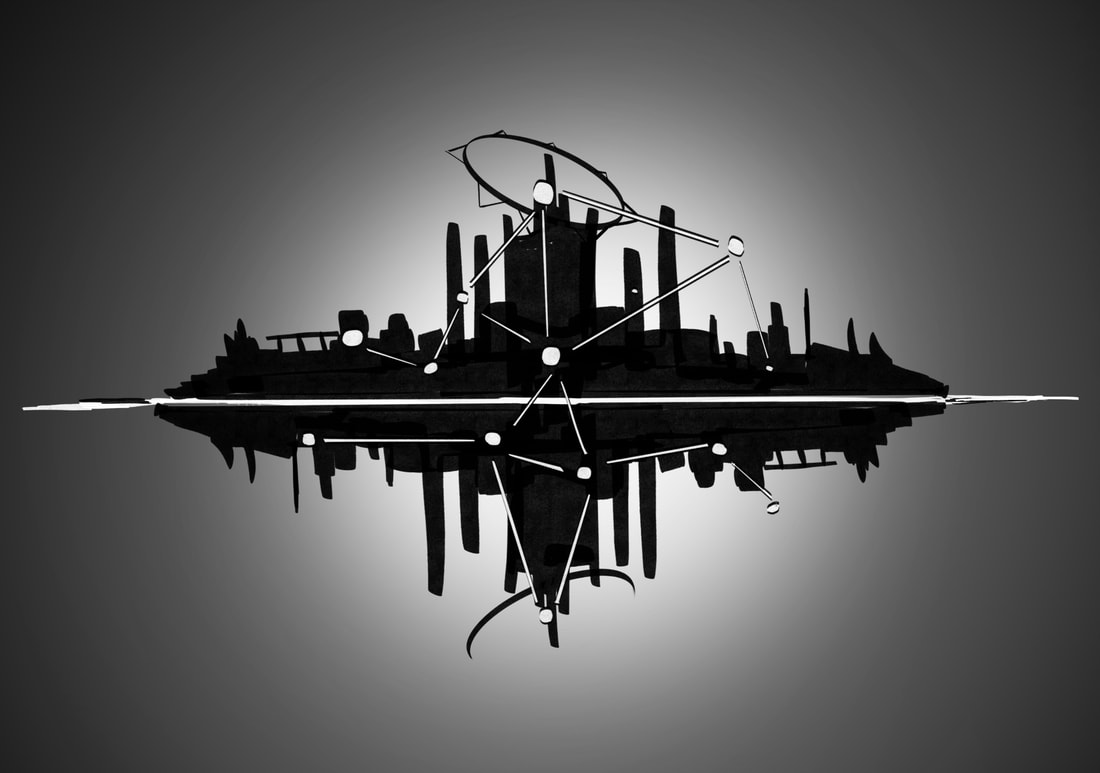
Blurred Black Hole
|
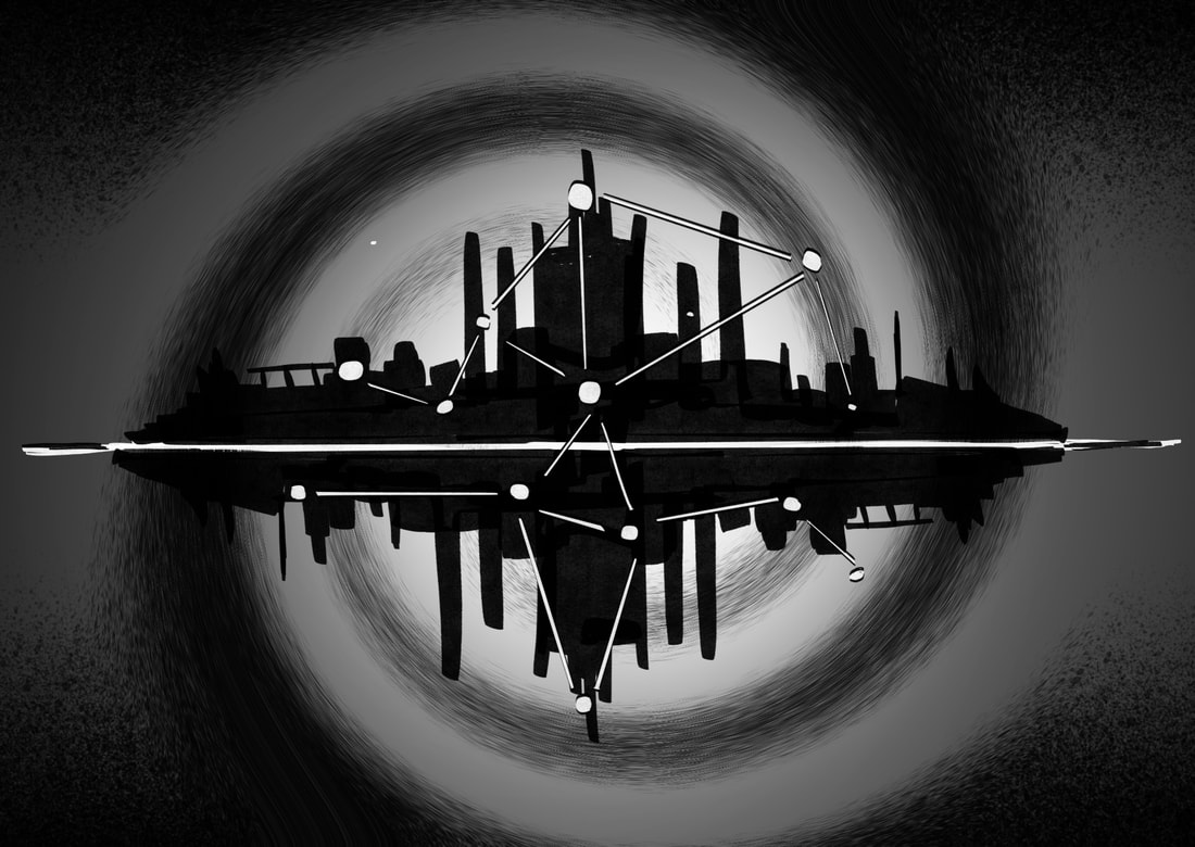
Swirled Black Hole
|
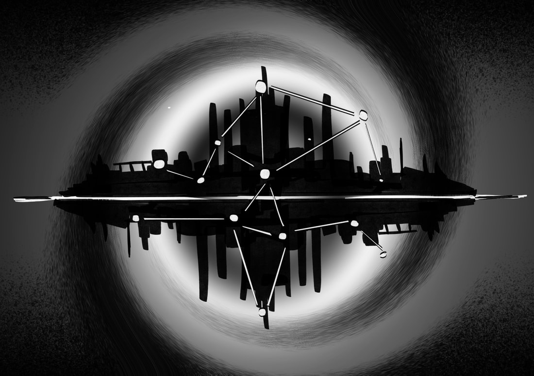
Swirled Black Hole (darker centre)
|

FINAL OUTCOMES
REFLECTION
During my development for the user interface, I think my biggest flaw was how many ideas I wanted to include. Since I was using a lot of games I personally liked and wanted to take inspiration from, I was constantly thinking of something new to add or how to change something I'd already finalised. I think I could have possibly done a better job at using the monochrome style to my advantage, things like the skill tree and border I was pleased with the most since it incorporated that fantasy feel but still lacked the inclusion of space that I wanted fit into everything I could, which could arguably be a good thing that I didn't try and do, but I did want to make it look like it was all from the same game. On the other hand, I'm happy with the designs such as the pause screen and dialogue interface, since out of all the changes I made, those were the two that I imagined looking at the start of the project. I think if I had the time to change anything, I would maybe look into a font style for the game and switch it out from my handwriting or perhaps include an animation to give a better visual for how I planned the skill tree to work.