OVERVIEW
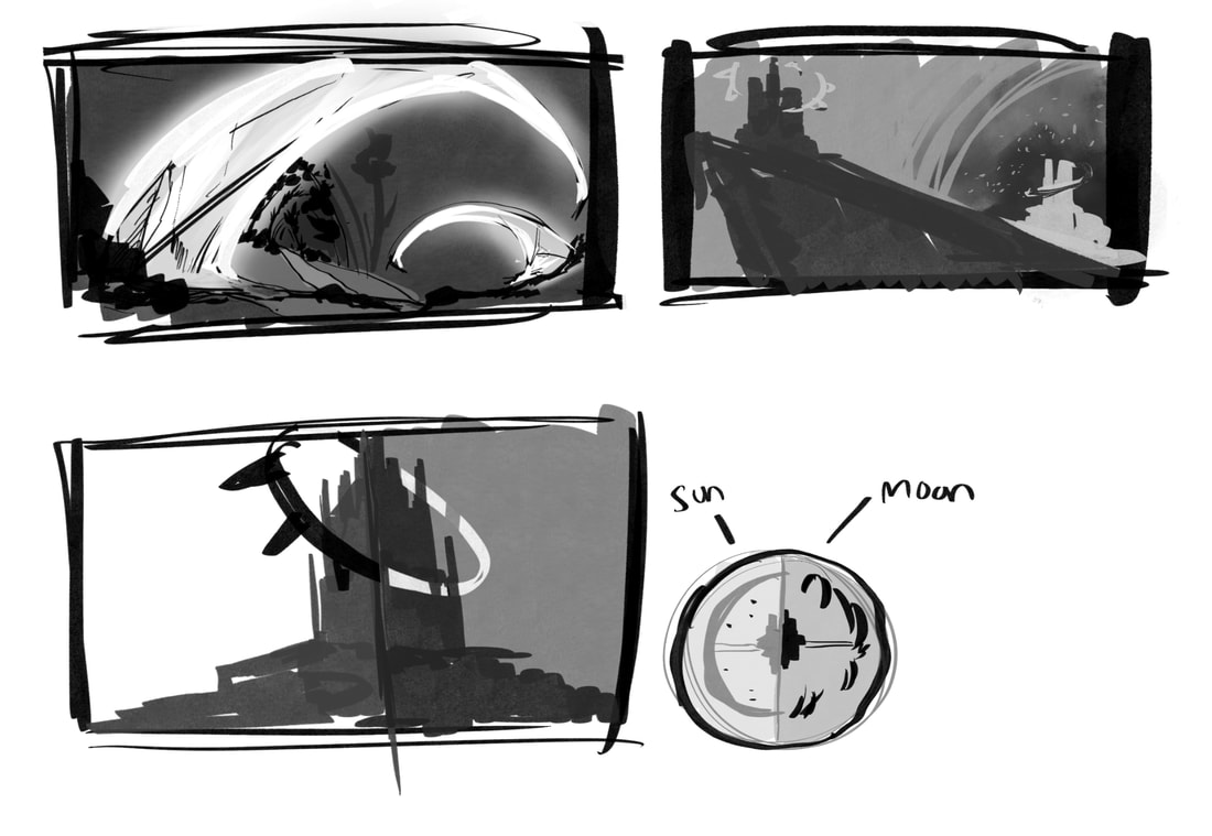
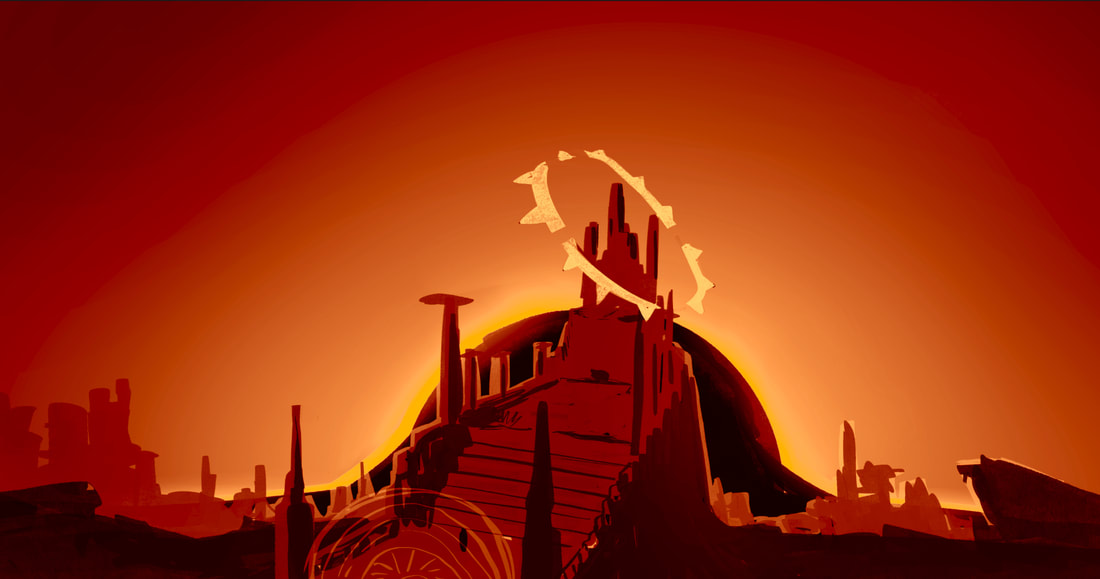
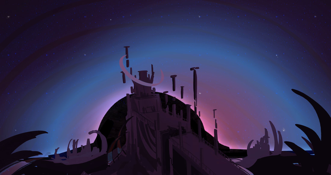
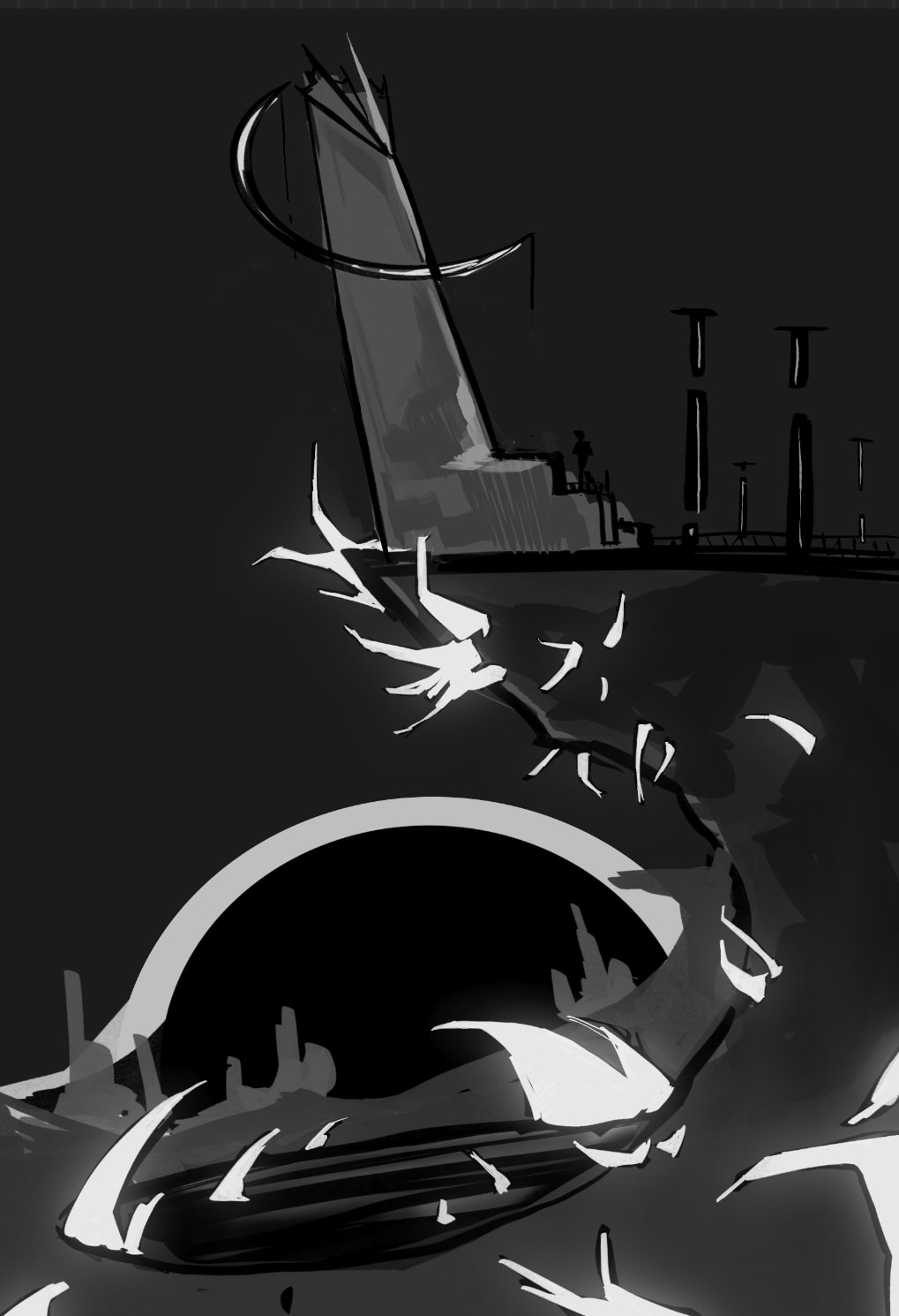
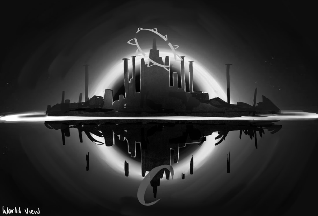
For the environments of my game, the goal I had in mind at the start was to design worlds for each planet in the solar system where the player would venture to defeat the boss there. However, this was changed to all become one world when I realised how time consuming it would be. The idea I took to the final developments was a world with two kingdoms split between a black hole behind it. The top half of the kingdom is designed to be home to the "Sun" while the bottom half is for the "Moon".
Since my world is split, I planned to take the rest of the planets from the solar system to be apart of either one. I found it easier to assign them to a side by the colour tone of their planet, warmer toned go to the Sun kingdom and cool toned go to the Moon.
Sun - Venus, Mars, Saturn, Jupiter
Moon - Mercury, Neptune, Uranus, Earth
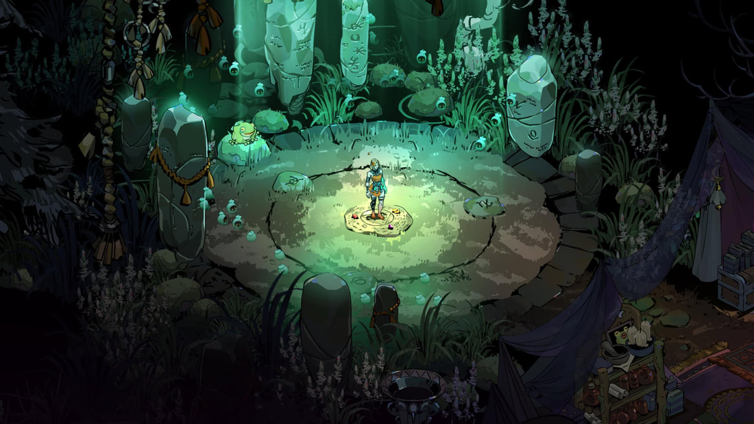
The protagonist was designed to begin where the two kingdoms split, a section where characters who don’t align with either side reside. This could bring in the future idea of any NPC designs from the inspiration of objects in space such as stars, magnetars, super nova's, etc.
Sun - Venus, Mars, Saturn, Jupiter
Moon - Mercury, Neptune, Uranus, Earth
The protagonist was designed to begin where the two kingdoms split, a section where characters who don’t align with either side reside. This could bring in the future idea of any NPC designs from the inspiration of objects in space such as stars, magnetars, super nova's, etc.
Pinterest Board
https://pin.it/6EM5TFswp
RESEARCH
Hades
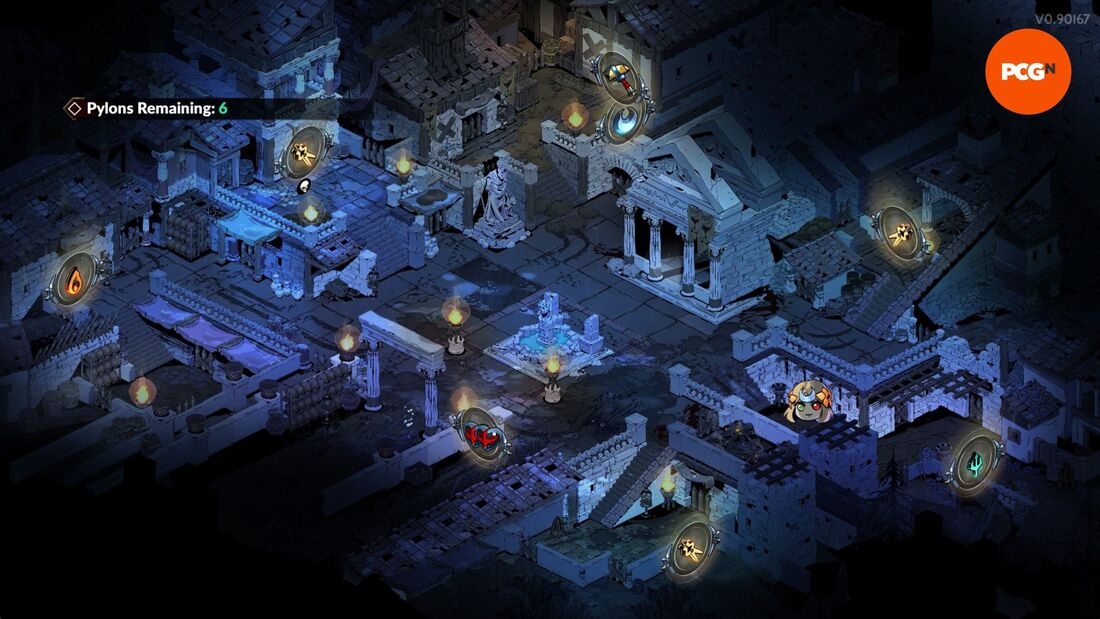
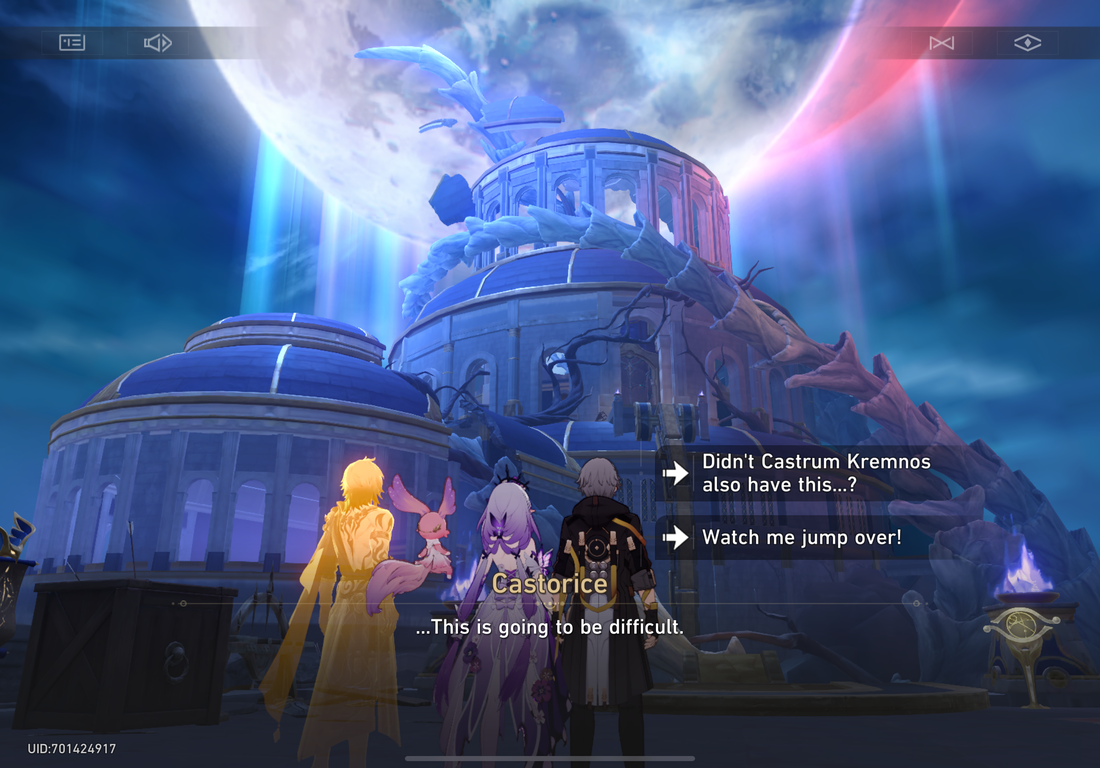
One of if not my biggest inspiration from this project comes from both Hades games. They’re a rouge-like dungeon crawler set around Greek mythology. The most captivating part about is to me is its sprites, portraits specially designed for each character you interact with. Recently I got the chance to try out their sequel and noticed that there is a difference in the designs between characters who are aware of the protagonists existence, black and silver featured with moon crescents for those are and the usual gold and sunny lighting for those not.
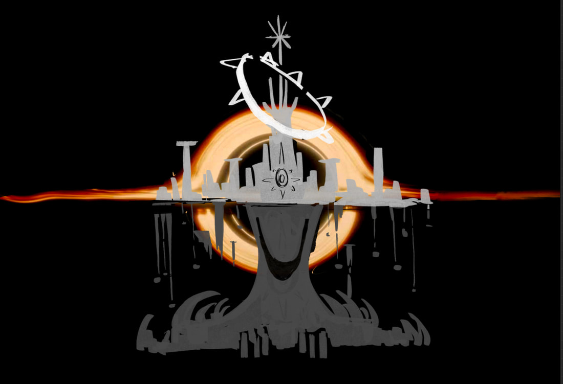
This gave me my solution to my games world plan, create one world by itself and split them into two kingdoms. One kingdom above that is for the sun and a flipped kingdom underneath for the moon. The way they would work is both sides of the world are basically the same. Same locations, but one side is more deteriorated than the other. For example, a Coliseum I have planned to illustrate will look brighter and cleaner on the side of the day but broken, dark and close to collapsing on the night side.
This gave me my solution to my games world plan, create one world by itself and split them into two kingdoms. One kingdom above that is for the sun and a flipped kingdom underneath for the moon. The way they would work is both sides of the world are basically the same. Same locations, but one side is more deteriorated than the other. For example, a Coliseum I have planned to illustrate will look brighter and cleaner on the side of the day but broken, dark and close to collapsing on the night side.
|
|
|
|
Final Fantasy
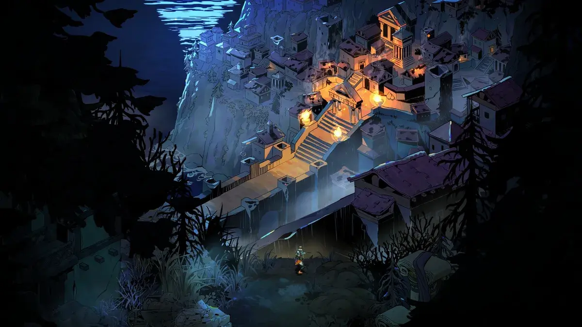
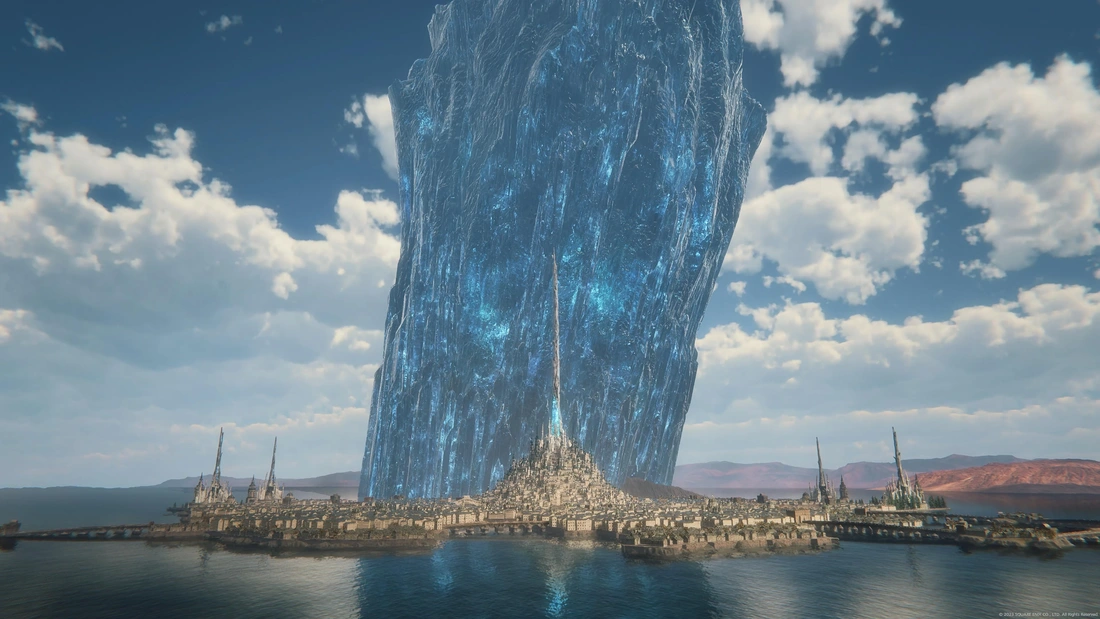
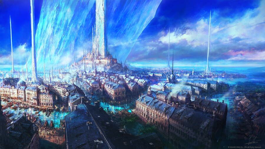
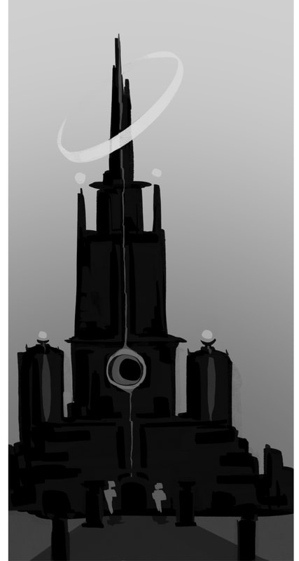
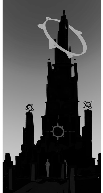
The Final Fantasy series helped scale what I wanted when it came to the world design. The long pillars and castles to the giant crystals in each region acted as landmarks that gave the idea for the halo / crowns around the top of my kingdoms own castles in the final designs.
|
|
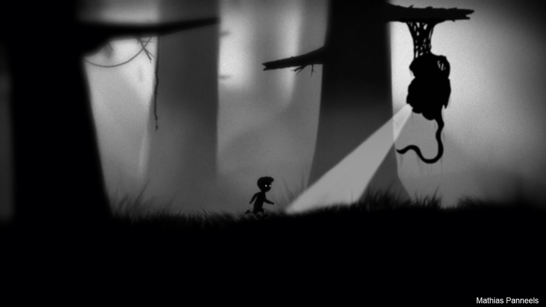
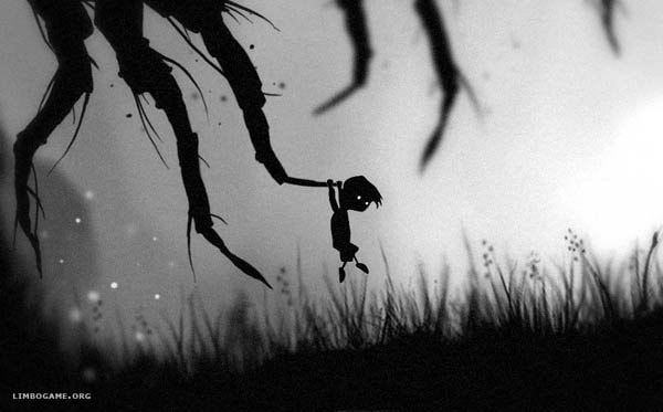
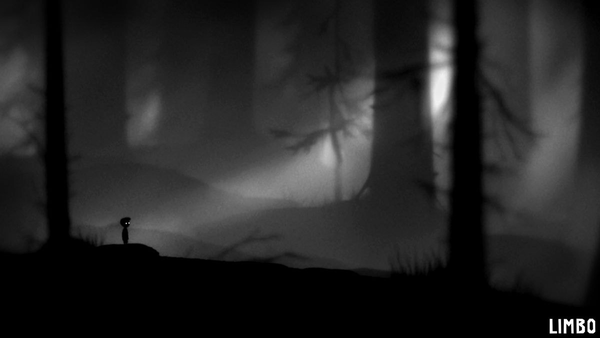
Limbo
Once I decided that the world would be illustrated in greyscale, I looked into any games that had similar effects. What I landed on was Limbo, an indie horror platformer where play as a silhouette of a kid. The monochrome style reminded me a lot of old storybooks, so this also inspired the UI later on in my project.
|
|
|
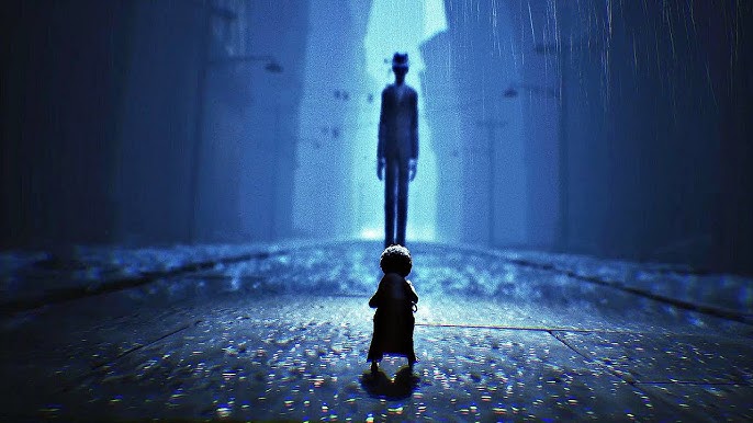
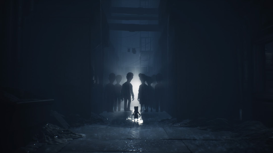
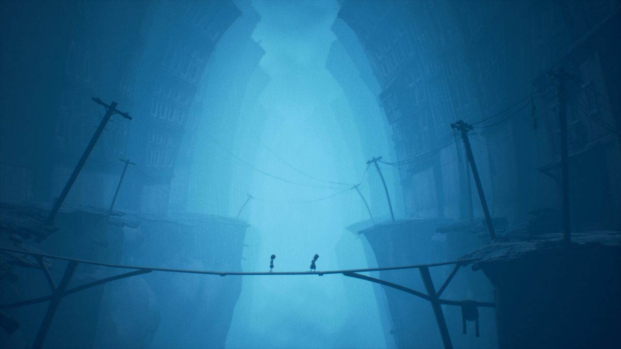
Little Nightmares
|
|
|
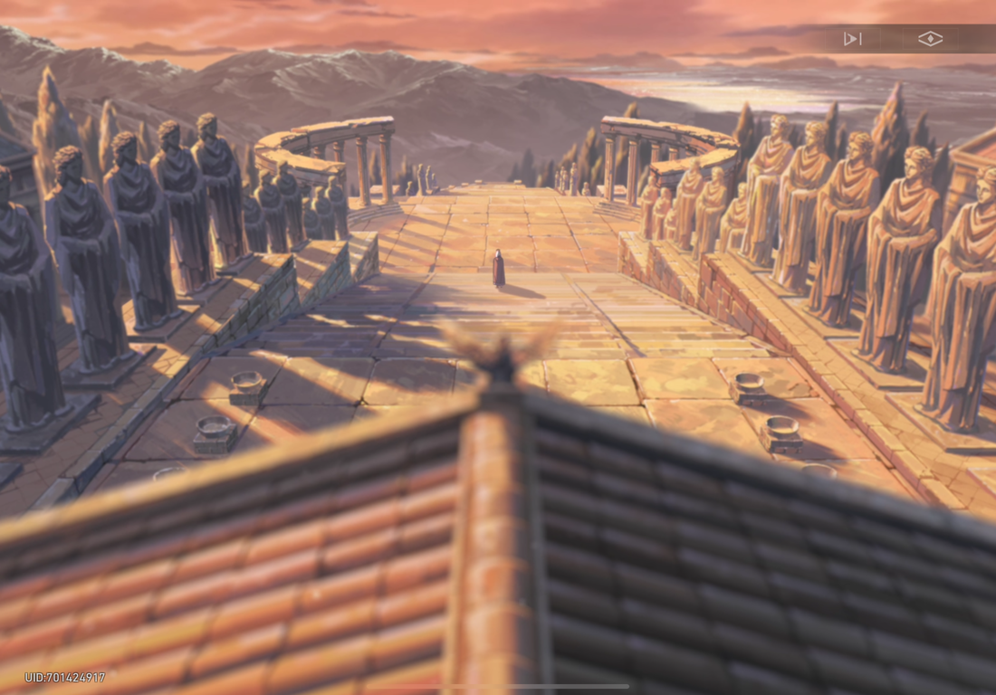
Honkai Star Rail
In this games environment design there's a lot of mixtures between fantasy and sci-fi. Before I looked into the game I had planned for there to be a difference between the Kingdoms structural integrity. The Suns would be bright and golden, clean buildings and no faults. However, the Moons side would be deteriorating. In my earlier sketches they had broken bridges and pillars floating in separate pieces. What Honkai's recent planet added was a feature to switch between past and present, which also switched the area between a normal to crumbled area that served at some great references.
|
|
|
|
|
|
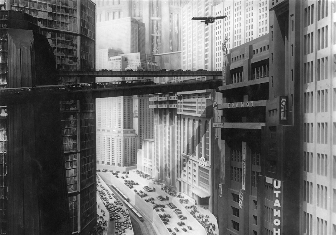
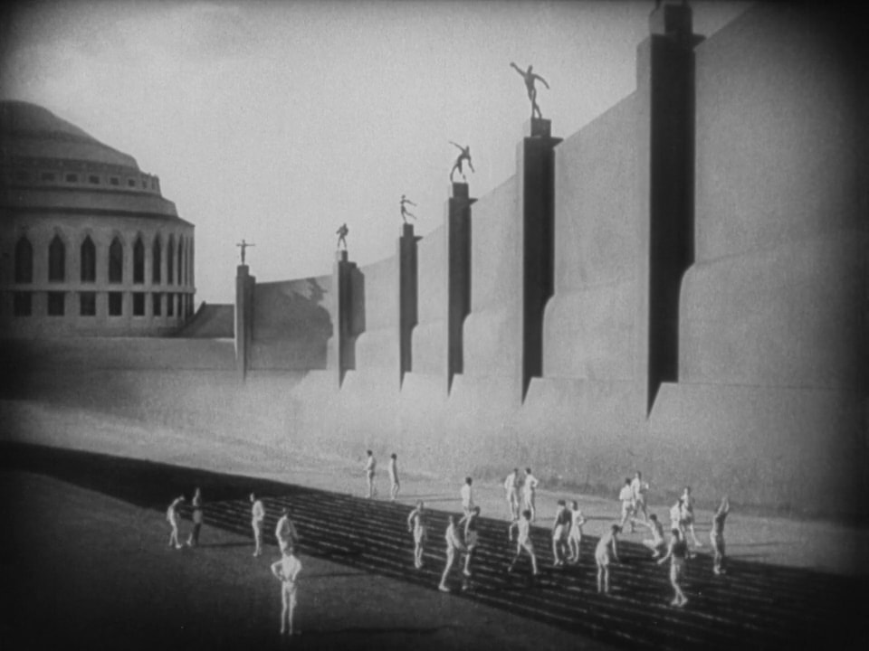
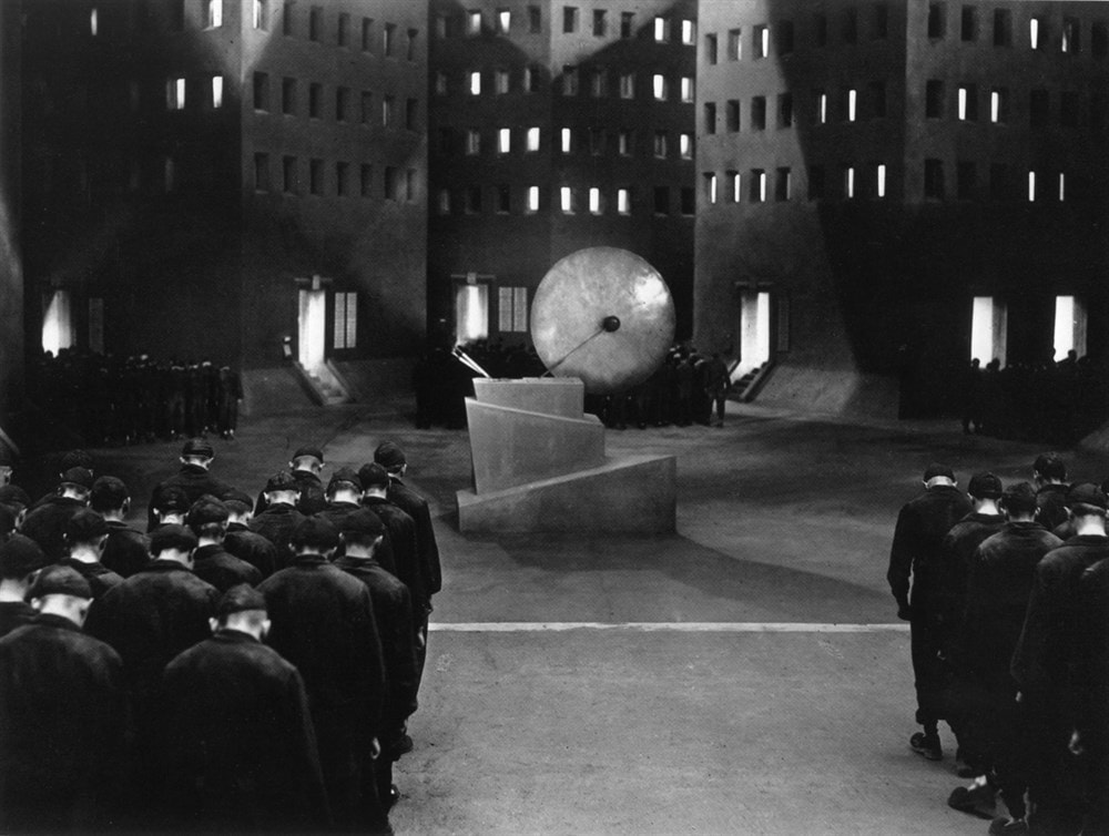
Metropolis
The black and white visual look of Metropolis was another part of my decision to turn my world into a monochrome style. Originally, I was going to go through the process of doing my designs in greyscale, then put them through photoshop and add colour that way. I ended up growing comfortable with this theme instead as I think it made the environment look more ancient and isolated.
|
|
|
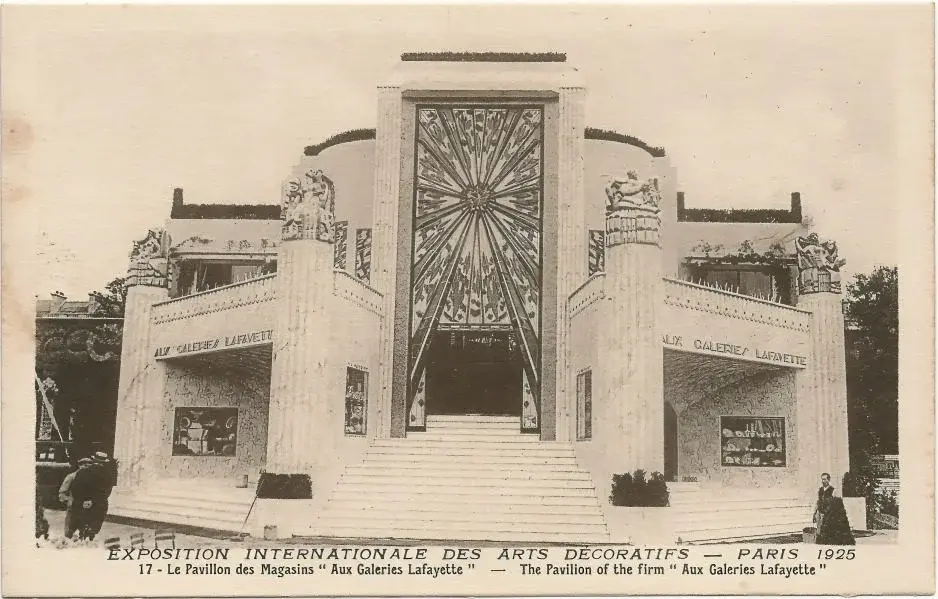
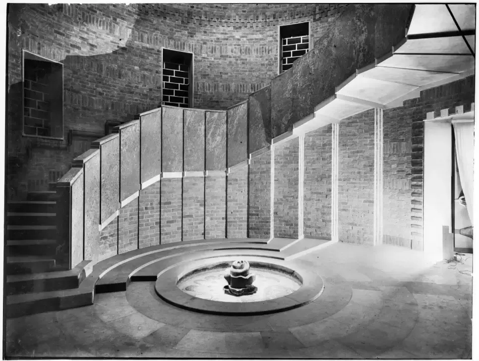
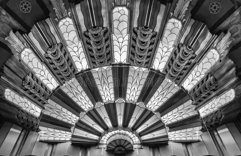
Art Deco
During my designs for the castles or other areas in the kingdoms, I wanted to differ from the usual medieval, classic style that's in most of the games I looked into. What I chose however, to give it a more unique look, was to inspire my designs of off art deco buildings. The references below caught my eye the most during the research, the front designs reminded me of sun rays I could use.
|
|
|
IDEAS / DEVELOPMENT
One of the first designs I sketched for a potential world of my game. During this time of the project I had in mind to design each planet a world where their boss fight would be, but this is also where I began having trouble with some issues that had me changing the games plan to be set all in one world and split off into sections.
|

|
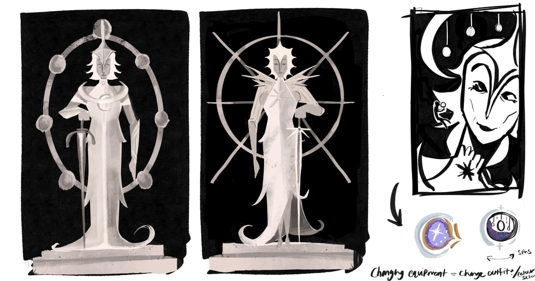
A small addition to my world I wished to include was statues of the Sun and Moon to be in their respective kingdoms. The idea was for the player to come across them to give them a first impression of highly respected they are before meeting the actual character. I wanted them to be at the kingdom entrance, but this was later changed to be around the inside of the battle coliseum.

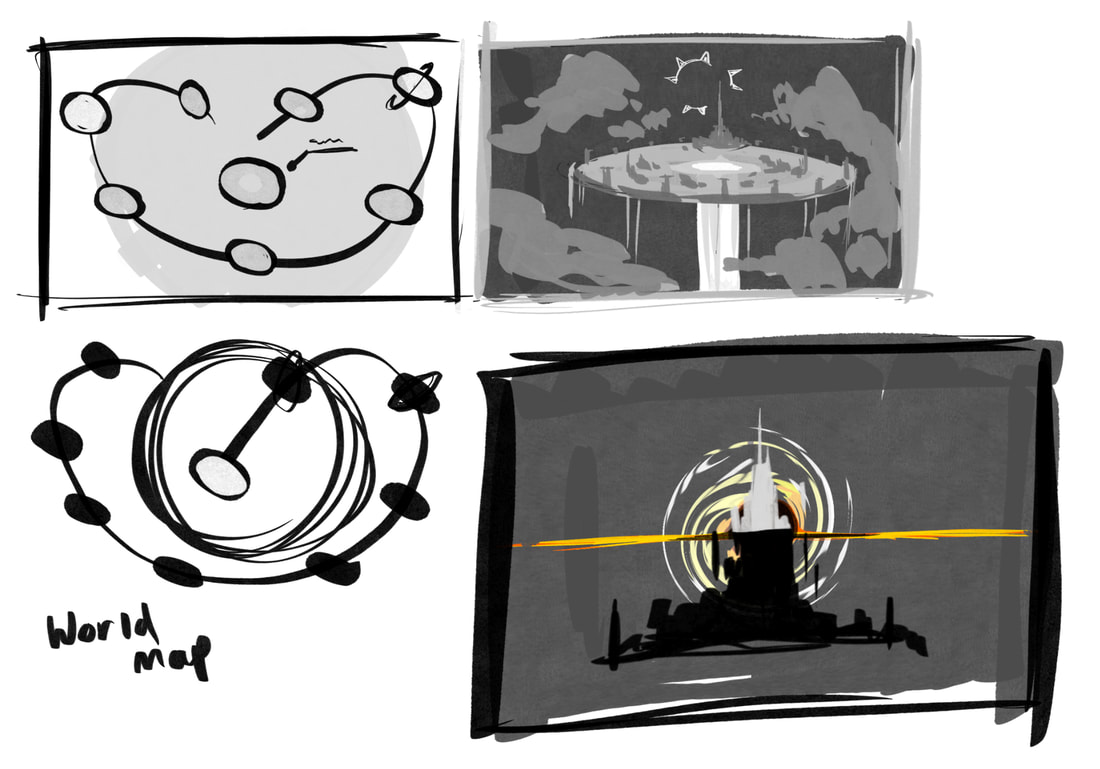
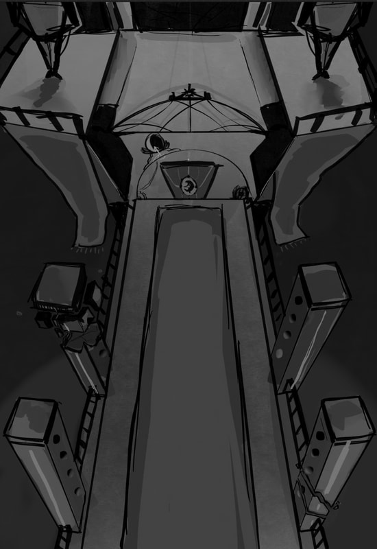
Next I worked on designing the full view of my world. I also began some thumbnails for a possible map for the player. I wasn't sure at the time how I would go around it. Would it be two maps for each kingdom? Would it be a full view of the world with main landmarks highlighted. There was a lot of ways I could go about it. But I first wanted to have a full design of the world before I thought about any changes.
|
|

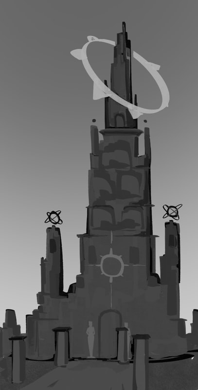
Once I had down how I viewed my world design, I moved onto the kingdoms own designs next. The early mock ups of my two areas were meant to be very similar or to be identical with the difference being the deterioration the Moons side. While I kept somewhat of my old look I changed some small features such as the front view of the castle and the inclusion of the coliseum in both areas. I also tested out adding colour to the world, which was before I decided I wanted to go for a monochrome theme.
|
|
|
|
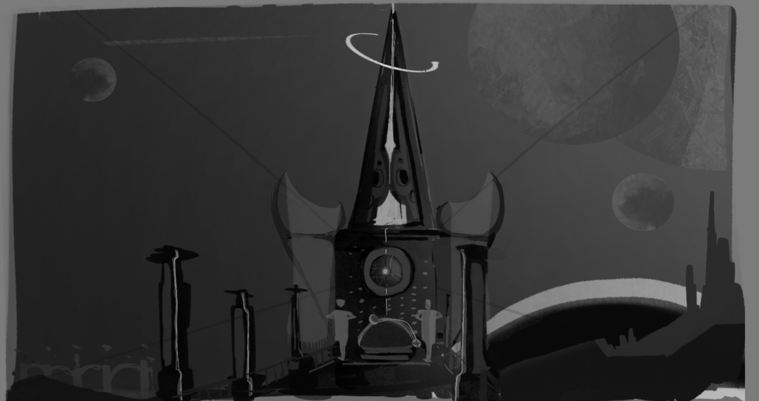
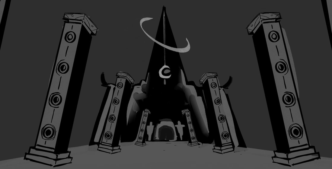
Most of my mock ups were done to test out the features I struggled with the most. For example, I wanted the Moons kingdom to have a noticeable danger in the environment, so for some sketches I kept the castle out of distance to test designs for the mountains, hills and adding in lakes or buildings in the distance. I think my biggest struggle during the process of the castle designs was to not make it too detailed. I was pleased with how it looked when I did the blocking, but to me it felt like I was being lazy and had to add details to put in the effort, which always ended up in losing the styel I was going for.
|
|

|

|
|
|
Because I chose to go for a monochrome look, creating the concept art for the Moons kingdom felt more difficult. Lighter shades felt too similar of a representation to the Sun, so using mostly dark shades was harder to keep parts from blending into each other.

|

|
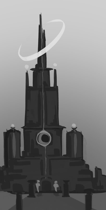
For the next few weeks whenever I got to work on my environmental work I was never happy with the castle designs, so I simply tried redrawing them over and over. I believe a while later I did find a design I was happy with, it was just the style I struggled with. My game has a mixture of styles to go from and characters were made to be have a graphic look, while I planned a lot of the world to have a realistic touch. Although, the more I attempted this realistic style, I felt like my progress was going backwards. Whenever I complete an illustration I go through the greyscale feature to slide around the tones and see if switching the lighting around could work, or if more darker shades are needed, and I've grown to like the blacked out versions more than the previous designs since they remind me of the game Limbo.
|
|
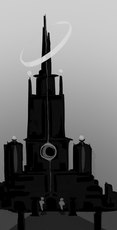
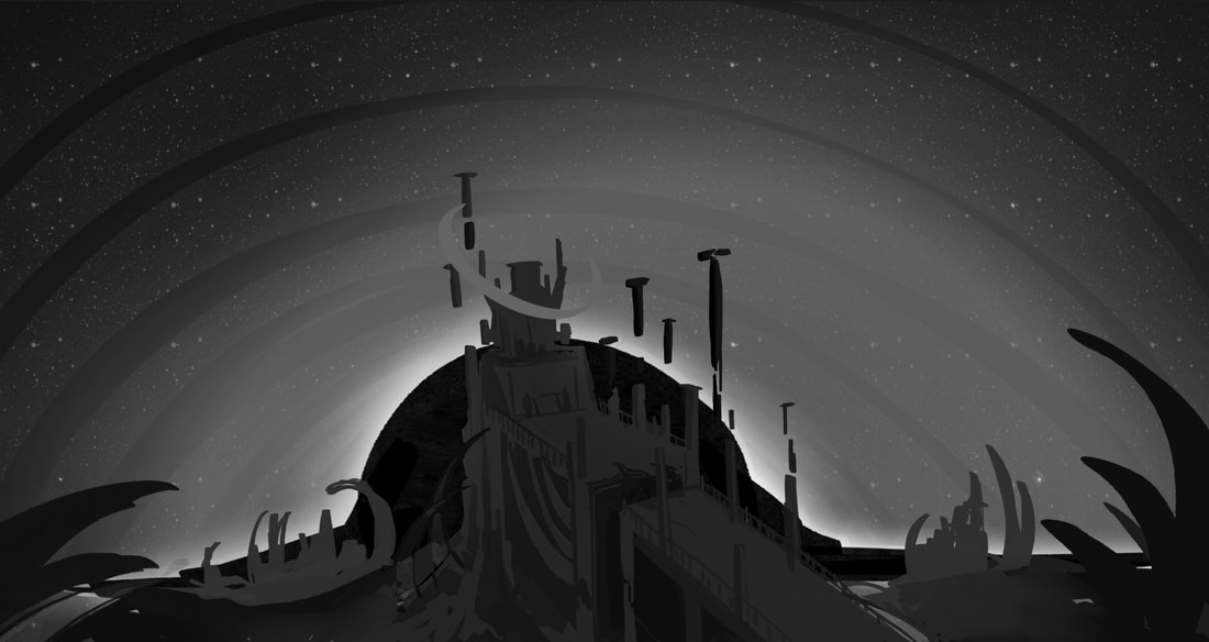
Moon kingdom, blacked out ver
|
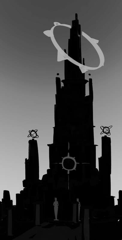
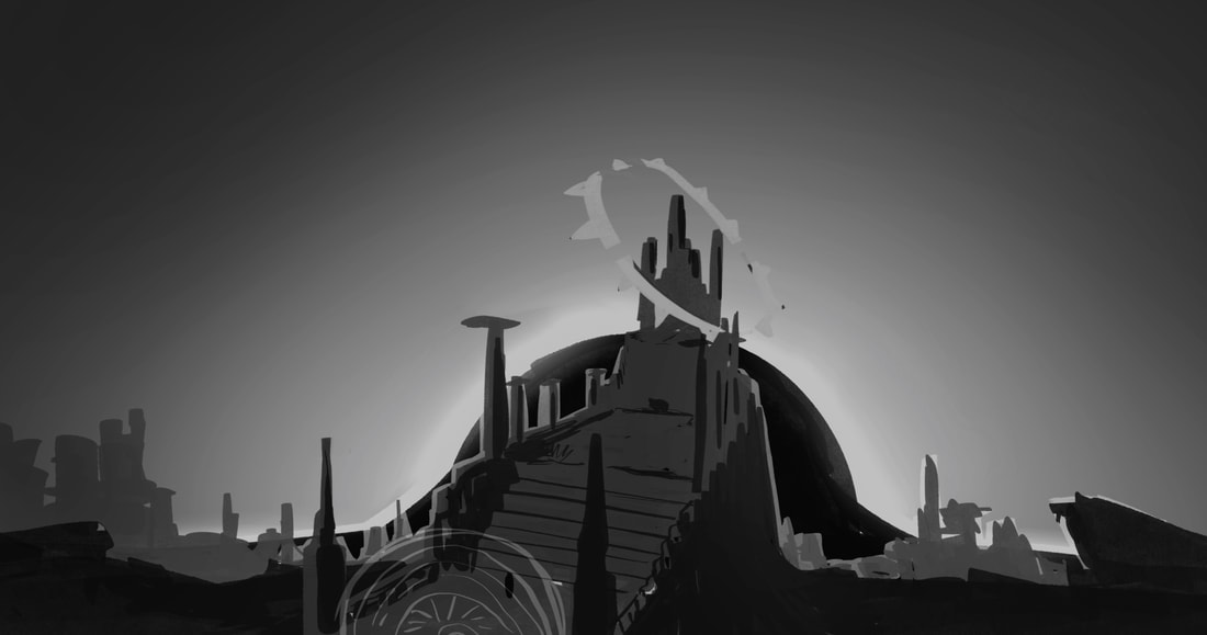
Sun kingdom, blacked out ver
|
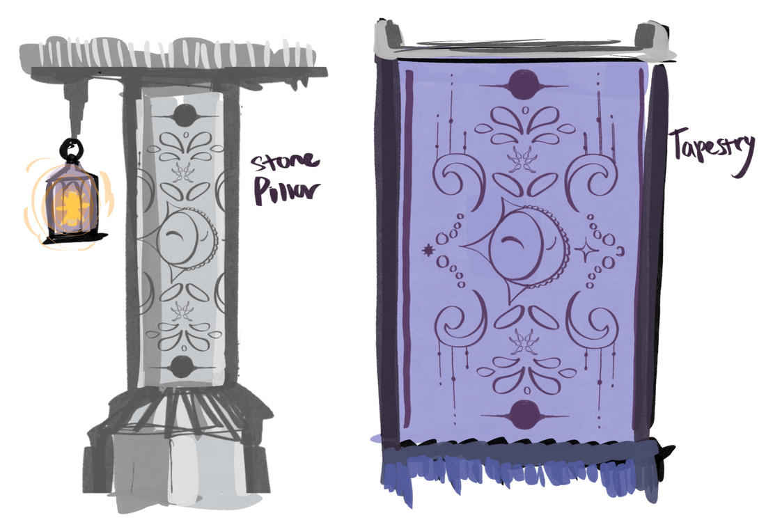
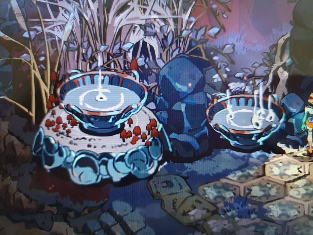
When I spent a couple weeks working on my environment of the kingdom, there was a point I grew pretty burnt out trying to come to a design I felt was the final one. To pass some time away from that while still adding to my world building I started designing any miscellaneous sections. This included pillar designs, fire pits where I imagined the player could go to heal or be a waypoint / indicator to where the shop could go.
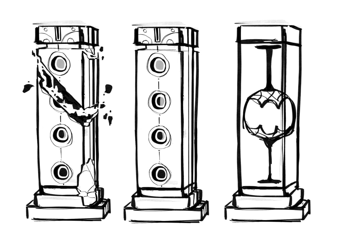
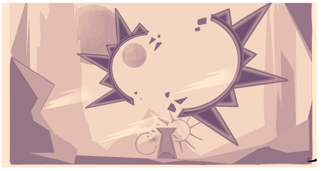
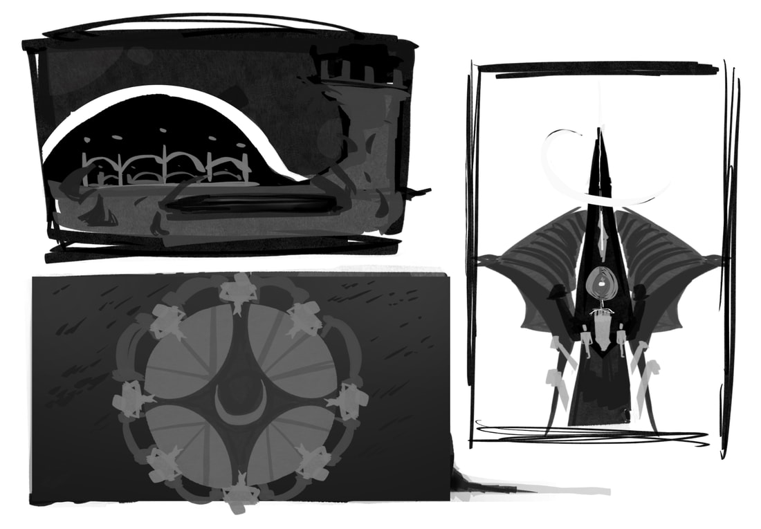
Below was a quick sketch for crest designs. The use of them were between collectables or decorative pieces to be placed around their respective kingdom just for something more unique for them. I don't think I would use them in my current point of the project, but they helped give an example of what shapes and patterns would be for them. For instance, even though the Moons crest has spikes, they're rounded, as well as the crescent in the centre that was meant to replicate her headpiece. However, the Suns crest has sharp spikes that reminded me of sun rays in illustrations.

Idea for kingdom crest design

|

|
|
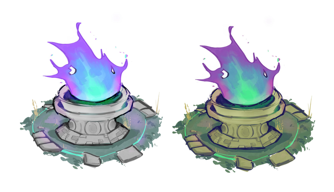
Moon kingdom fire pit
|
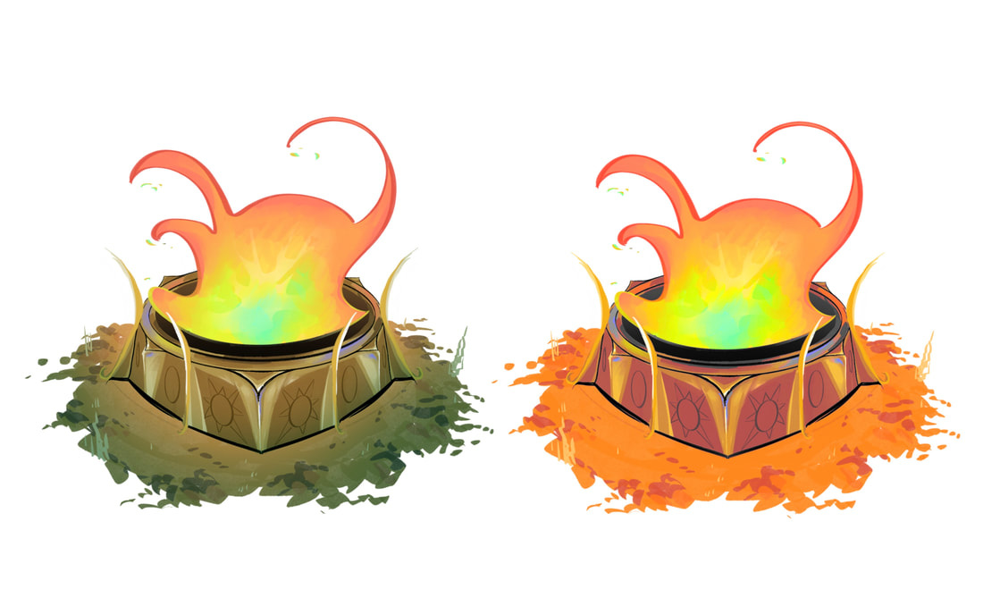
Sun kingdom fire pit
|
FINAL OUTCOMES
|
|
Reflection
My work on creating environments has been a fun experience. I'm aware a lot of concept artists prefer character design and while I've spent most of my time doing the same I think I've enjoyed the process of creating concept work for the world more. I've definitely had troubles sticking to the simpler style since a lot of my knowledge on environmental work in concept books have always leaned towards realism, I often forget that there are different ways to go about it. I also think if I could go back and change anything, I would spend more of my weeks on the environment due to the troubles I had creating final pieces that I was happy with.