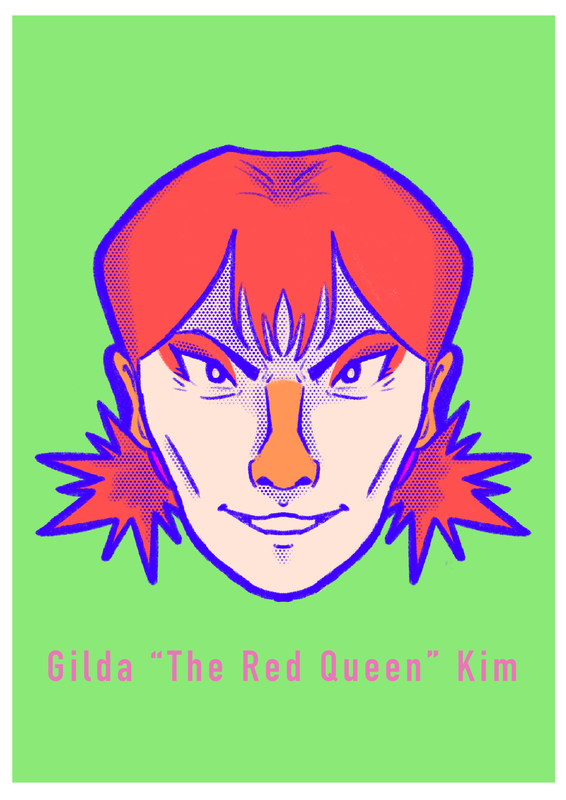
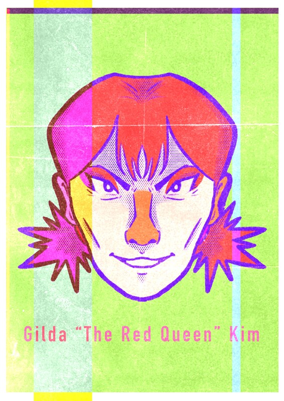
Thursday Photoshop task - Fake collectors card
I am very happy with how it turned out, the textures make it look very cool.
|
|
|
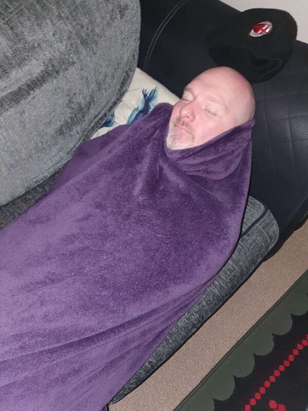
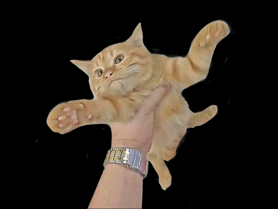
Thursday photoshop task - following tutorials
I used a picture of my dad for the practice, he wasn't impressed
|

|
|

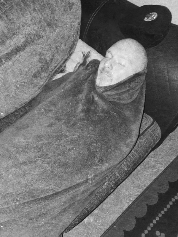
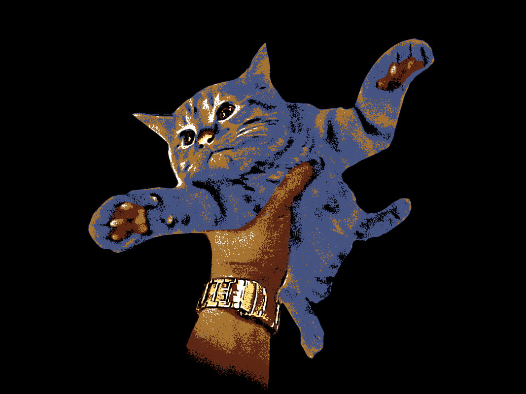
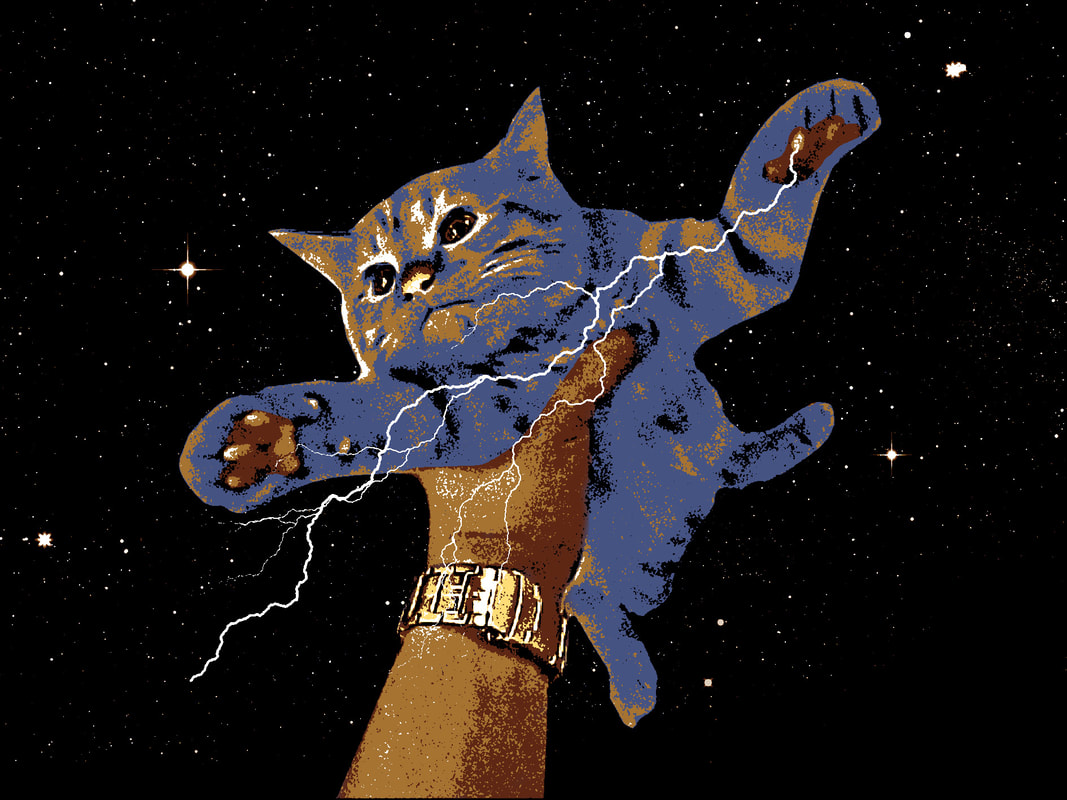
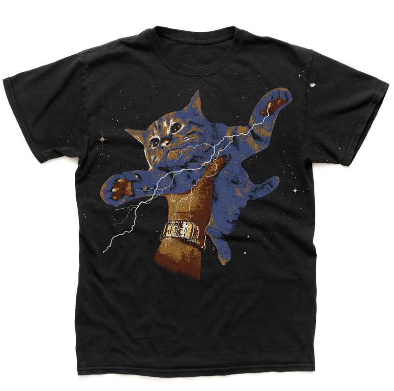
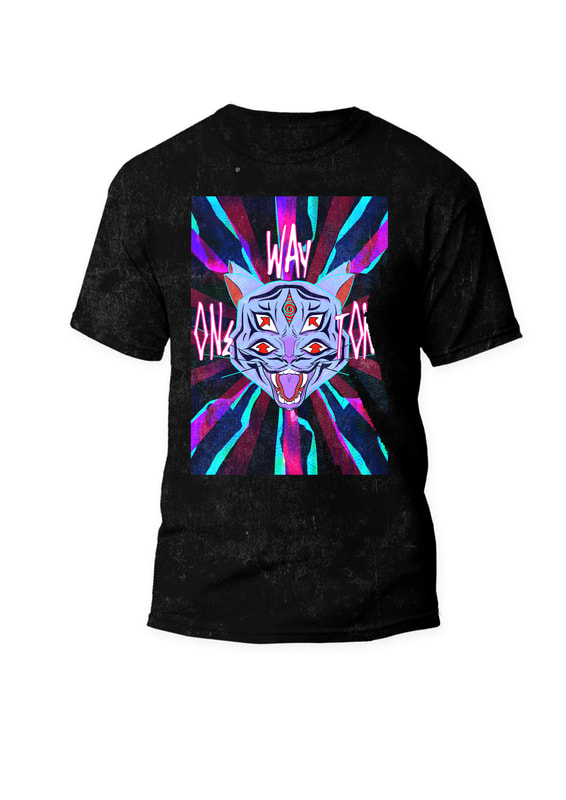
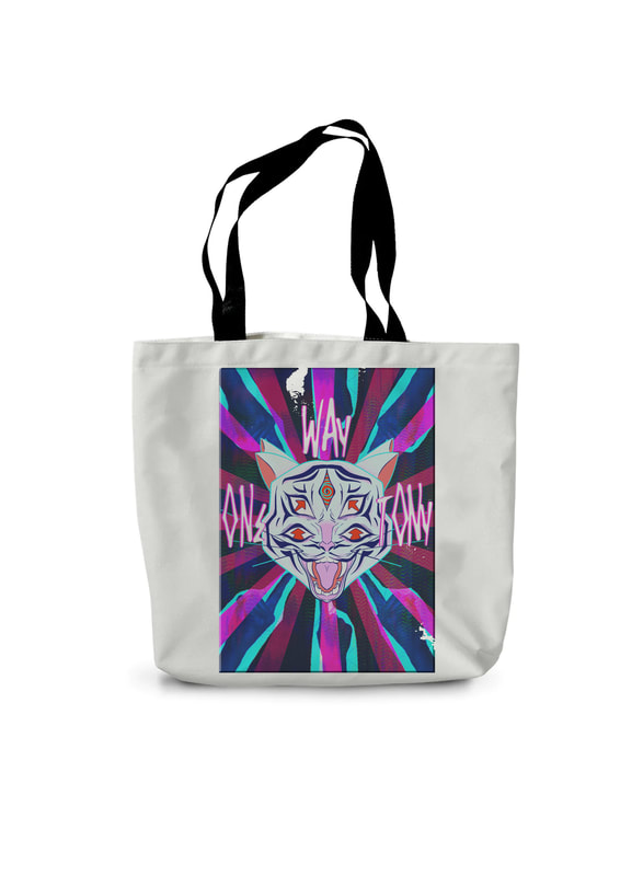
Despite choosing this image as a joke, it turned out better than expected. Abbie said she wants to print it off as an actual shirt.

|

|
|
|
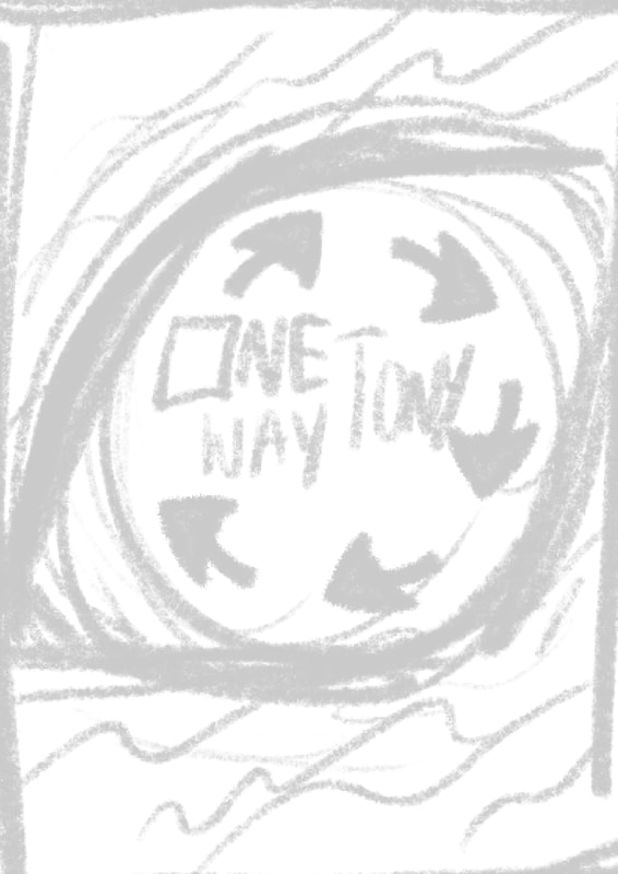
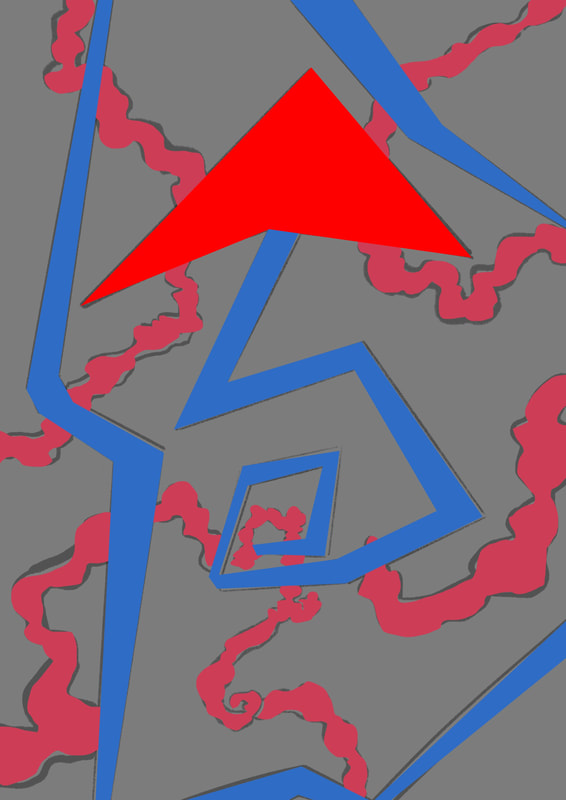
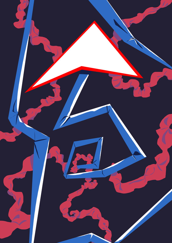
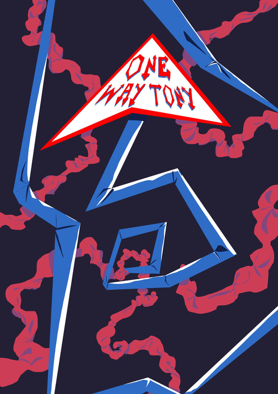
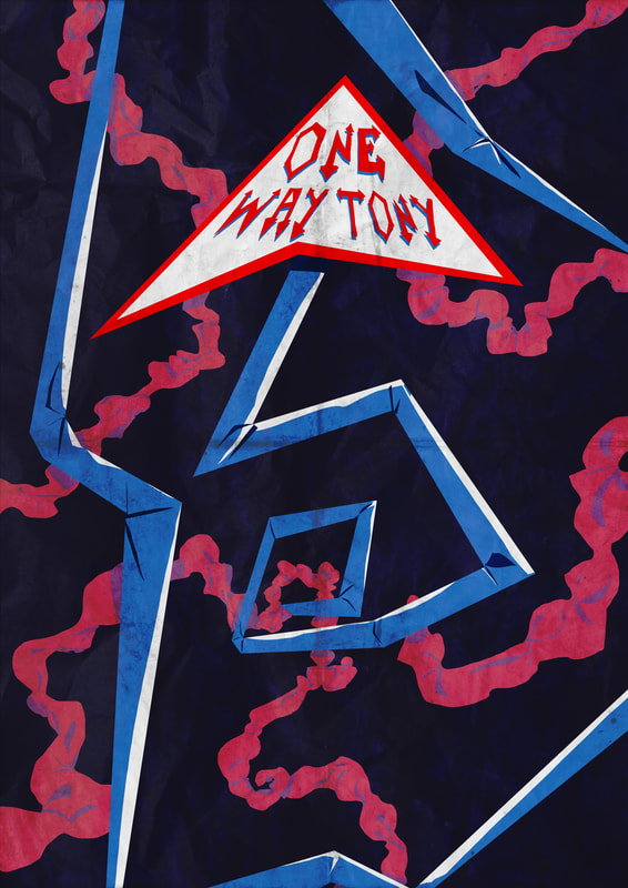
Band Posters (One Way Tony)
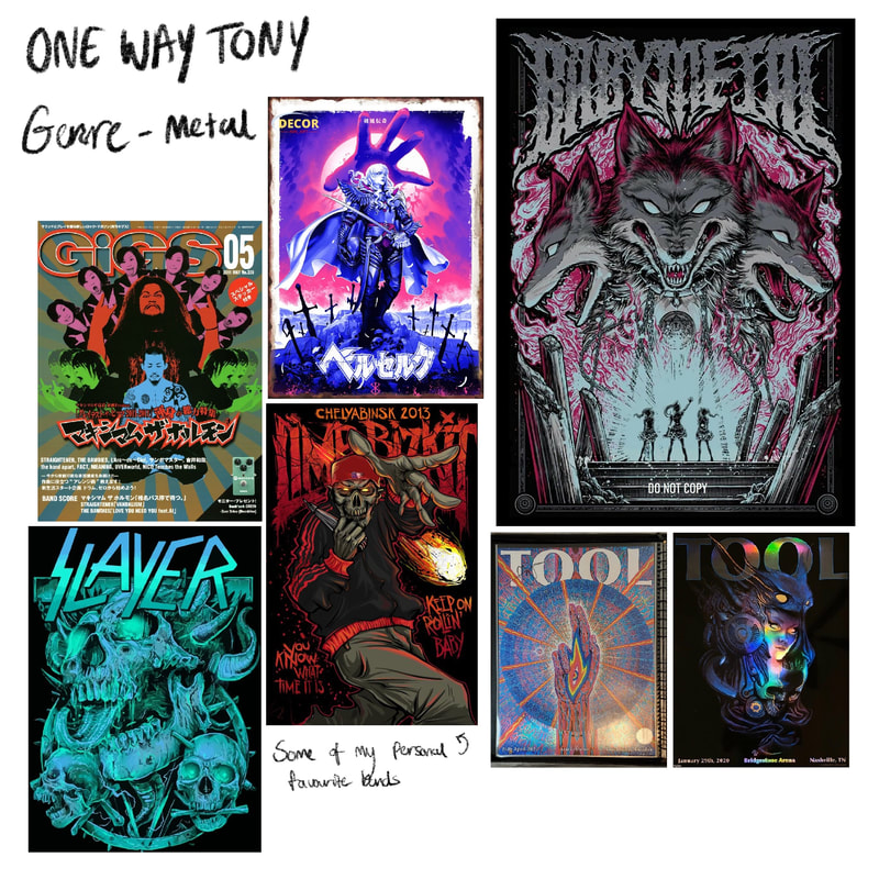
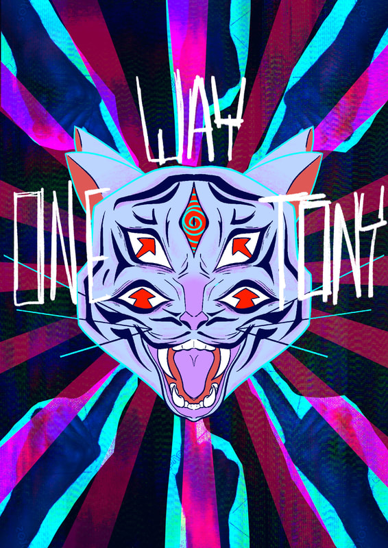
When I got my band name, I was interested in making it themed of off metal / thrash metal specifically. when researching different posters, I noticed a reoccurring theme was animals and bright colours. Abbie had gave a cool idea to create a Spotify playlist based off our given fake bands. It was fun to make but all kept as a reminder for what kind of vibe I was going for.
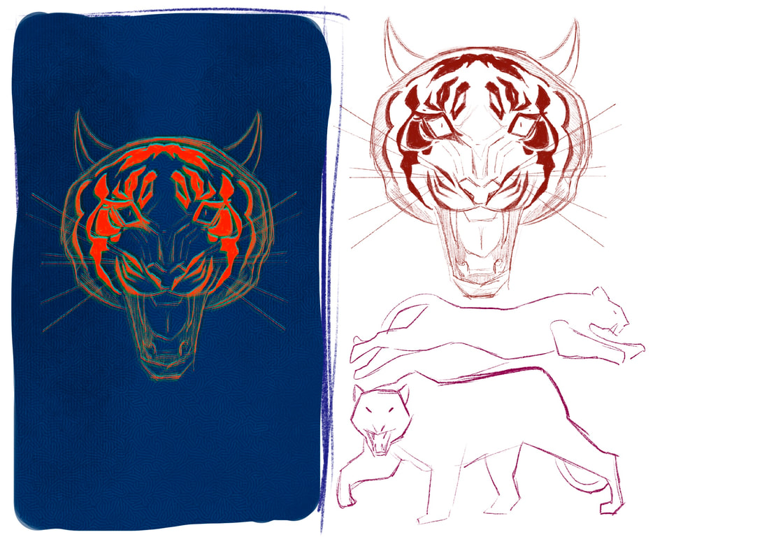
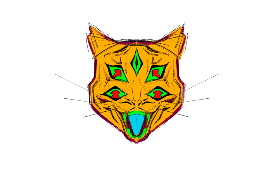
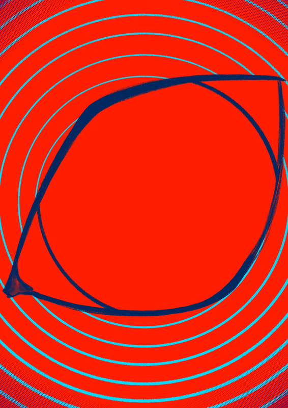
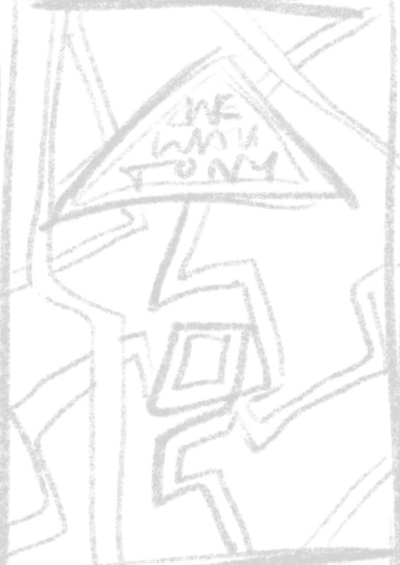
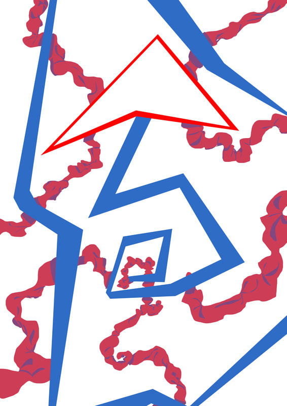
While thinking of starting points for my posters, I got yet another suggestion to reference Tony the Tiger. Since I noticed a reoccurring theme in predatory animals, I thought the first poster based of a tiger would work quite well. For my sketches I stuck with using procreate before turning to photoshop to clean up the drawing I had in mind.
|
|
|
|
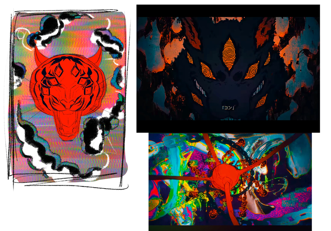
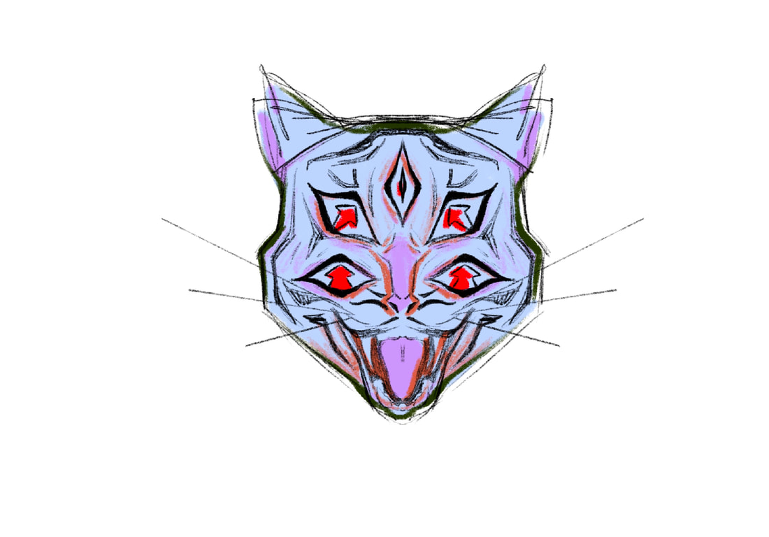
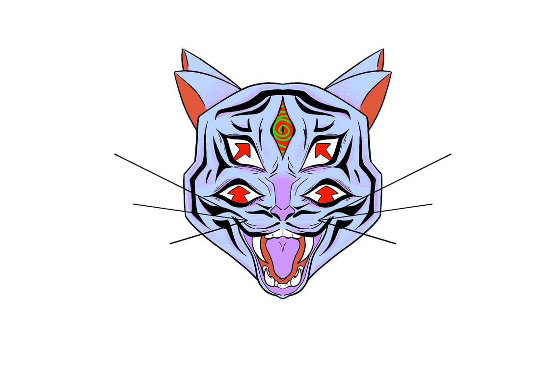
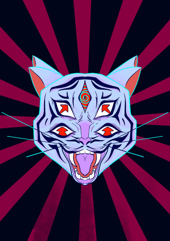
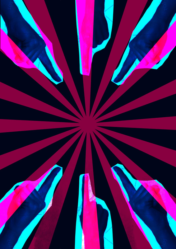
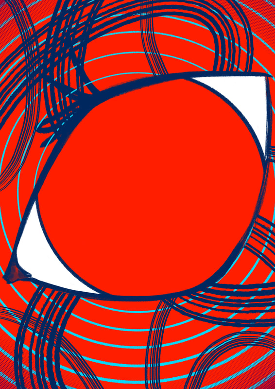
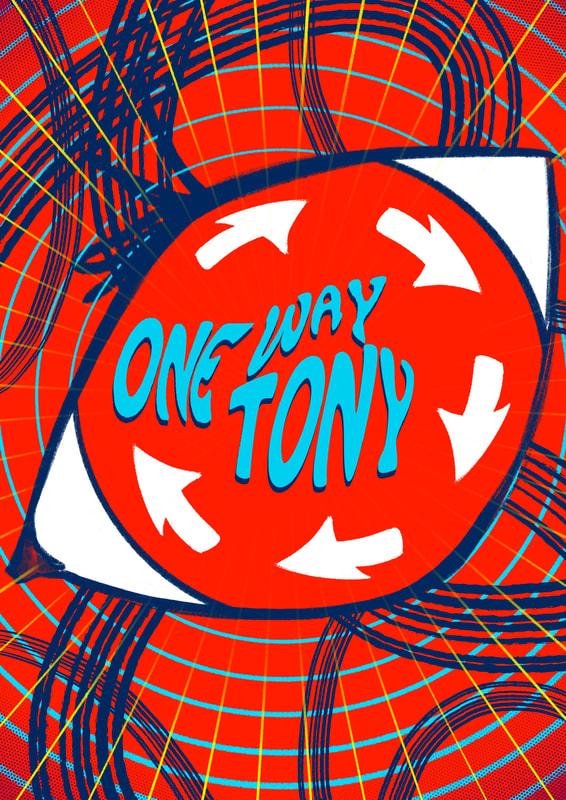
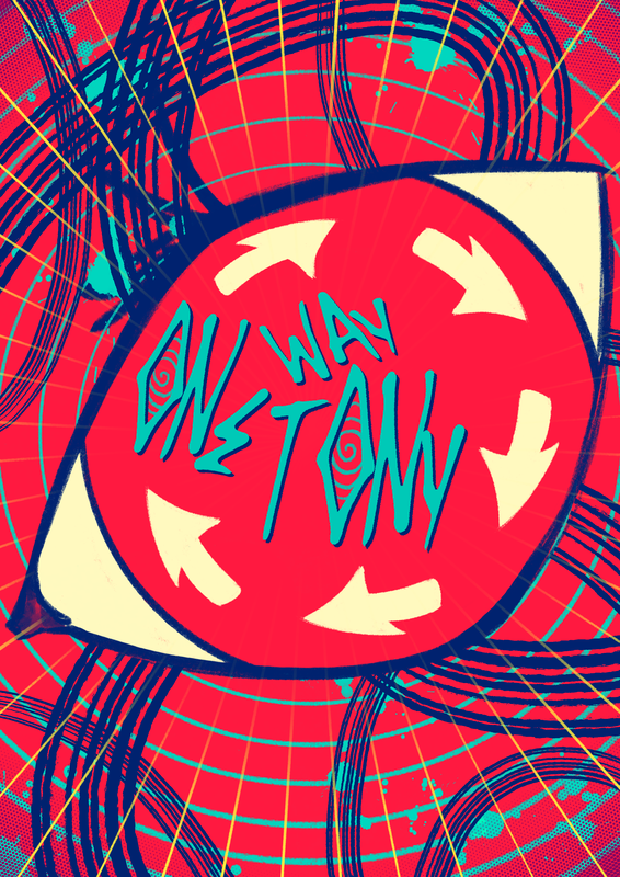
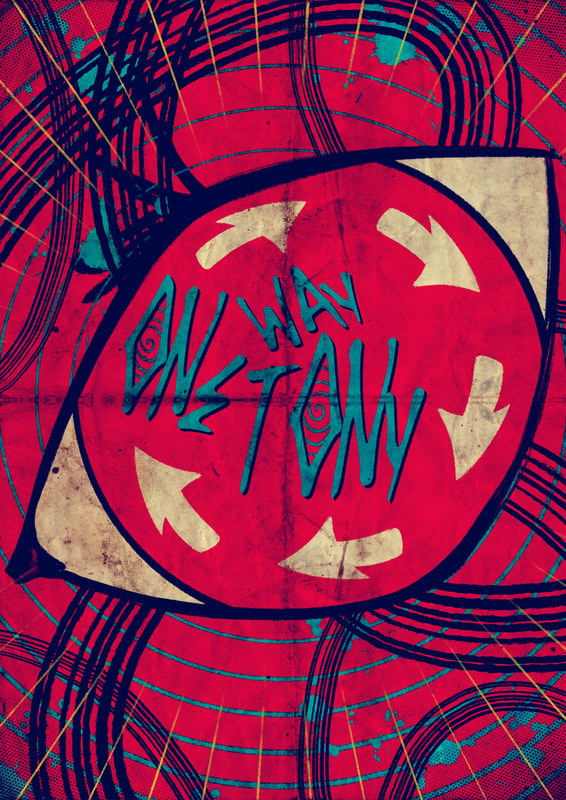
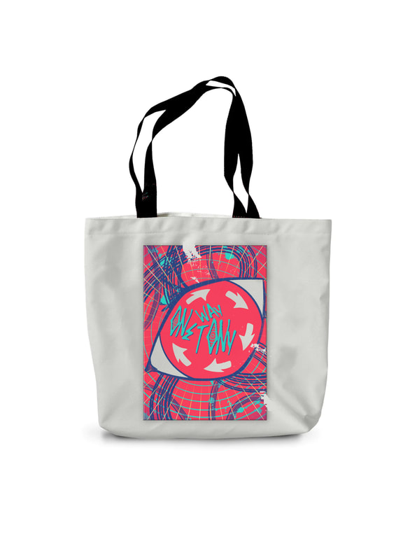
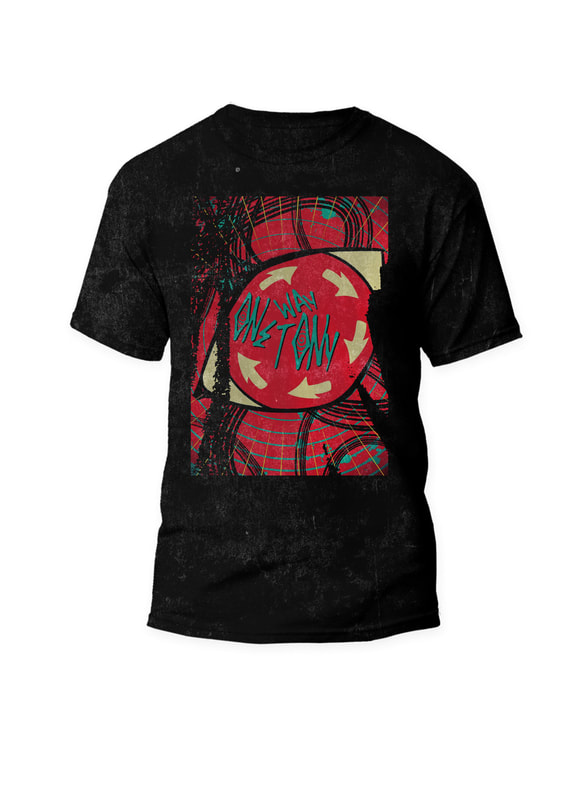
One theme I stuck with in all the posters I made was about the "one way" signs you see on the road. So a lot of my posters feature arrows either pointing in one direction, or doing the opposite and going in different ways. For the first poster I added arrows into the tigers eyes.
|
When it came to the background I wanted it to be flashy and bright. A mistake I made that I ended up sticking with is the photos of hands. I accidentally put them onto a different blending option and liked the outcome it had.
|
|
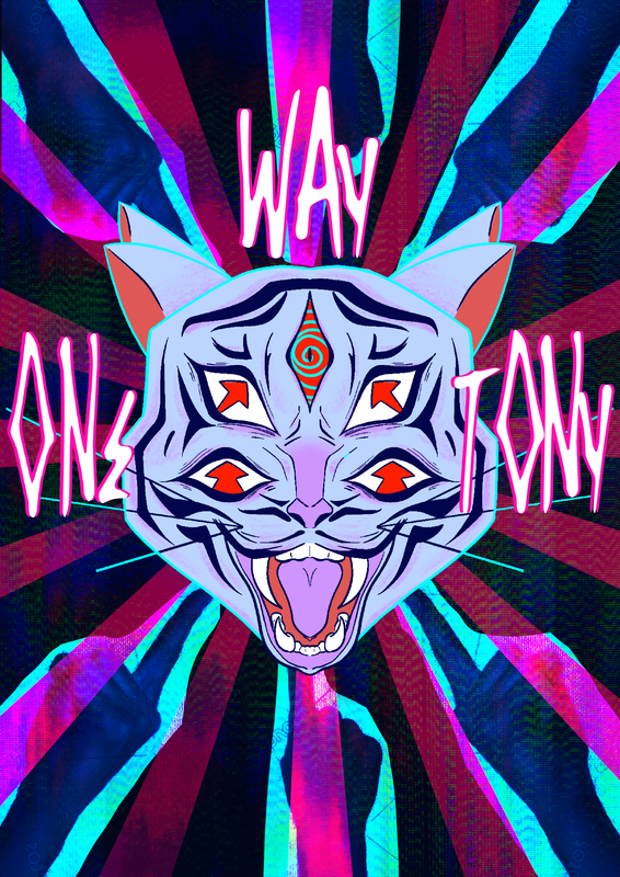
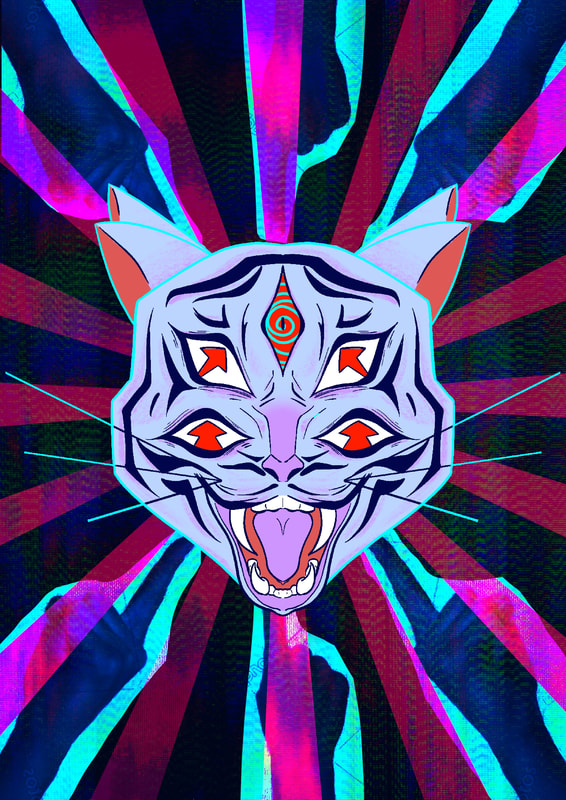
Above is the normal version, below is the roughed up and old textured one.
|
|
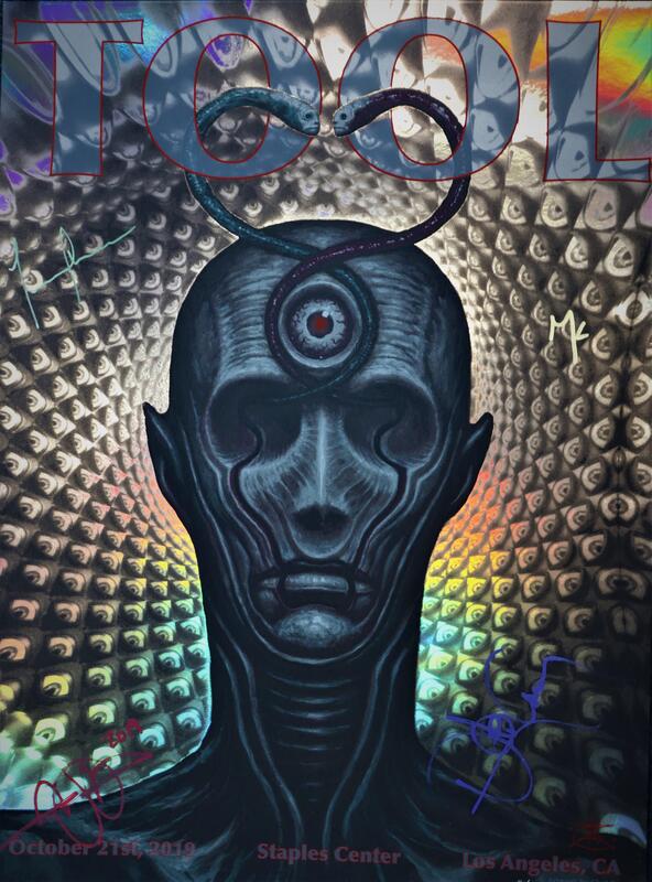
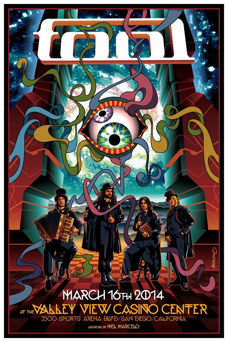
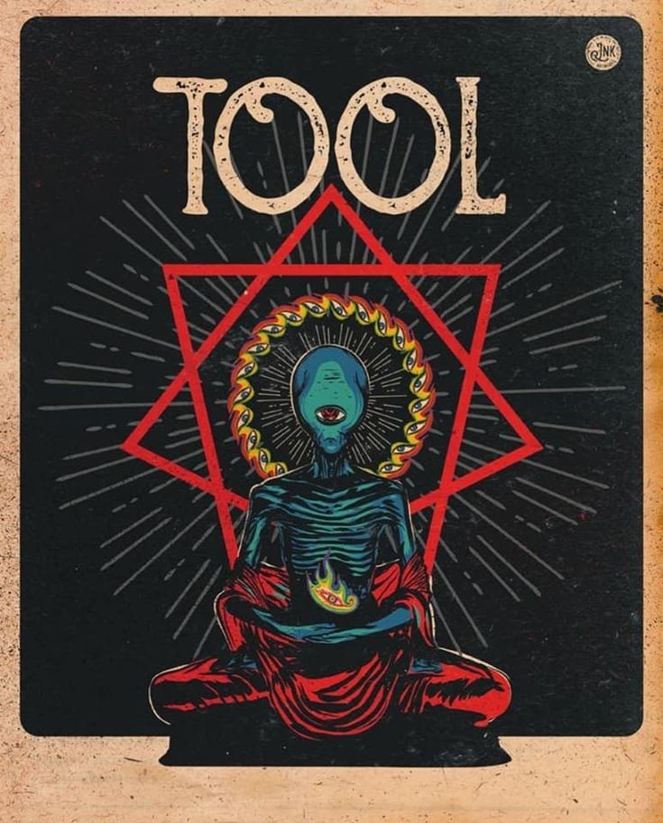
For my next poster I had a specific idea in mind. One band I looked out into was Tool. They had a lot of interesting posters I used as reference. I was very into the almost dizzying effect it gave with their posters I wanted to try and achieve a similar thing.
|
|
|
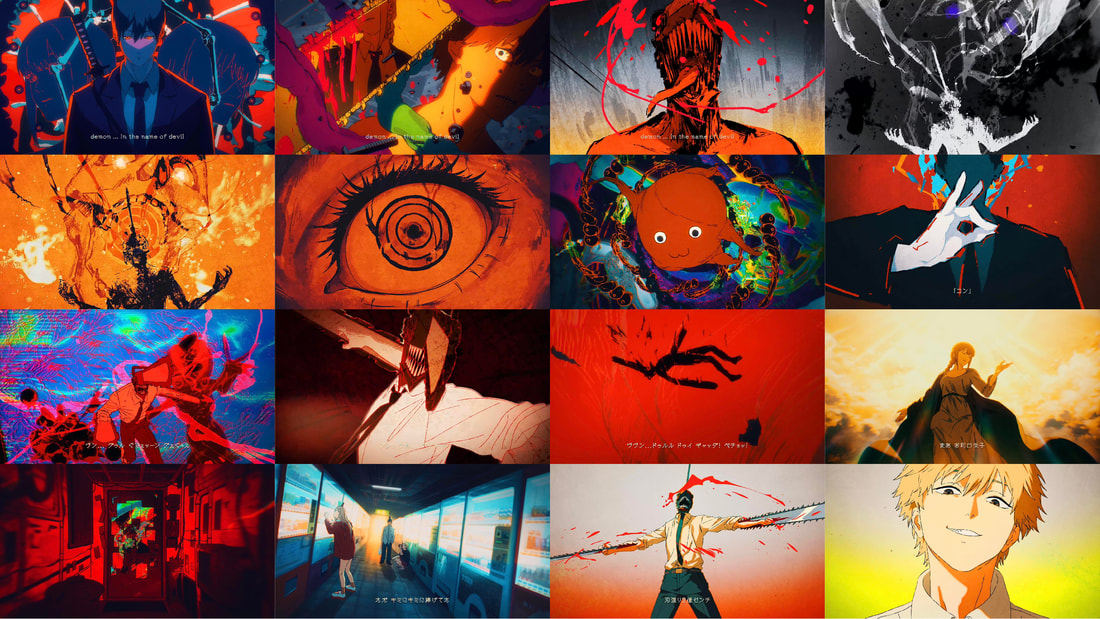
A couple other things I used as inspo was some music videos. The first is a music video by Tool called Vicarious which has a lot of weird and kinda gross CGI going on. The second is an animated song for an ending of a popular anime.
|
|
|
|
|
|
|
For the last poster I did, I looked into using the lasso tool in Photoshop. Below is a few tutorials on how to use the tool for drawing. I thought it would interesting to try out.
|
|
|
|
|
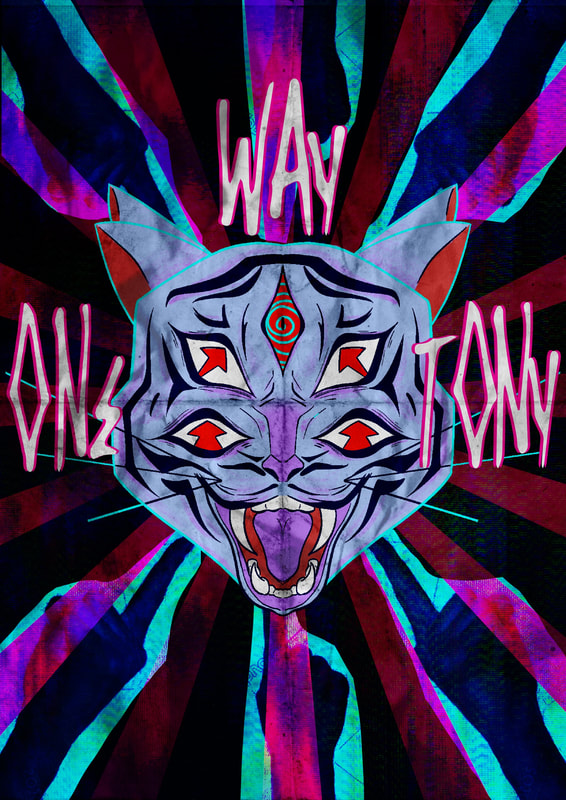
Colour wise, I might need to change I the future because it does not scream "metal band" to me enough. However I had fun doing this one and my idea in mind came out much better in the end. The type I also changed up since I recently found one that matched the theme I pictured.

Week 7 & 8 - Illustrator
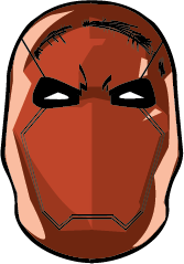
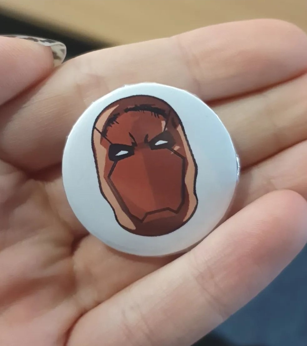
Thursday Illustrator task - Badge making
Was quite fun drawing Red Hood for it, the badge came out nice.
|
|
|
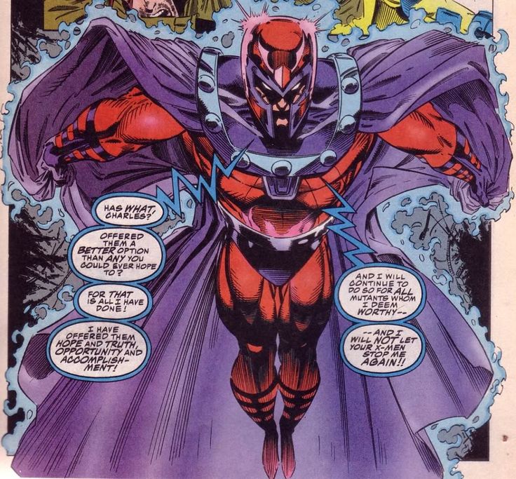
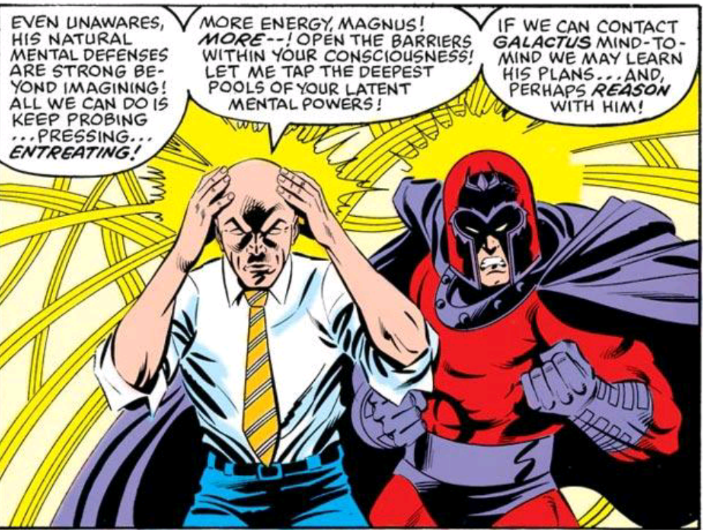
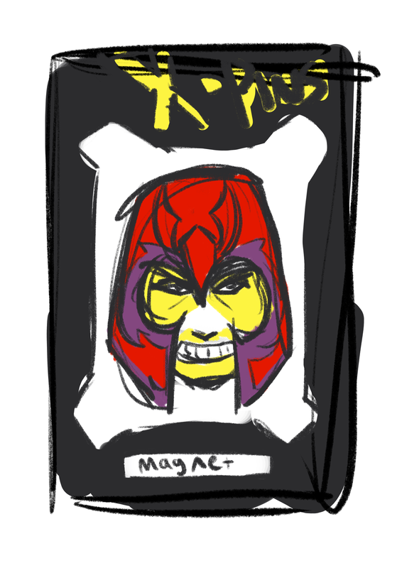
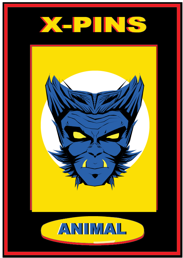
For our badges we had to create, I had the funny idea to base them off of X-Men characters. Mostly this was just an excuse to call Magneto "Magnet".
|
|
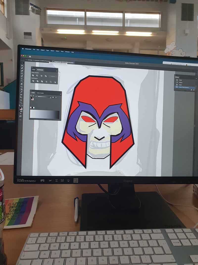
To be honest, I never enjoyed using Illustrator and walls mixed up its properties with Photoshop. So trying to learn what I can to create the pin designs was quite difficult. The picture below was my first attempt at the design I had in mind. I wasn't happy with it so I later restarted and put some more time into it.
|
|
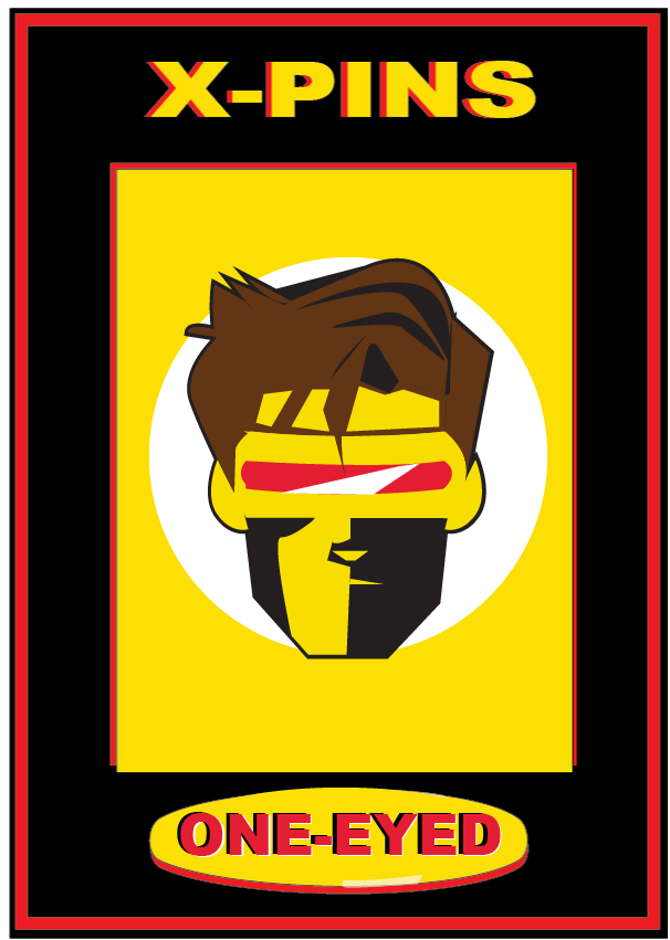
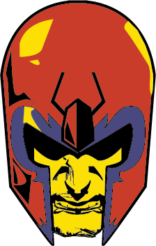
My second attempt is much better in my opinion. I've definitely gotten more comfortable with Illustrator and while I still don't enjoy using it I can tolerate it a lot more. I stuck with the 4 Pantone colours of my choice, trying to show off the old 90s look from the comics with the overly saturated colours.
If I had more time, I think I could have designed a much better background for the pin, but since I was also still learning the ropes of Illustrator again I felt my skills were very limited. I think maybe if I did some more in the future in my own time, It could turn out a lot more better looking.

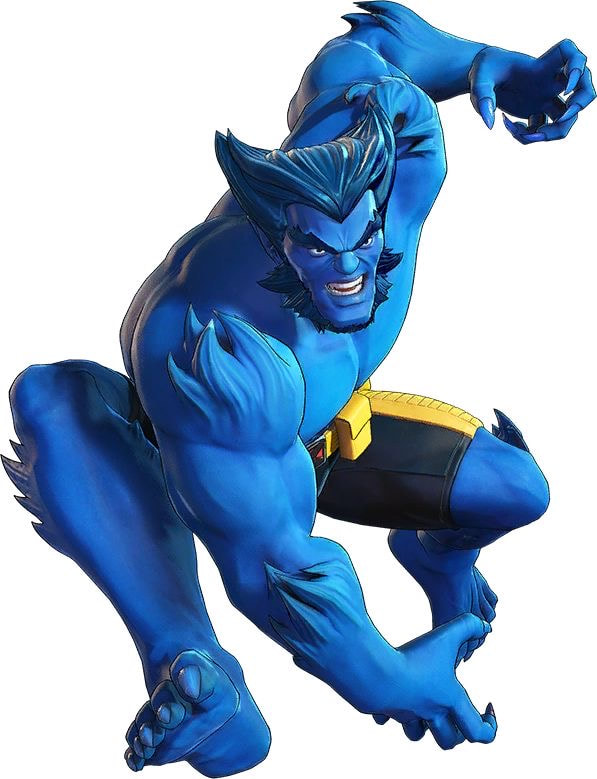
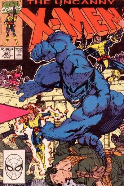
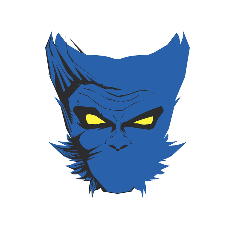
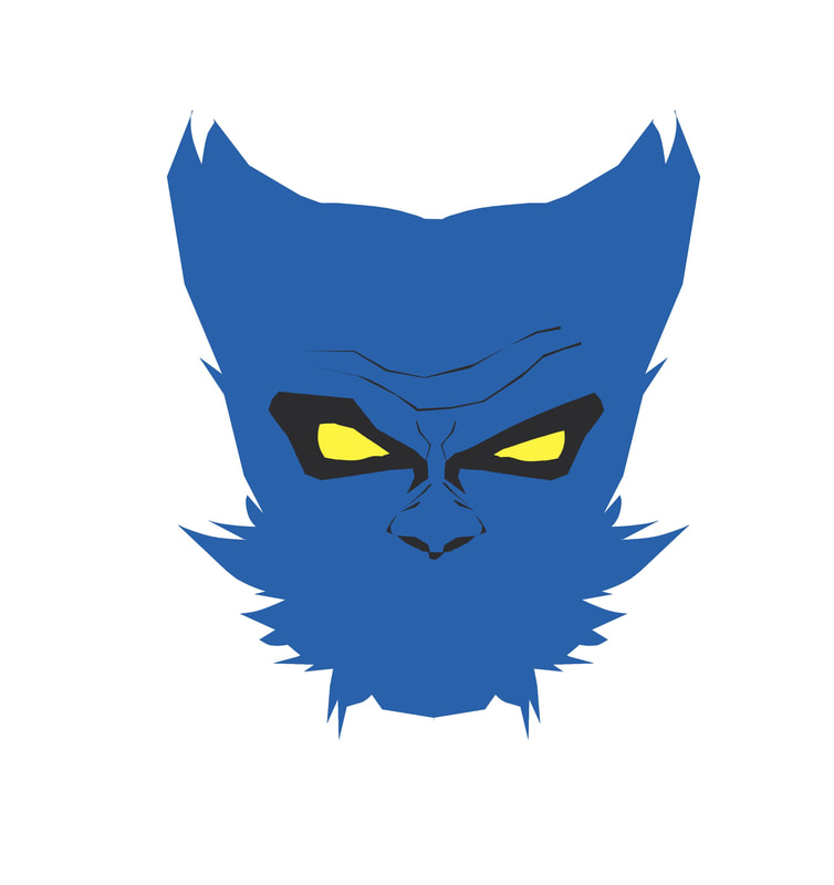
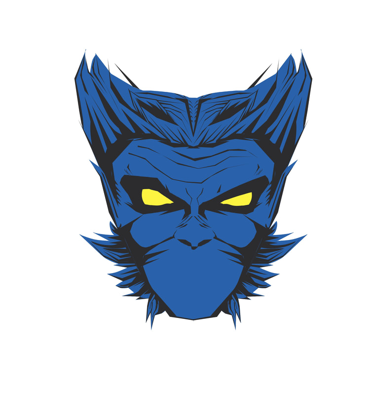
As per Oscar's request, my next pin was based off of the character Beast. At this point I think I had gotten familiar using some tools so this didn't take as long as the others, and I might be my favourite too. I wasn't too sure if these palettes had to be the same on each one (I will change them if necessary), but I did keep most of the colours the same except any key features the characters had.
|
|
|
|
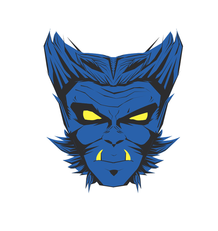
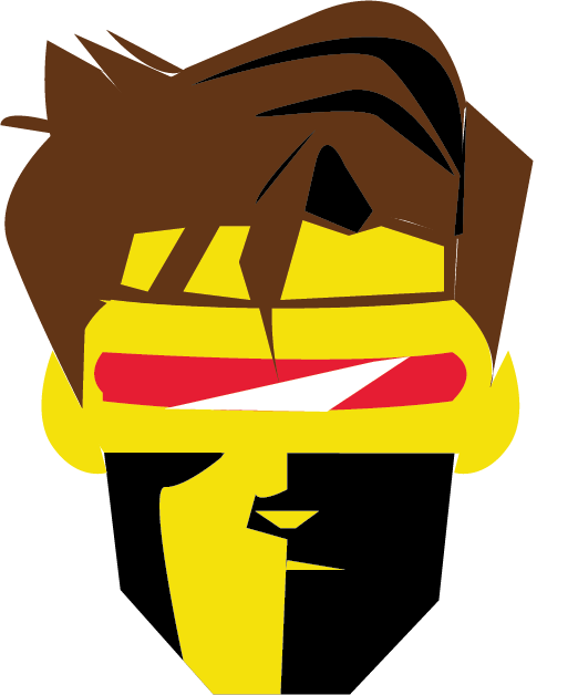
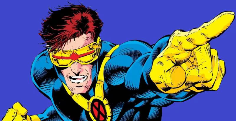
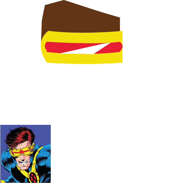
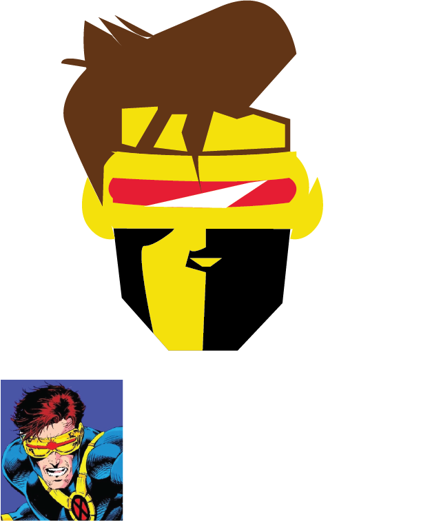
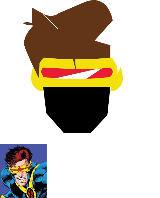
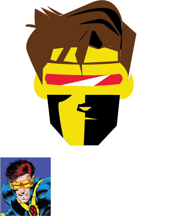
For the third and last badge I thought Cyclops would be a fun and interesting one to attempt. This was probably my least favourite. While it looks like him it doesn't really have the same look as the other pins I created. His hair was the most trouble to get around but thankfully I didn't have to attempt any of his eyes.
|

|
|
|