OVERVIEW
When beginning my journey of the characters, I wanted to create my designs around making two to three "sides" of each character, each being a stage that progressively get worse and take a more horror look after each interaction between them and the player, a form of time-based decay mixed with quest-driven choices that alter characters appearances based on what the player chooses.
Pinterest board
https://pin.it/1XZofVK5U
RESEARCH
During my research I knew I wanted to have a theme that would centre around each design. For example, could I make them a series based off pre-existing characters or could I use single colours? Since this was during the beginning of my project I knew it had to at least be something that would keep me interested enough that I could still have much fun when making it.
No Straight Roads
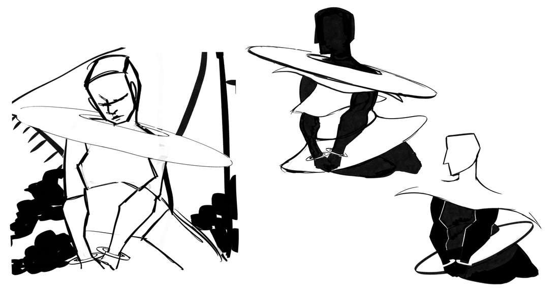
When it came to the poses, it was the sprite illustrations for the game No Straight Roads that I chose to take influence from. The long limbs and odd colour choices stuck out most to me. What I did to create all the poses used was to take photos of myself for them and redraw them multiple times until it became more stylised and less realistic.
|
|
|
Hades 2
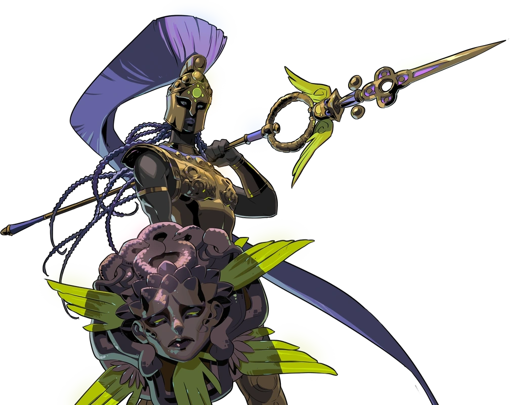
Hades is the game that this project has taken most influence from. From the character sprites to the dialogue box designs each part of this game has inspired me to create something of my own for my game. Most my research for this comes from the second game, where I noticed characters who are affiliated with different factions come with their own details. For instance, characters who deliberately help the protagonist are given silver moon imagery in their outfits, while ones who aren't as close are kept with gold accents and wreaths.
|
|

|
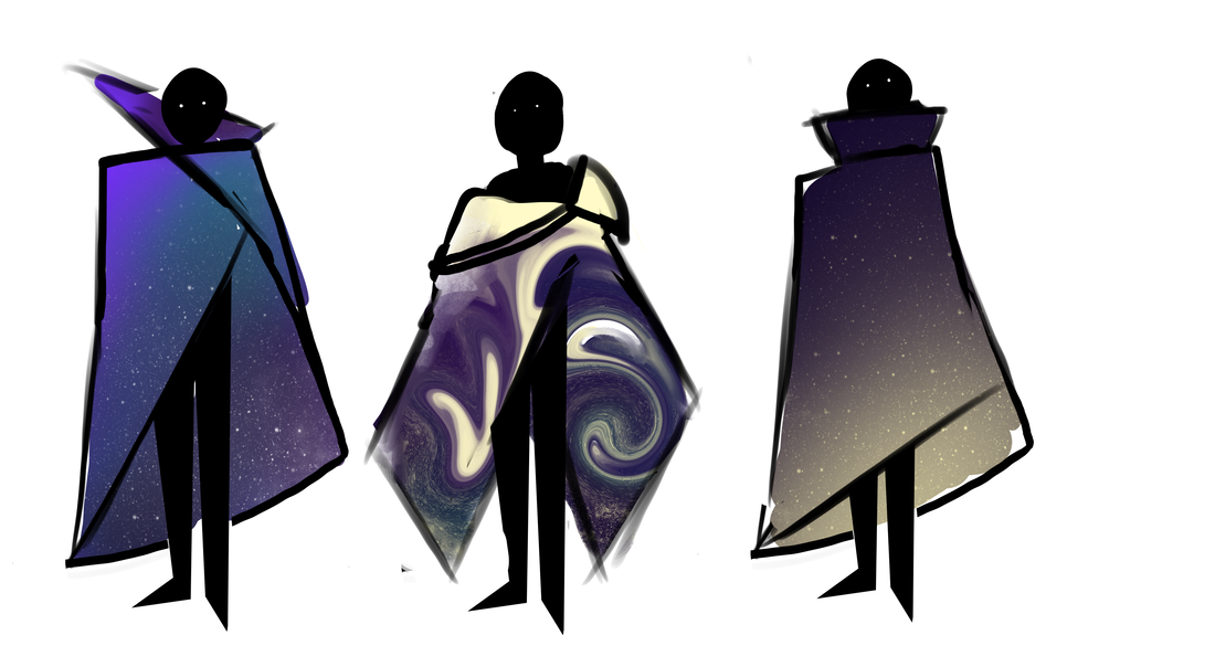
Honkai Star Rail
Because I wanted these characters to resemble gods I next looked into Honkai's designs for their Aeons. Apart from their use of colour that I liked, what I especially looked at was how they're presented to be large in size compared to humans, so when it came to scaling them against my protagonist I kept in mind to attempt a similar thing.
|
|
|
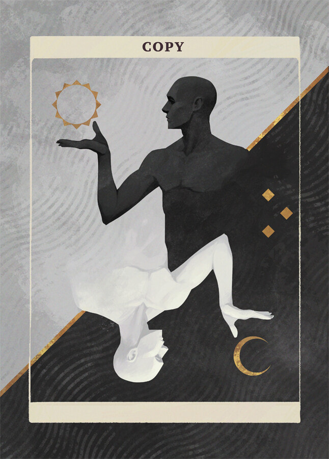
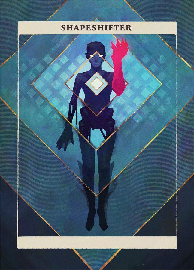
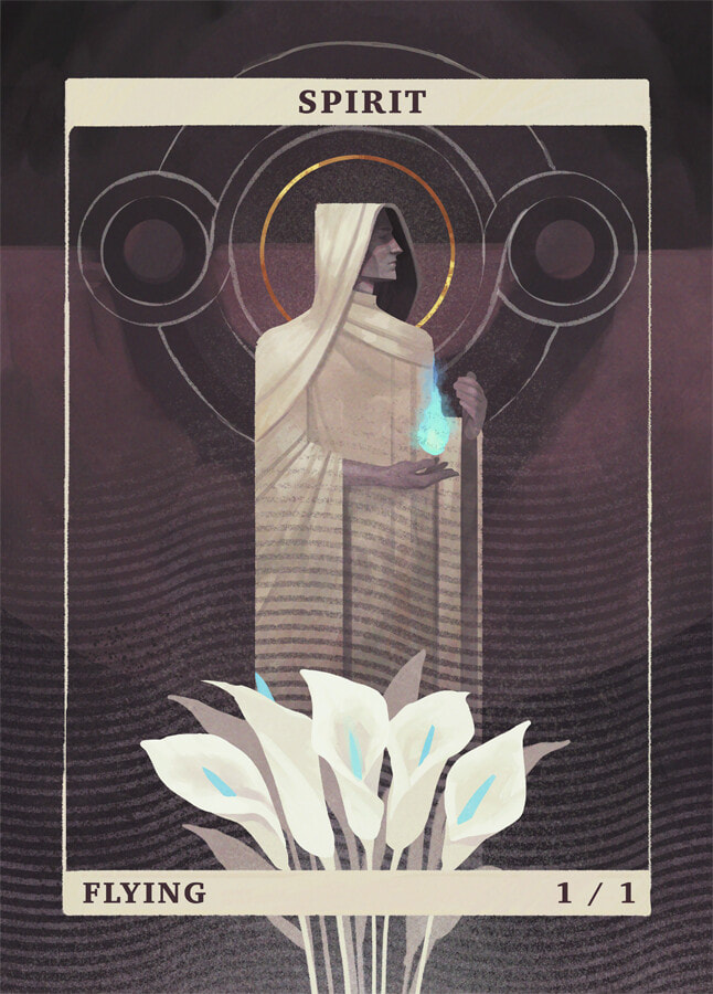
Ray B - MTG illustrations
When doing additional sprite designs for the NPCs I included a lot of influence from Ray B's deck design for MTG as I believed my early designs were still too detailed and felt very cramped with information. I loved how he focussed on shapes in his style and balanced out the detail to simplicity.
|
|
|
Yuming Li
|

|

|
Tom Zhao
|

|
|
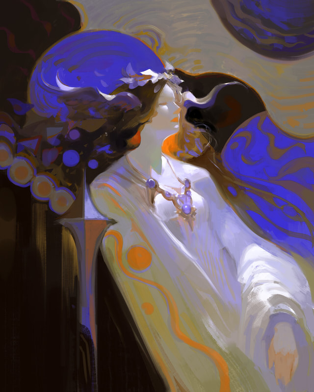
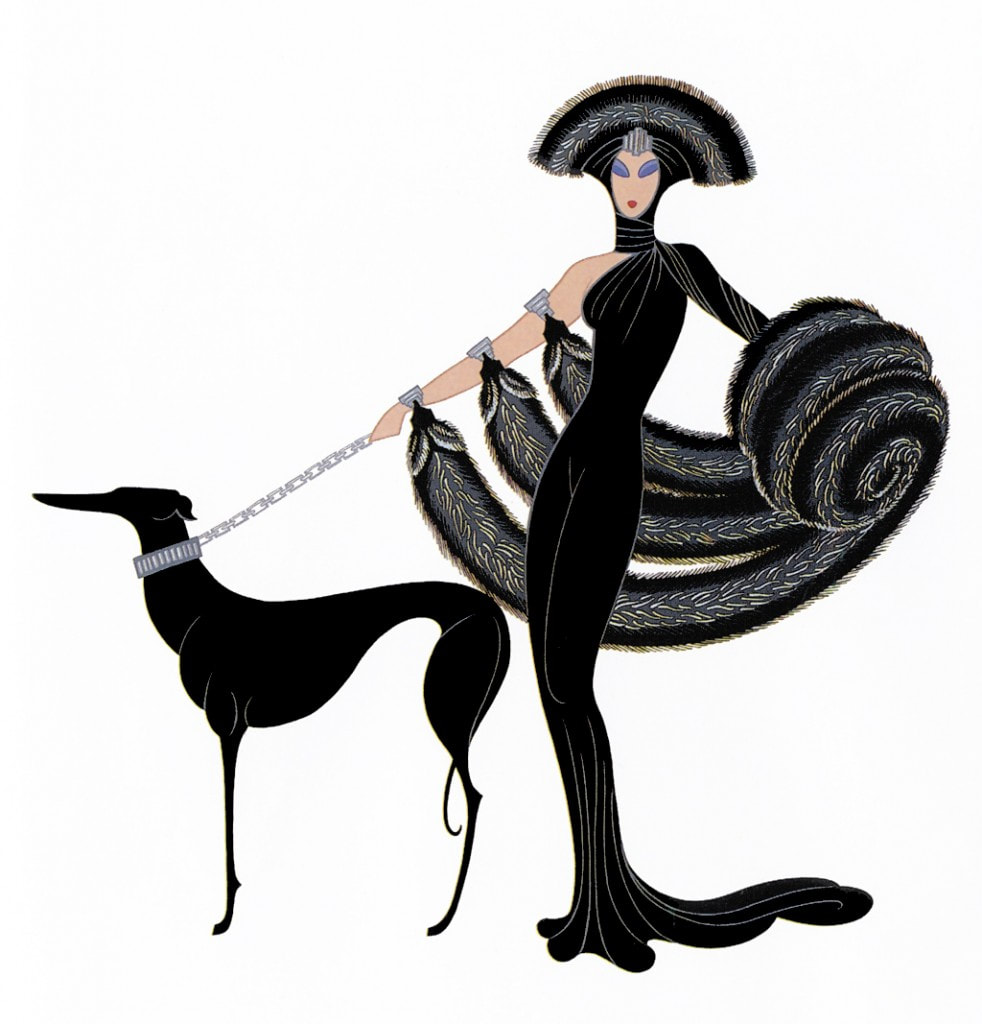
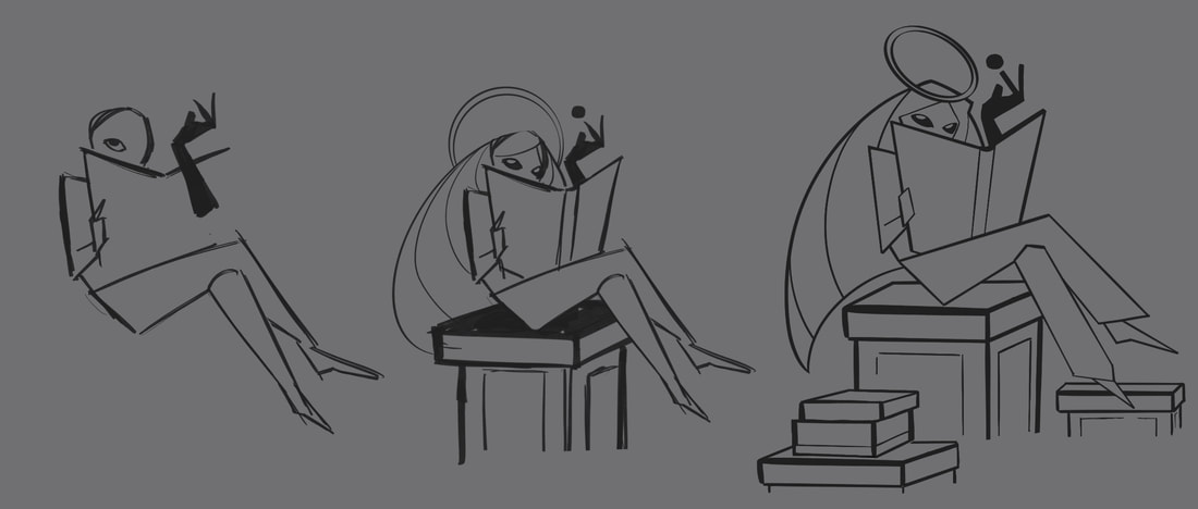
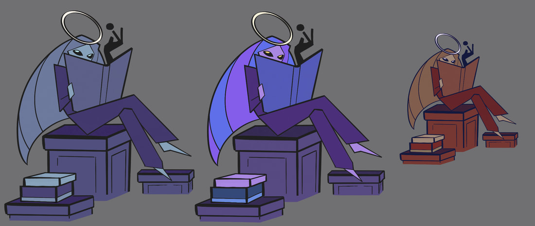
Erté
Erté had an aesthetic that I was inspired to also base the graphic like style on. In my development for my gods, as they are all female, most had the angled stance the woman in his illustrations have. The second illustration is apart of a set of three designs that inspired the pose I designed for the final development of the Moon's first form.
|

|

|
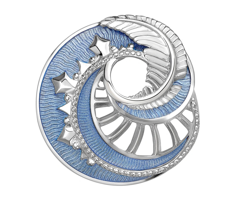
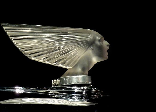
René Lalique
During my research into the art deco style, I came across a jeweller that I thought would be interesting to base some character designs off later down the line.
|

|
|
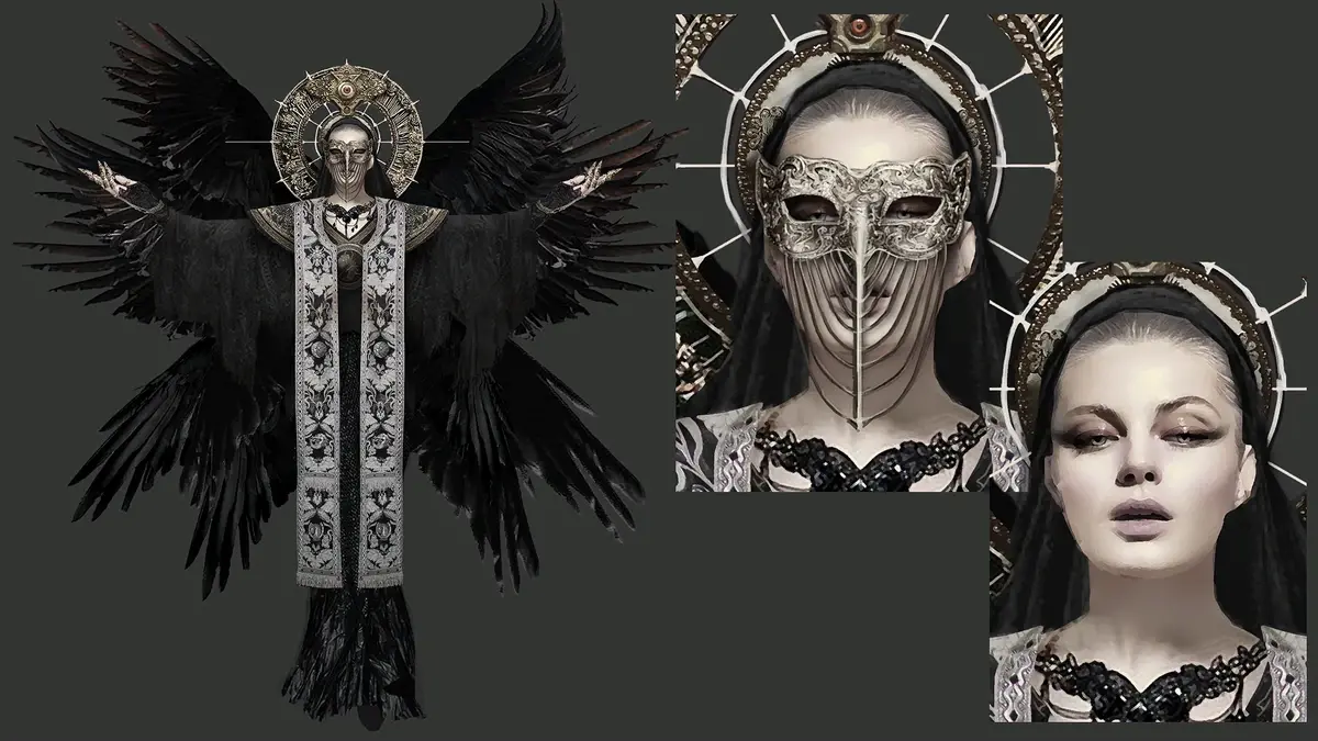
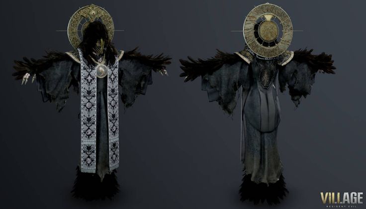
Resident Evil 8
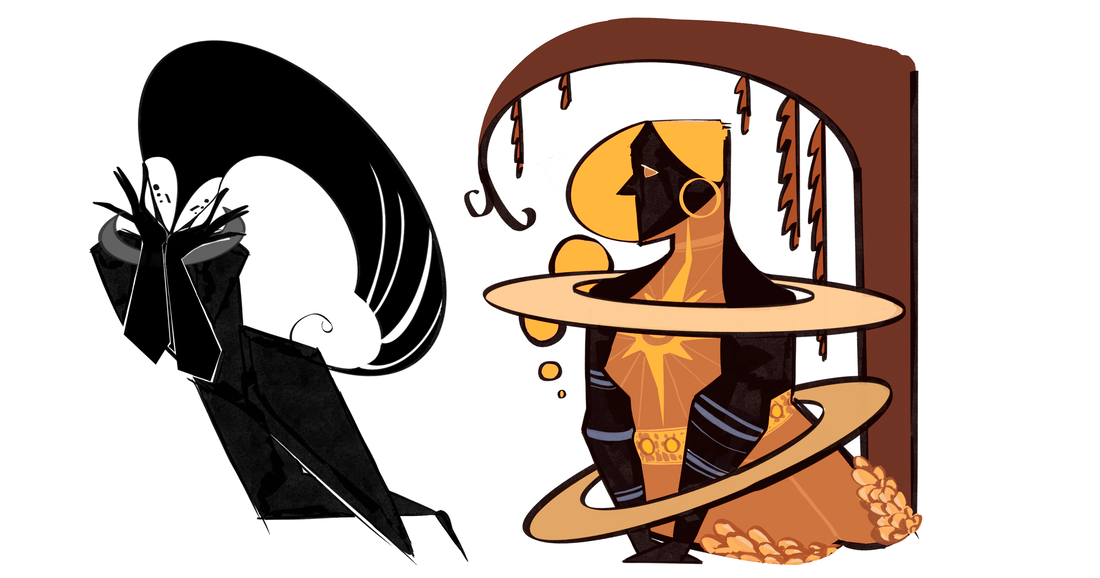
The character design for one of the antagonists, Miranda, was used a lot during my first few attempts at designing the Sun goddess. This was where I was basing a lot of my research of religious attire to match the impression I wanted players to have when meeting her, wanting them to know from how she dresses that she was someone of important status.
|
|
IDEAS / DEVELOPMENT
NOTES:
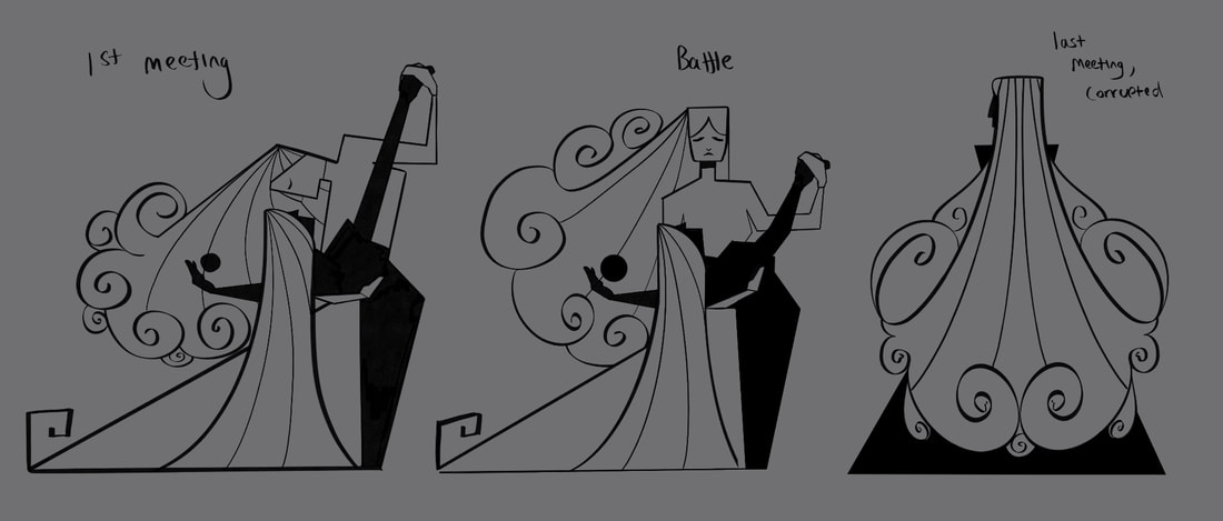
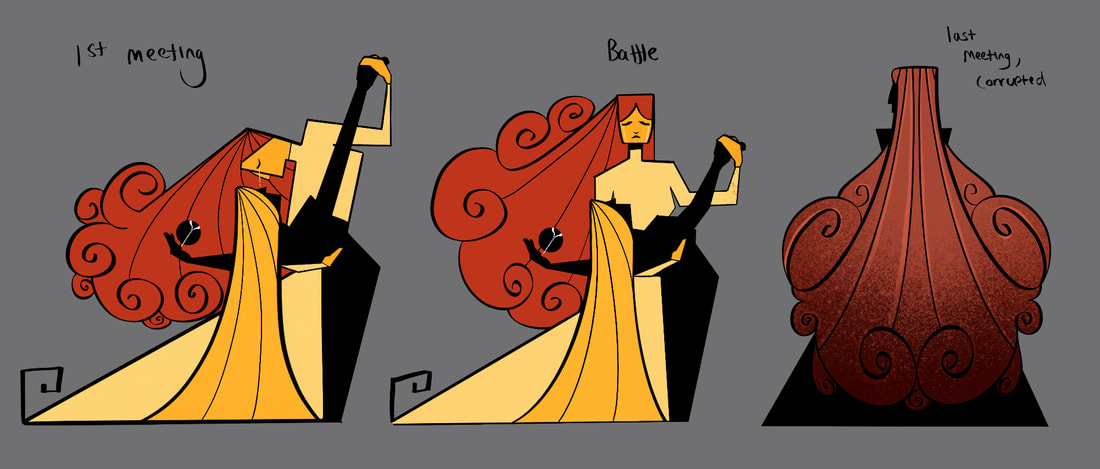
Solar systems corrupted, up to the protagonist to fight each one. Maybe as a way to ‘snap them out’. Could look into the FF16 corruption plot in cities as inspiration? An unknown power that lures the characters of the story to it. Corrupted planets could have four forms to slowly seep into the horror aspect I want to incorporate.
1st encounter - corruption has already began through characters, yet not visibly noticeable to the player at the time. Black silhouette with a main colour theme?
2nd encounter - change in dialogue, physically different in limbs and darker colour palette.
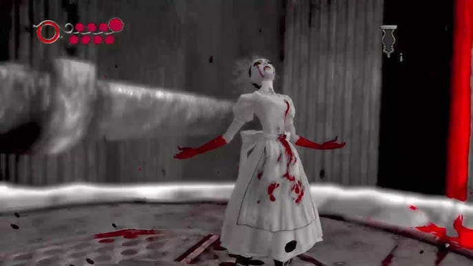
3rd encounter - some horror monster form that would become the boss fight? Look into Little Nightmares, Evil Within, Alice Madness.
4th encounter - after battle they’ll return to a similar look from their 1st encounter, lighter colours.
Solar systems corrupted, up to the protagonist to fight each one. Maybe as a way to ‘snap them out’. Could look into the FF16 corruption plot in cities as inspiration? An unknown power that lures the characters of the story to it. Corrupted planets could have four forms to slowly seep into the horror aspect I want to incorporate.
1st encounter - corruption has already began through characters, yet not visibly noticeable to the player at the time. Black silhouette with a main colour theme?
2nd encounter - change in dialogue, physically different in limbs and darker colour palette.
3rd encounter - some horror monster form that would become the boss fight? Look into Little Nightmares, Evil Within, Alice Madness.
4th encounter - after battle they’ll return to a similar look from their 1st encounter, lighter colours.
|
|
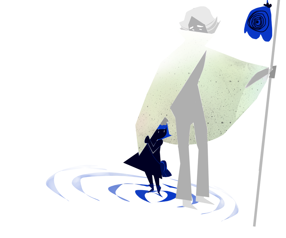
One of the first sketches I did while brainstorming was what I envisioned as the protagonist and their companion. Keeping them space theme I created the young girl to be similar to a star to possibly introduce the idea of using her to solve puzzles throughout the game.
|
|
I knew similar to Hades, I wanted the NPCs to be goddesses that interact with the protagonist and are the core characters that need to either be defeated or will help the player in their journey. My first idea for them, which ended up being the idea I stuck with for the final developments, was to create the main cast to be based off planets in the solar system. The idea included the sun and moon to possibly be these rulers over the games world with the rest of the planets being similar to mini-bosses.

|
Sun and Moon boss fight ideas,
|
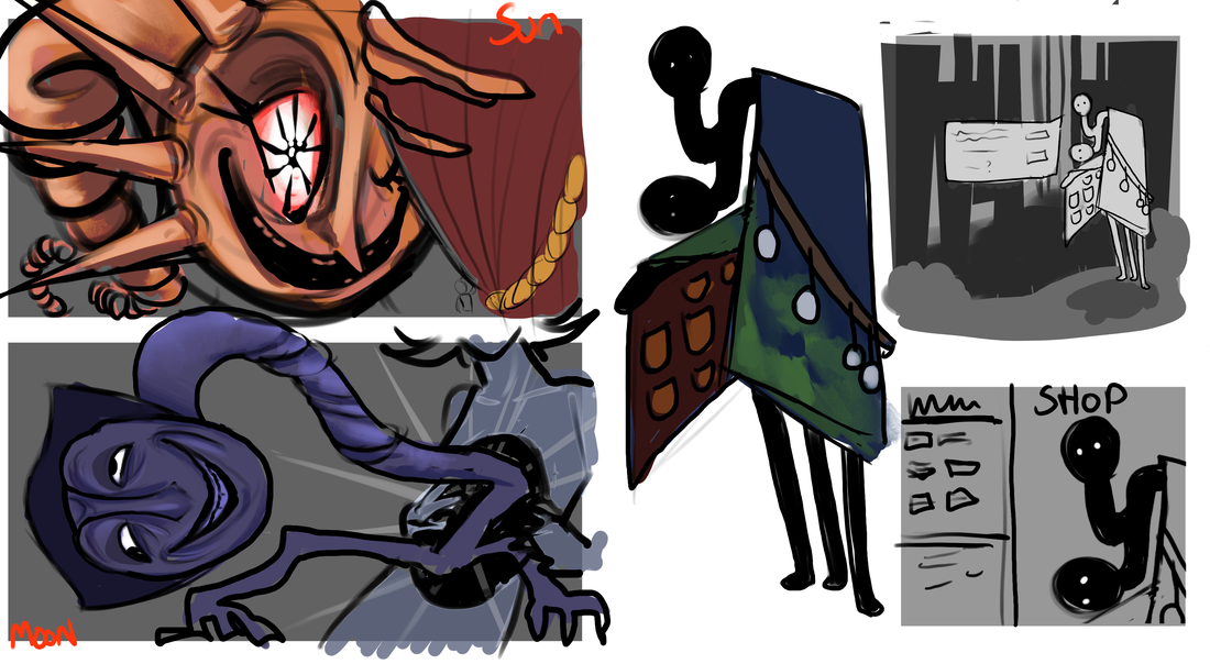
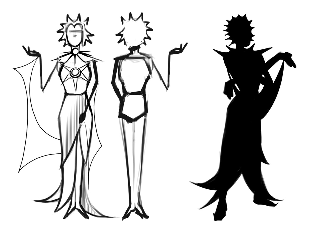
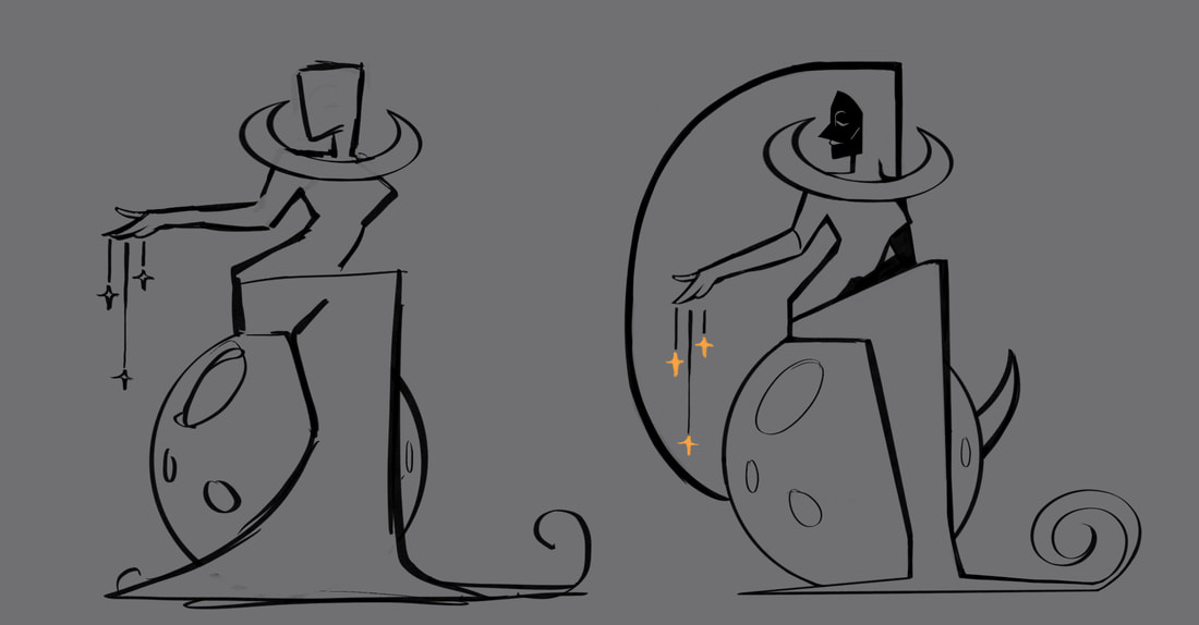
First sketches of my sun and moon characters. At the start of the project I wanted to go full horror into the designs but I later scrapped it to focus more on the worldbuilding before I reconsider it. An early inspiration for the long, twisting necks and uncanny features was the Little Nightmares series.
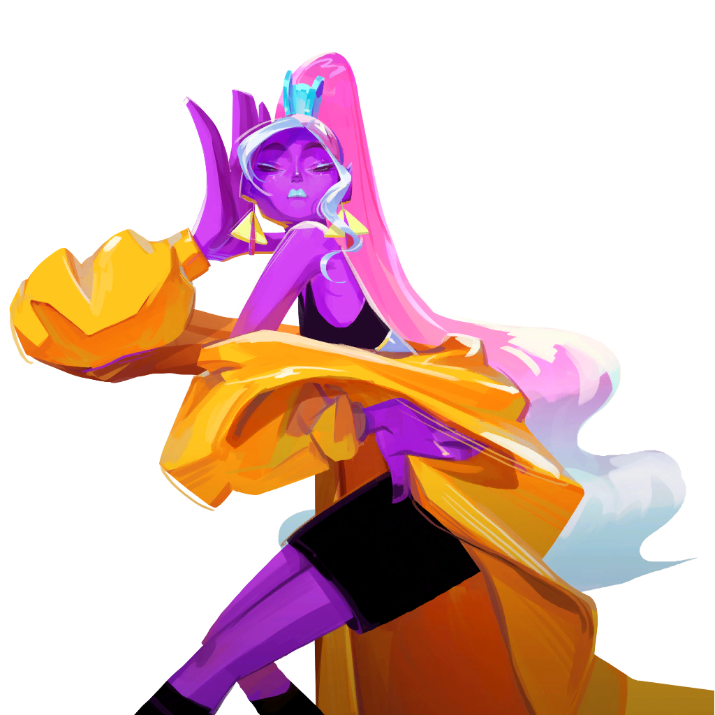
Another feature I wished to finalise at a later date was a "Shop" system. Using the horror game Limbo for inspiration I created a design for an Earth creature that sold items to the player. The coat it wears resembled the layers of the planet.
Another feature I wished to finalise at a later date was a "Shop" system. Using the horror game Limbo for inspiration I created a design for an Earth creature that sold items to the player. The coat it wears resembled the layers of the planet.
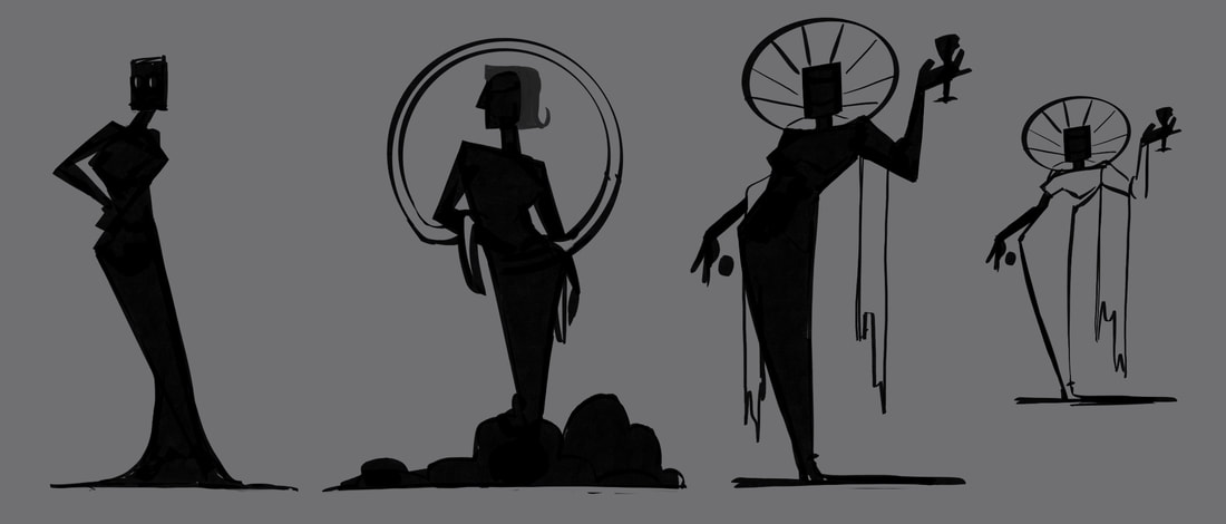
The Sun
|
|
|
|
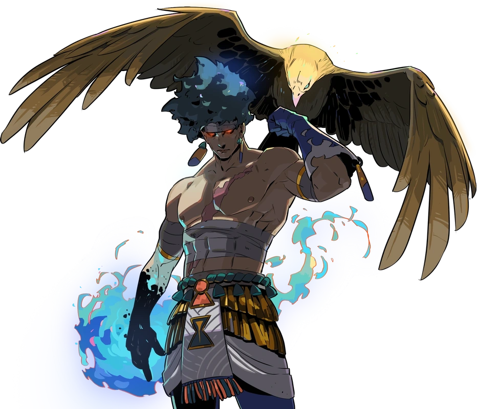
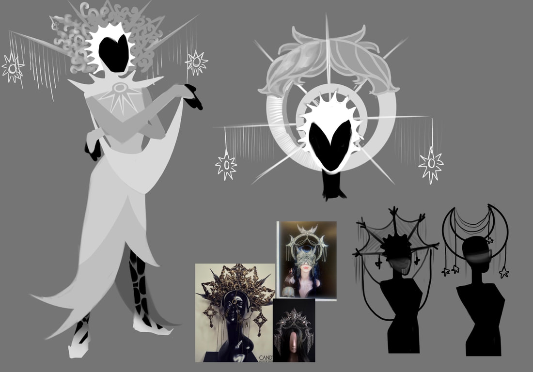
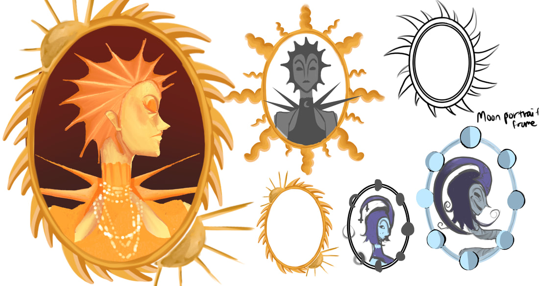
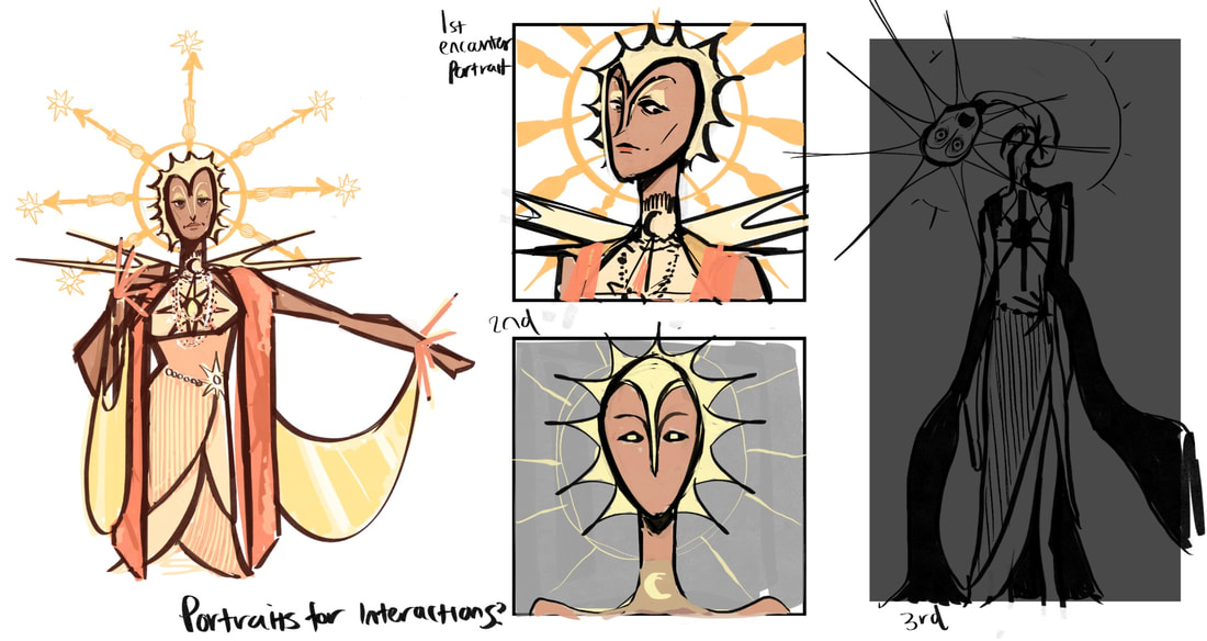
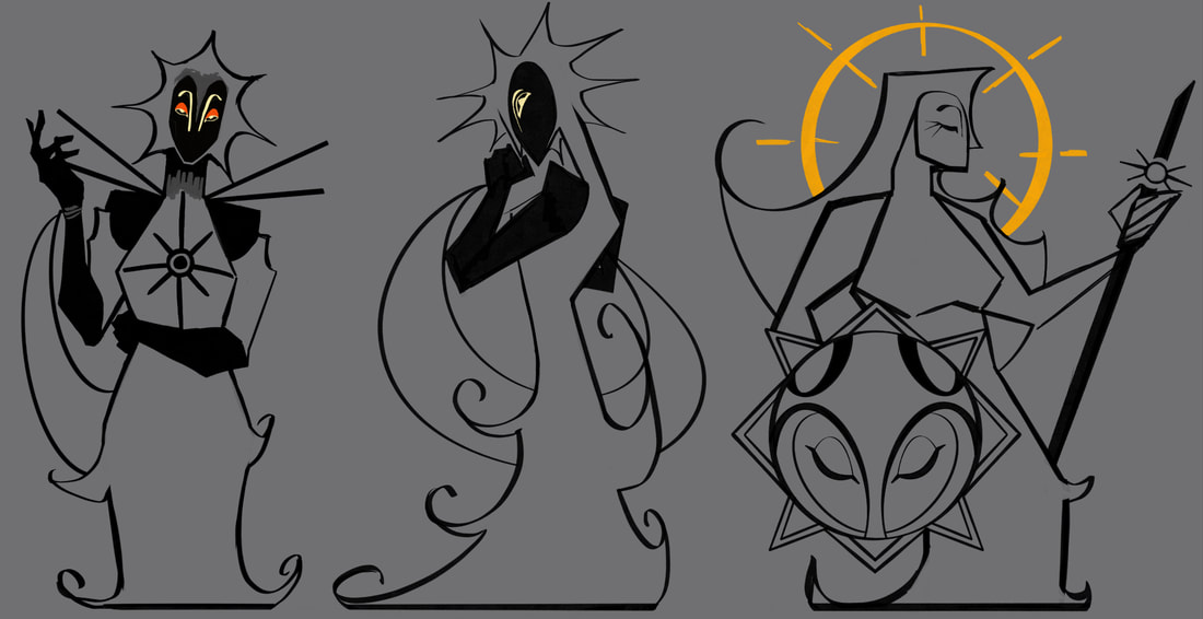
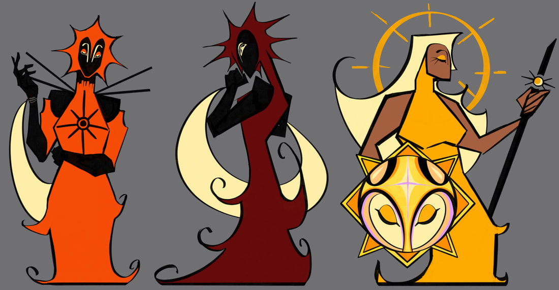
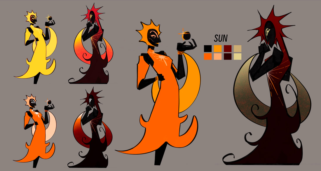
The sun was the first character I chose to finalise first. Looking at characters such as Athena (Hades) and Aglaea (Honkai Star Rail) I chose a regal look for her. While I was happy with the design I later had to switch styles to something simpler and efficient due to issues with my hands. The sketches of portraits were for where the moon and sun both reside. There would be portraits along the walls, the further the player ventures the more messed up the portraits become. I wanted them to be seen by the player so they knew what they should look like, but when they finally meet the characters they'll understand something is wrong with them.
|
|
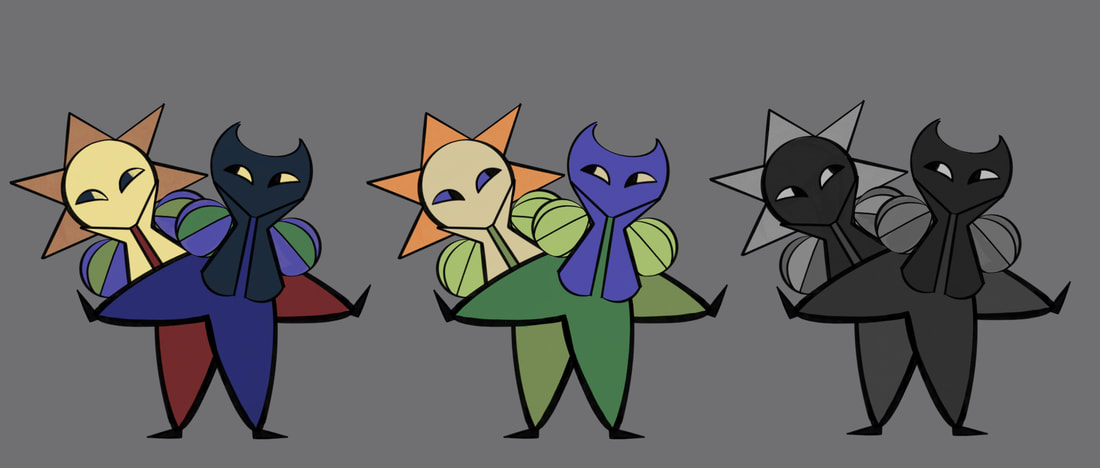
Between these sketches I created some potential designs for her corrupted look. Her hair would grow longer spikes and clothes would change colour to match an eclipse.
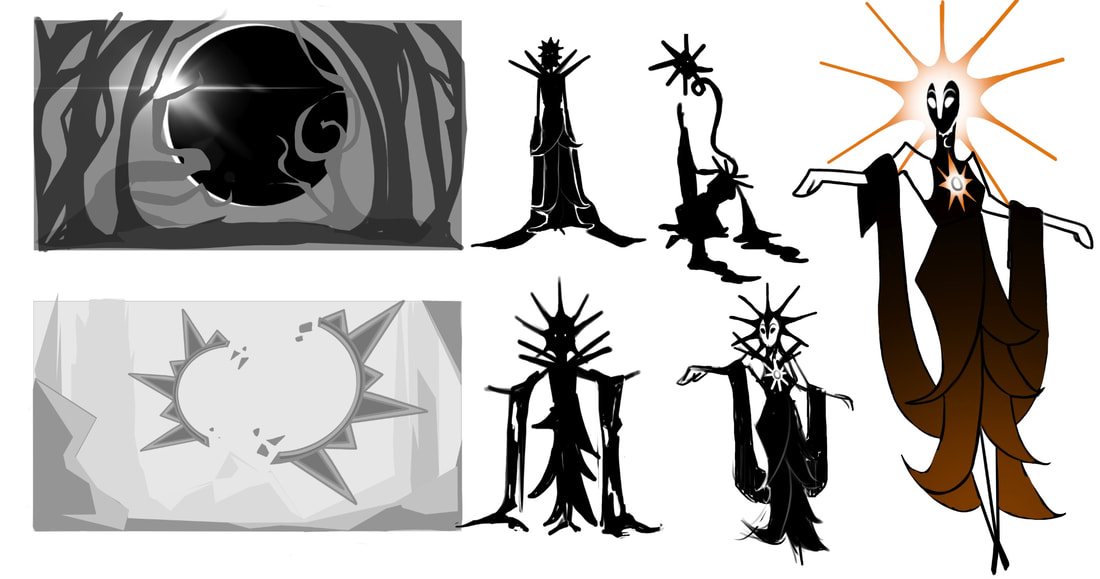
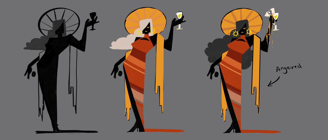
The sprite work changing throughout the game came from the idea of including the eclipse. During this stage I hadn't solved exactly what would cause this corruption in the characters yet, so the blacked out silhouette was inspired by the eclipse as some second form of the Sun, next to it being its "healed" self. However, when I came to a decision on the plot I wanted to continue using the silhouette in my designs since I loved how the colours contrasted against it.

|
|
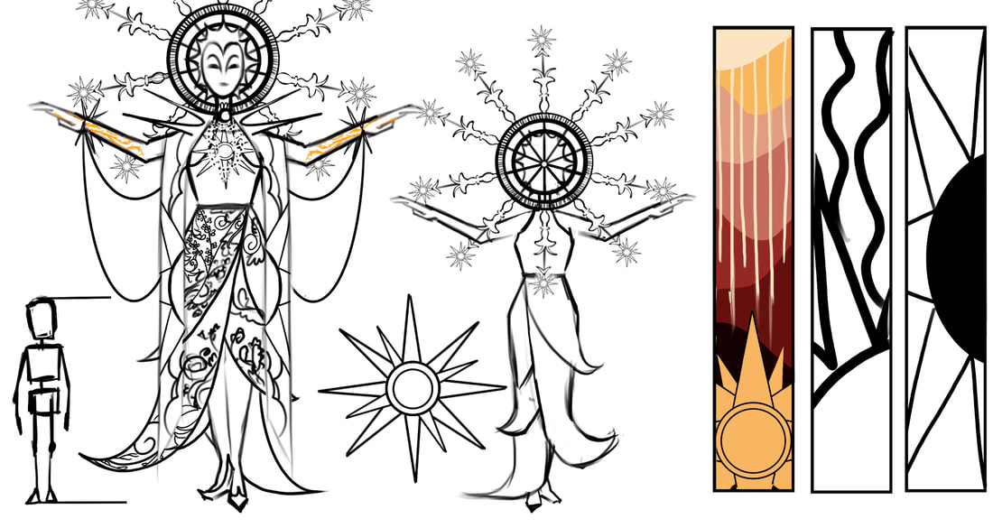
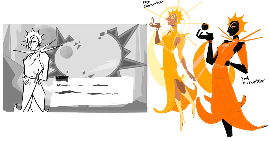
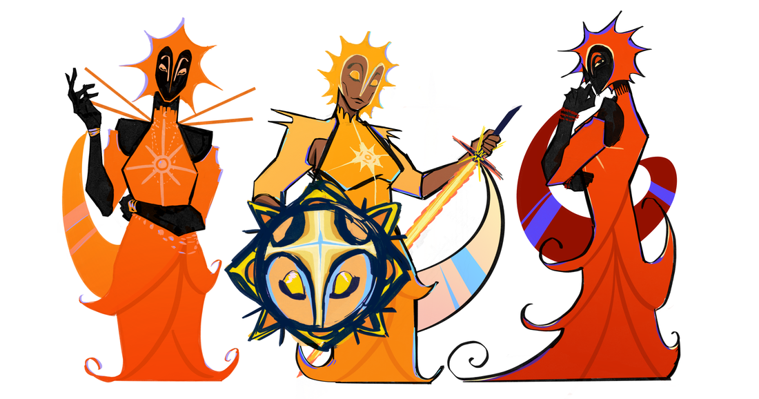
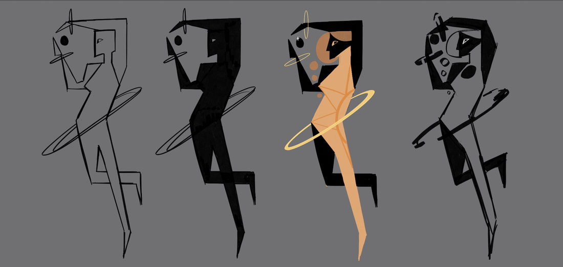
During the final designs for the Sun, I wasn't certain I was liking what was done. I had the tendency to keep adding detail until it got too complicated so I would need to constantly look back at my first sketches for her to understand what style I was wanting to achieve. I think for the second phase, where the illustration becomes more uncanny and unsettling, is where I'm allowed to add a specific amount of detail to keep it creepy. However for the others, I wanted to redraw them to a more graphic style.
Since a lot of my inspiration when it came to games I was personally playing for reference usually had this theme of styles mix and matching to create something that stands out and tells a story, I hoped to bring the same idea to my own. This is where I kept up with the graphic style and kept everything else (Interface, environment, etc) illustrative.
Since a lot of my inspiration when it came to games I was personally playing for reference usually had this theme of styles mix and matching to create something that stands out and tells a story, I hoped to bring the same idea to my own. This is where I kept up with the graphic style and kept everything else (Interface, environment, etc) illustrative.
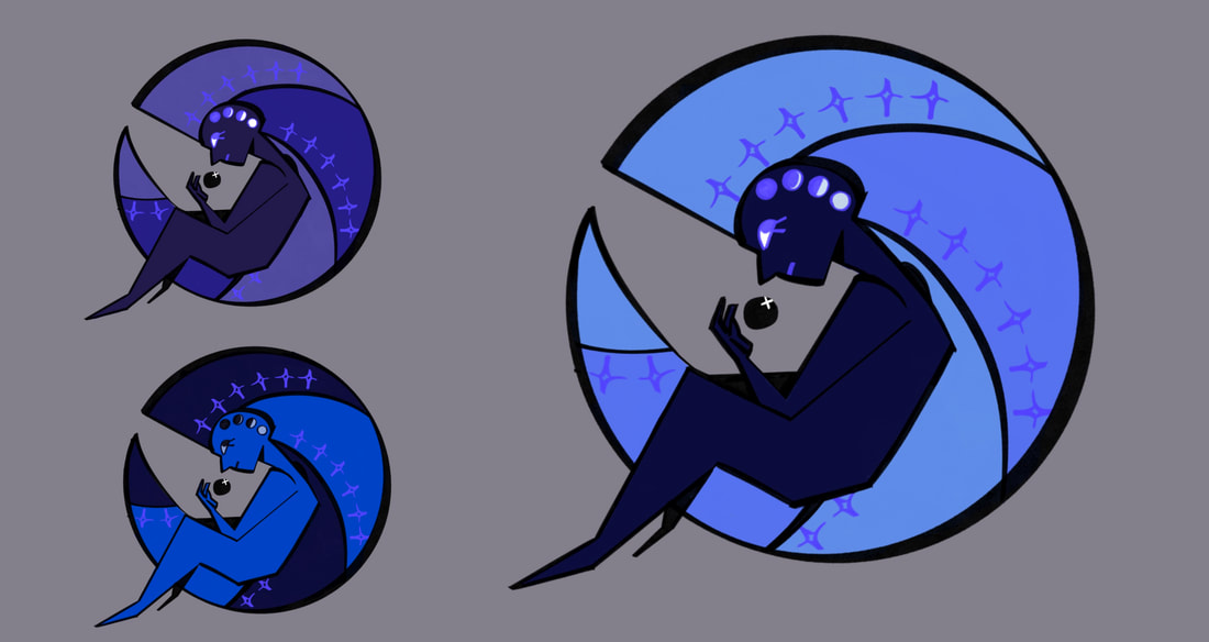
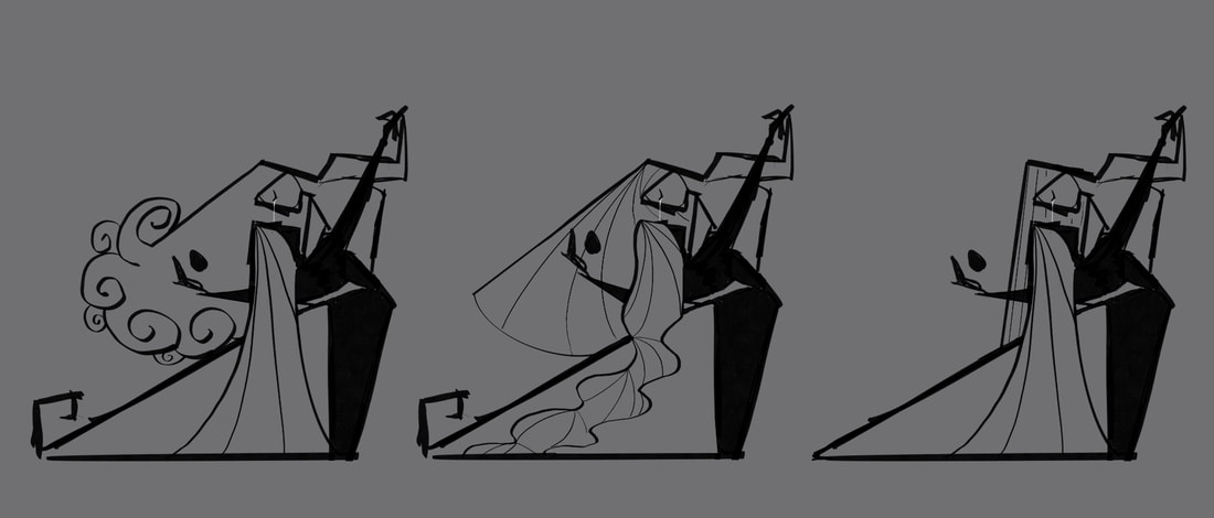
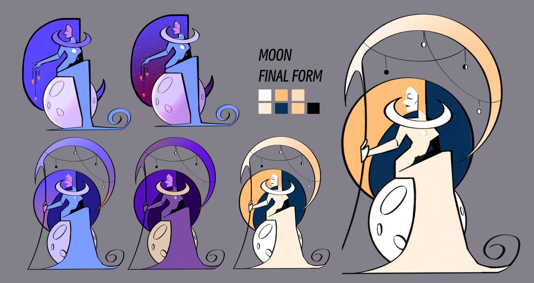
The Moon
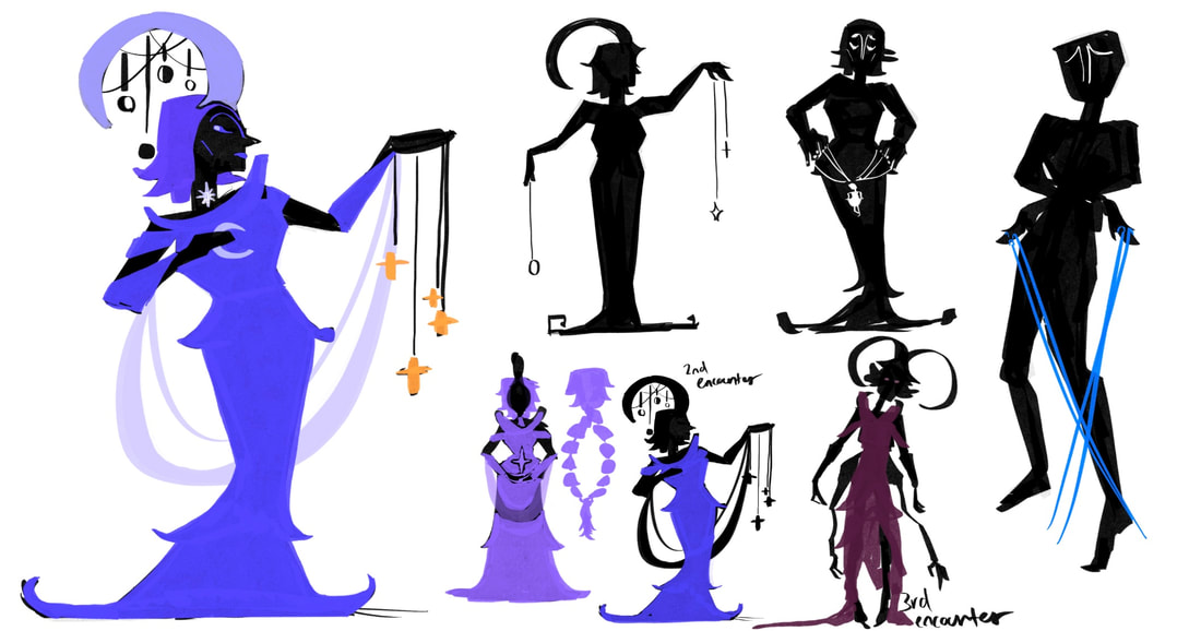
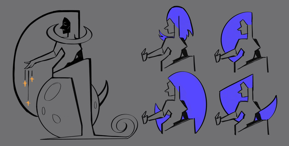
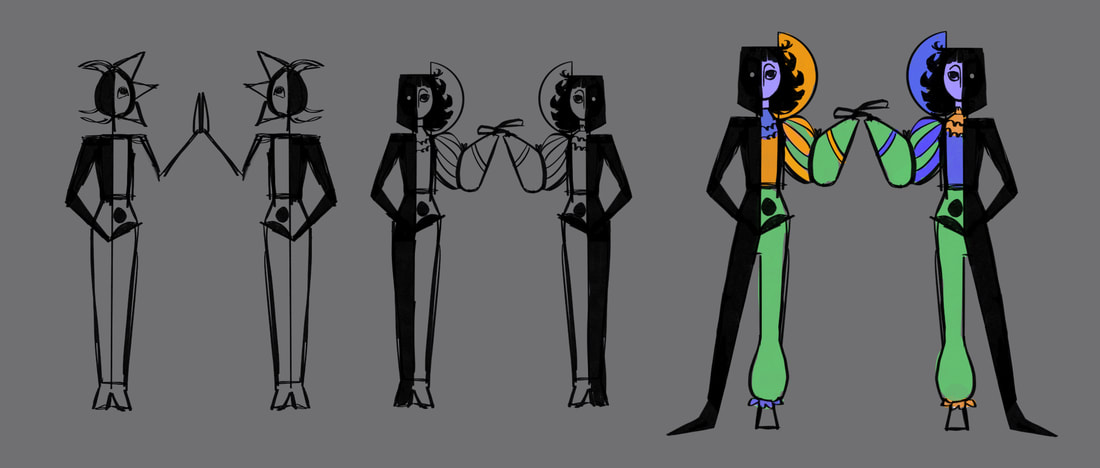
What I would begin with is a silhouette of the head before the hair and then work the rest of the body around the hairstyle before I go over the body in a bright colour to represent them. This helped quickly craft a pose that didn't take up too much of my time and gave it a more unique appearance with the colours contrasting against the black.
Moons corrupted form ideas
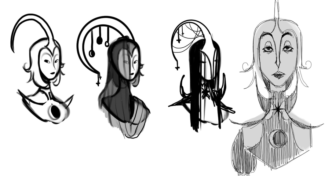
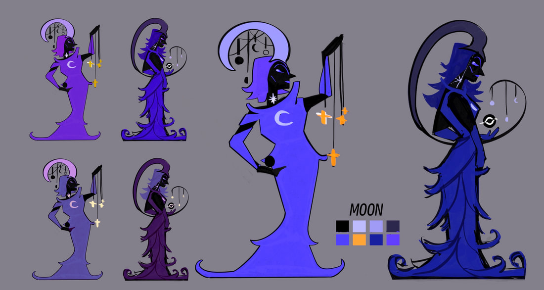
Following the style I had chosen to go with, the Moon was much easier to decide. I wanted to her to be just as mysterious but less unsettling to see than the Sun. I incorporated crescent shapes into her design to represent the moon. During the time I had began to brainstorm and sketch out more ideas for her, I had to unfortunately move away from characters for a while in order to focus on the other aspects I needed to adapt for my game.

|
|
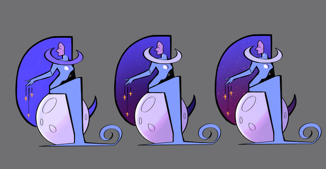
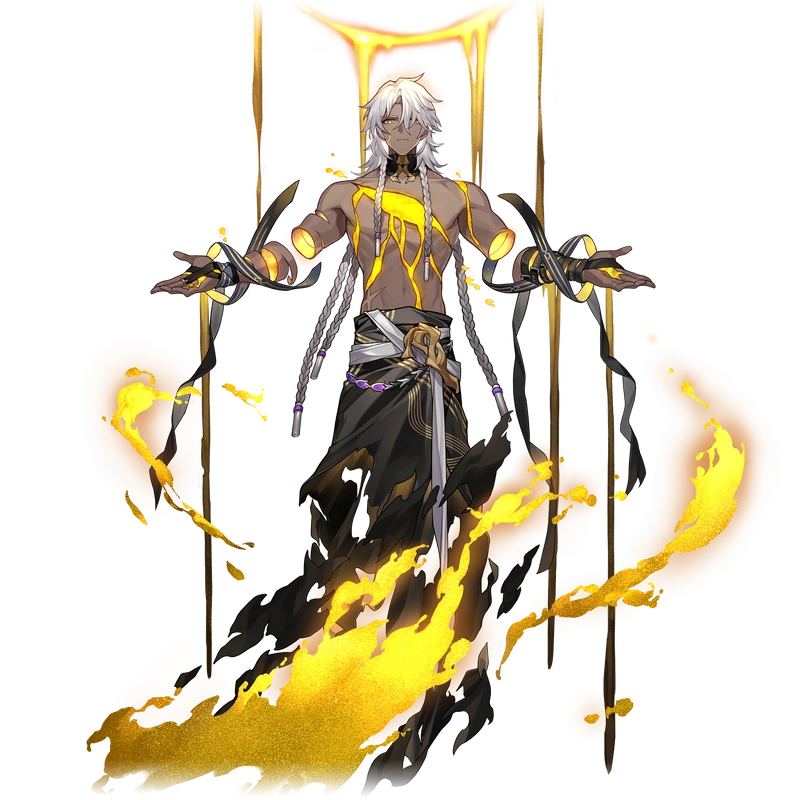
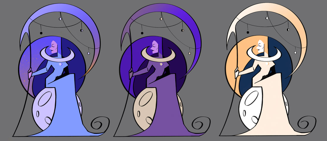
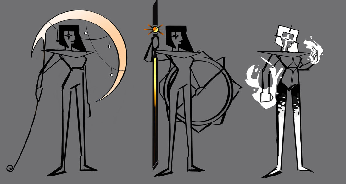
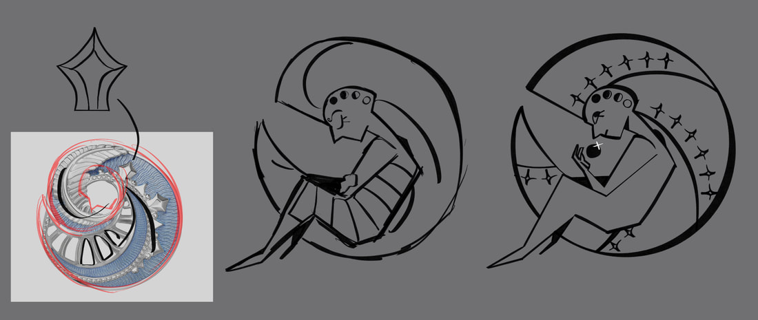
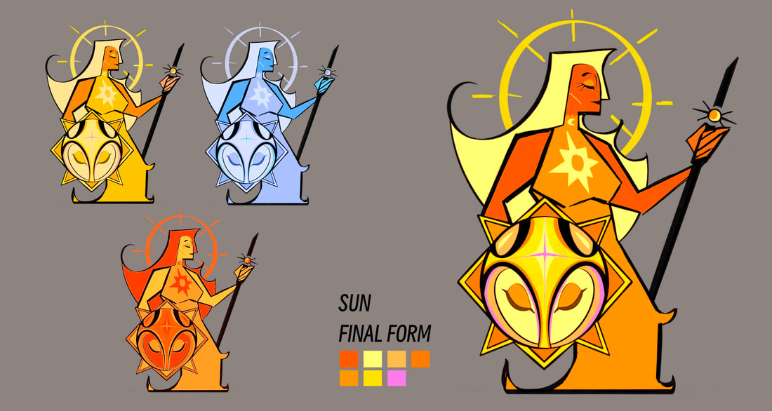
When I had the chance to come back to this again, a lot had changed in my head to what I wanted the Moon to have. The changes included switching her weapon choice to a scythe to fit her final form design where the character would hold the weapon meant to be given the protagonist afterwards. I also had the idea for her hairstyle to not only fit like a phase of the moon, but to also represent the crescent headpiece she wore. The crescent headpiece is also what later becomes the scythe, as shown by the hanging moon phases still present. In addiction, I didn't feel happy with her colour scheme being the same. Like the Suns brighter final form, I ended up on the colour choice to be more accurate to the actual moon, cream whites and pale oranges were used in the final design to get that brighter look.
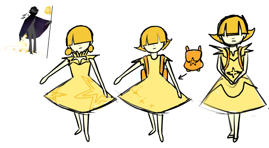
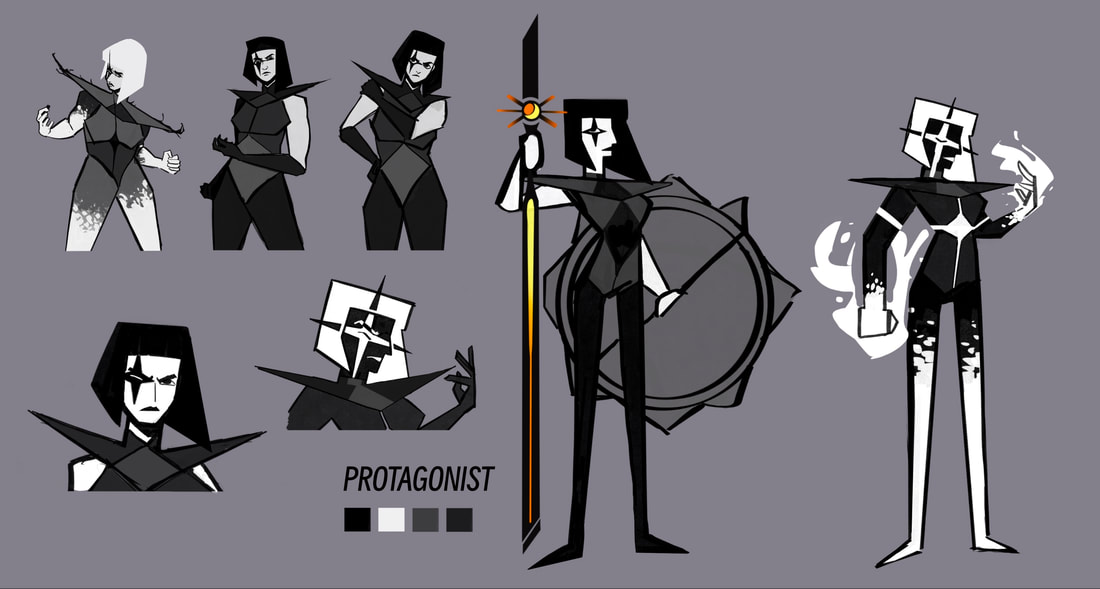
The Protagonist
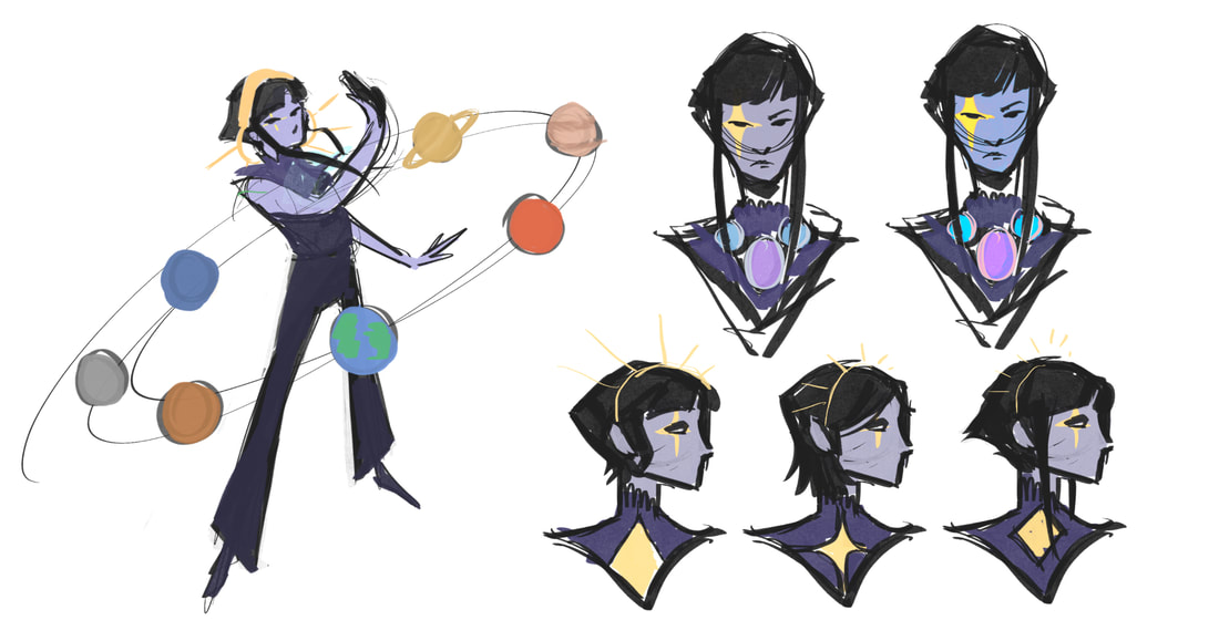
The earliest design I created for my protagonist was centred around stars. The planets I drew around her were for an idea on how she could equip and switch between each ability. When she'd defeat a boss that represent a planet it would be put into on orbit around her that she could summon to switch around. This was later changed to be much smaller and similar to an equipment belt. While I didn't particularly like the design I did like the star pattern over her eye so I continued using that as her main feature in her later designs.

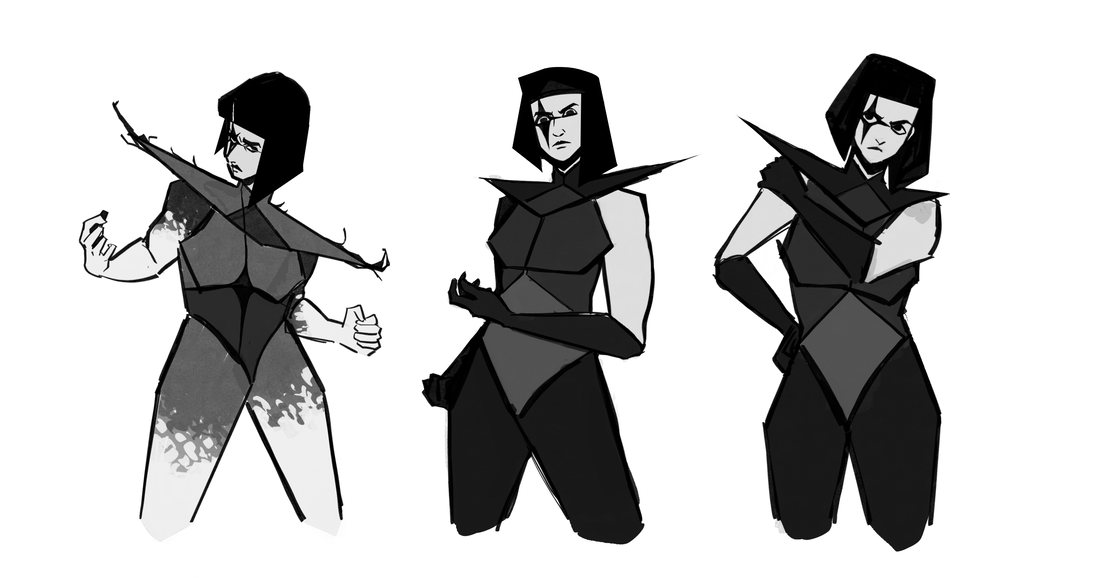
Using myself as reference for her poses, I stylised it until she had a sharp figure. She did not previously have much shape to her design as I wanted, so I made sure when sketching new ideas to base a lot of her around triangles. The choice for triangles simply came from the idea of keeping her star themed. I liked the thought of her being based around a star to be like a middle ground between the two kingdoms. She's neither apart of the Moon's or the Sun's, she's simply her own self.
|

|
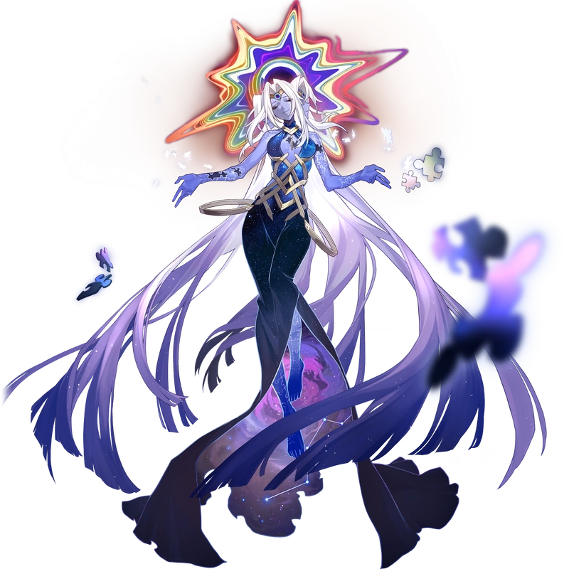
Keeping the black and white theme to her look, I had in mind to give my protagonist some kind of gauge meter that gave her a "corrupted" look that inverted her black and white appearance. A lot of the inspiration for the idea came from Alice's white and red Hysteria (Alice Madness: Returns) look that triggers at low health as well as Acherons monochrome attack (Honkai Star Rail).
The Planets
Saturn
Saturn
|
Neptune and Saturn
|
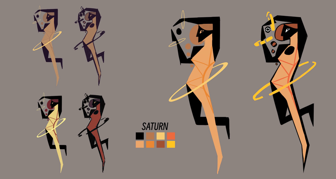
To be honest, whenever I tried to work on the other planets designs early on in my project, nothing would stick and I had the habit to lose motivation because of it. I felt as if I needed so much more of this world fleshed out before I can begin basing my characters designs over where they're meant to be, rather than doing it the other way around. What I did attempt at first was Saturn and Neptune. In my research on Saturn's representations being maturity and life, I got the impression they would need to be someone who looked gentle and mature despite the corruption in the games world. This is why I gave her first design a relaxing pose with trees / bushes behind, to show her connection to life.
Afterwards, when I found the style I wanted for the game, I did a quick redo of Saturn's final look. Since in my story, I didn't have as big of a role for her like other characters, she wasn't given a detailed rethink into her design.
Afterwards, when I found the style I wanted for the game, I did a quick redo of Saturn's final look. Since in my story, I didn't have as big of a role for her like other characters, she wasn't given a detailed rethink into her design.
Saturn redesign
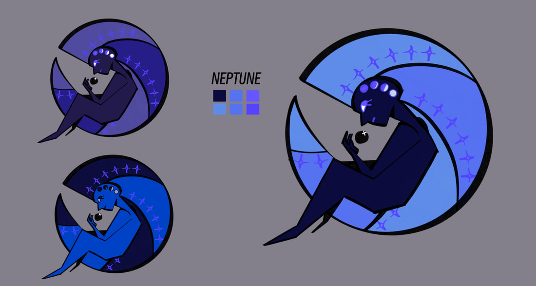
Neptune
After a few weeks I came back to these planets I wanted to design. I struggled first on where to even start, but chose my favourite planet Neptune. I wanted to keep the curled hair in her design and looked into the planets representations as I did with Saturn. Since Neptune represents inspiration, I thought it would best to use that as an opportunity to look into René Lalique, a French art deco style jeweller that ended up being the inspiration for a better version of Neptune's hair.
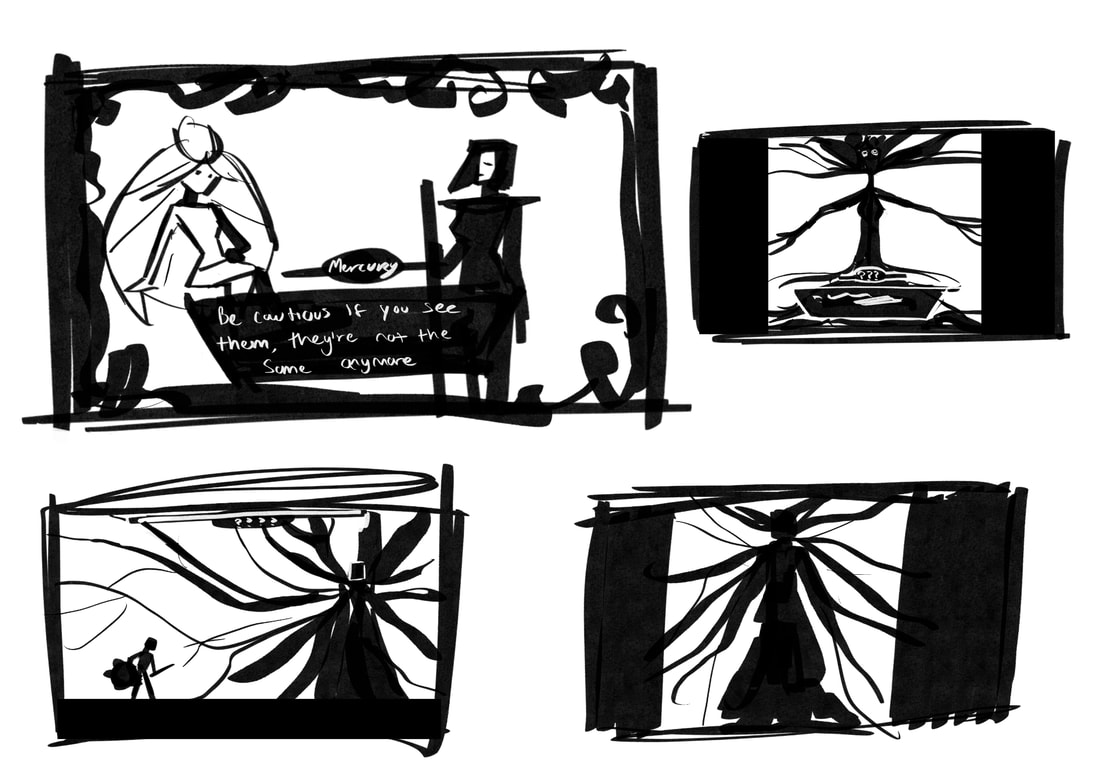
Mercury
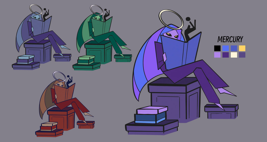
Because I was pretty indecisive on who to work on next I stuck with picking planets I placed on the Moons side before tackling the Suns side, mostly because I was currently reworking the Suns designs and didn't want to have to change any patterns later down the line. The next planet I worked on next was Mercury, the planet that represent intellect. When I planned to spend a week or so on these planets I took the chance to also begin their own personal stories.
For Mercury, I wanted her to be overly curious, someone who sought out answers to her questions over everything else. This trait lead to her designing only having the silhouette of the corruption on one arm. She wants to know what's happening, so she's deliberately letting the mystery corrupt her in the name of science. To keep her connection to the moon, she's given the blue / purple colour palette and a moon ring headpiece. I also wanted to give her a more professional outfit compared to the dresses others have. I imagined her role in the game to not be a boss fight, but to give vital information to the player for a price.
For Mercury, I wanted her to be overly curious, someone who sought out answers to her questions over everything else. This trait lead to her designing only having the silhouette of the corruption on one arm. She wants to know what's happening, so she's deliberately letting the mystery corrupt her in the name of science. To keep her connection to the moon, she's given the blue / purple colour palette and a moon ring headpiece. I also wanted to give her a more professional outfit compared to the dresses others have. I imagined her role in the game to not be a boss fight, but to give vital information to the player for a price.
Earth
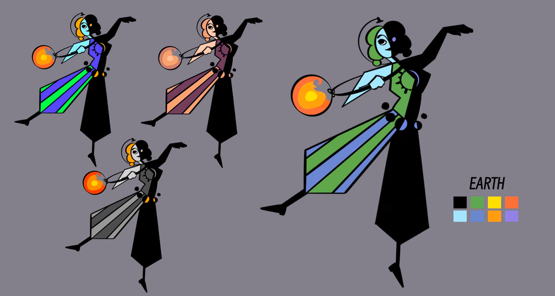
The next character on my list was Earth. During the very beginning of this I had no intension of making Earth a boss fight but instead a shop for the player to visit and buy from. I thought it would be cute to make Earth be two characters, either one representing one part of the world. As nice as the idea was, the process wasn't as enjoyable as I hoped. It felt like there was too many variables to consider, colours, poses, style, I ended up going through a handful of different ways to design the Earth. On my second attempt, I kept the twin theme and tried to introduce a corruption for them too. I was more happy with this outcome, but felt it didn't fit alongside everyone else instead, it looked too detailed and overcrowded.
Onto my third attempt I scrapped the twin theme. When I thought about how it would look in a shop menu, two characters felt like it took up too much space. Though I was interested in continuing the jester similarities I had during my last version, so the striped pattern and large pants stayed. Keeping the split down the middle, I thought it was a better alternative to having both the sun and moon represented on her. Earths colours of greens and blues are also kept, with the addition of her accessories being an item that represents the Earths inner layers. She is also given a semi-meridian that globes have for her headpiece.
Onto my third attempt I scrapped the twin theme. When I thought about how it would look in a shop menu, two characters felt like it took up too much space. Though I was interested in continuing the jester similarities I had during my last version, so the striped pattern and large pants stayed. Keeping the split down the middle, I thought it was a better alternative to having both the sun and moon represented on her. Earths colours of greens and blues are also kept, with the addition of her accessories being an item that represents the Earths inner layers. She is also given a semi-meridian that globes have for her headpiece.
|
|
|
|
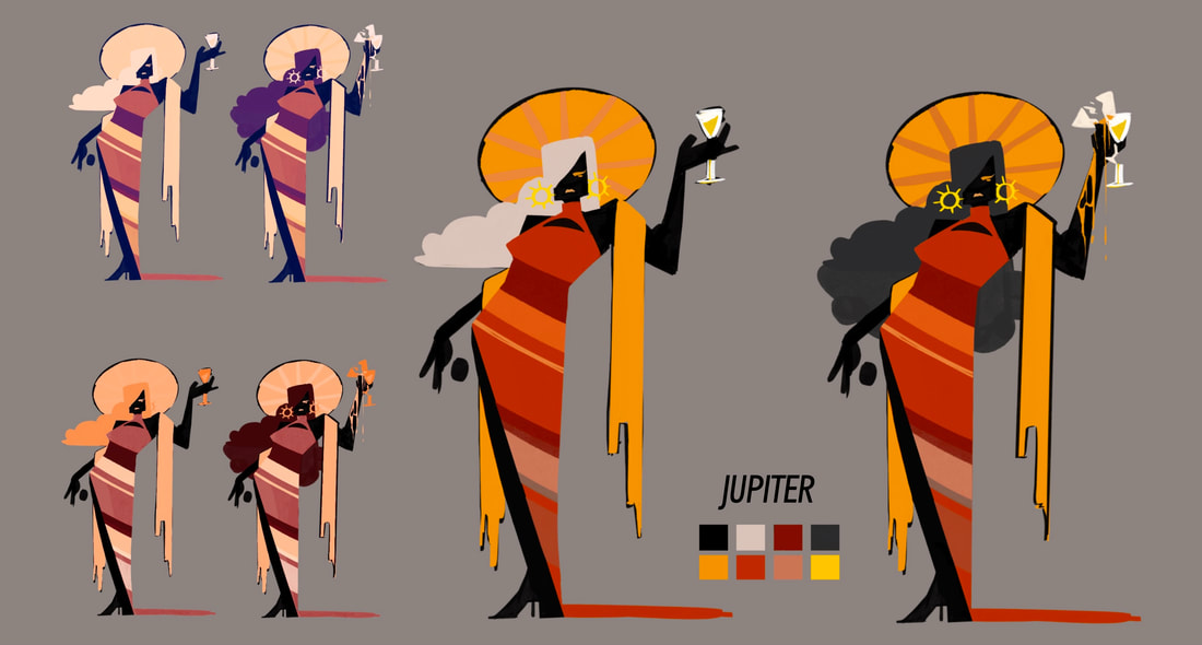
Jupiter
With the Moons planets out the way, it was next to go through the Suns. Firstly, I chose Jupiter, the planet that represents mostly luck. I instantly knew I wanted to make her some sort of rich goddess and almost go for a similar design to my old versions of the Sun. What I also found out through some research was Jupiter has a connection to weather, which sparked the idea of adding some type of cloud motif. When I was happy with the pose I then added in this cloud idea to her hair, making it represent a cloud. Jupiter's final designs are two forms, one before and during battle where the cloud hair darkens to give off a storm feeling. Paired with a dress that matches the planets actual appearance, she wears a sun headpiece, a gold shawl and a pair of sun earrings.
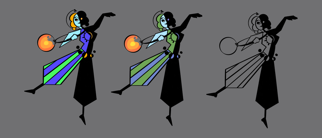
Half way through these designs I started to include a pattern of them holding a ball, this is meant to show the corruption and how they are always holding it. At first this was just something extra to add into these designs, but when I developed this world story more it became an important piece or each character. Now, this orb has an appearance that should remind the player of the black hole that separates the world into two. This is because I chose to make this the black holes doing, causing a corruption that lures anyone and everyone with the wish of power.
Venus
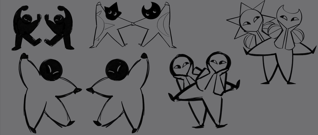
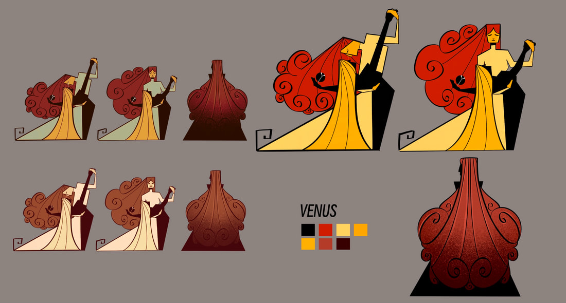
Once I had this as a new feature to consider in my future designs, I was able to create more stories around characters I had no inspiration to start. Following Jupiter, I chose Venus as my next character. Back when I was brainstorm near the start of this project, I already knew that Venus represented love so I wanted to show that in making the character a pair of lovers. I believed the best way to do this was to make them dancers. Thinking about characters fates I chose to make them tragic lovers, continuing dancing all the while her partner has already succumbed to the corruption.
|
|
Usually for other planets they would have one to two sprite designs. However, I was very invested in the story I was creating for Venus that I gave her a third. The first is in denial, she knows her partner is dead but chooses to continue dancing. The second is the battle sprite, she holds her lover with tears still and her neck a black silhouette. The last, after defeating her, is her back facing the protagonist. I made it so we can see her side view and dress are all a silhouette, the corruption spreading to her now. Instead of another fight like the player would usually do, she chooses to let the protagonist go so she can succumb to the corruption herself to be with her partner again.
What About the Other Planets?
In my early development of the characters, I planned to have a character for every planet. The only ones I didn't end up completing the designs for were Mars and Uranus. When I began to think about the narrative of my game and the corruption I created to be the cause of the plot. Since as well, this was originally meant to be a full horror game, I still wanted to keep a dark narrative going. Because Mars and Uranus were last on my list, I thought it was interesting for them to be the only planets that have already succumbed to the corruption and died. I imagined the player would hear about it from dialogue between other characters, but if the player explore every corner of the game they could stumble across them.
|

|
FINAL OUTCOMES
|
|
|
|
|
|
|
|
|
|
Reflection
While I've I had my ups and downs during the development of my characters, I found a big challenge was to be able to create my own story for these characters. While I've done concept art projects in the past I knew I was setting myself up for something much larger than what I had in mind. Some weeks I spent most of my time enjoying the process and brainstorming new ideas, thinking of how they would sound? Would they have fluid animations or be still sprites? and even what music would play specifically for them as a theme that could give the player a look into their personality. But I'd also have weeks I lose what style I wanted and had to keep redrawing until I was pleased. I'd even begin redesigning some even after I was comfortable with their final designs because I decided to switch up their story. I knew I could easily get carried away when it came to the characters and while I'm happy with the decisions I've ended with, it became an issue at times that had me needing to go back and restart. However, I'm very pleased with the graphic style I ended up choosing, it helped keep me working efficiently and not lose time constantly adding details.